Abstraction -
My Tumblr: Click Here
Abstraction, to me, is something familiar or even unfamiliar but has a hidden meaning or thought behind it. It's something than only exists as an idea rather than something physical. I could take a picture of a mental idea rather than a physical object, and to me that is an abstract photograph.
"Relating to or denoting art that does not attempt to represent external reality, but rather seeks to achieve its effect using shapes, colours, and textures."
"Relating to or denoting art that does not attempt to represent external reality, but rather seeks to achieve its effect using shapes, colours, and textures."
The Formal Elements -
Focus: The area in a photograph that appears in focus or is clearest.
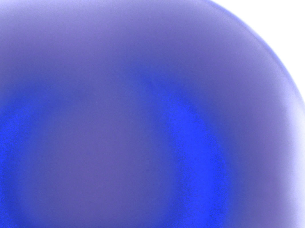
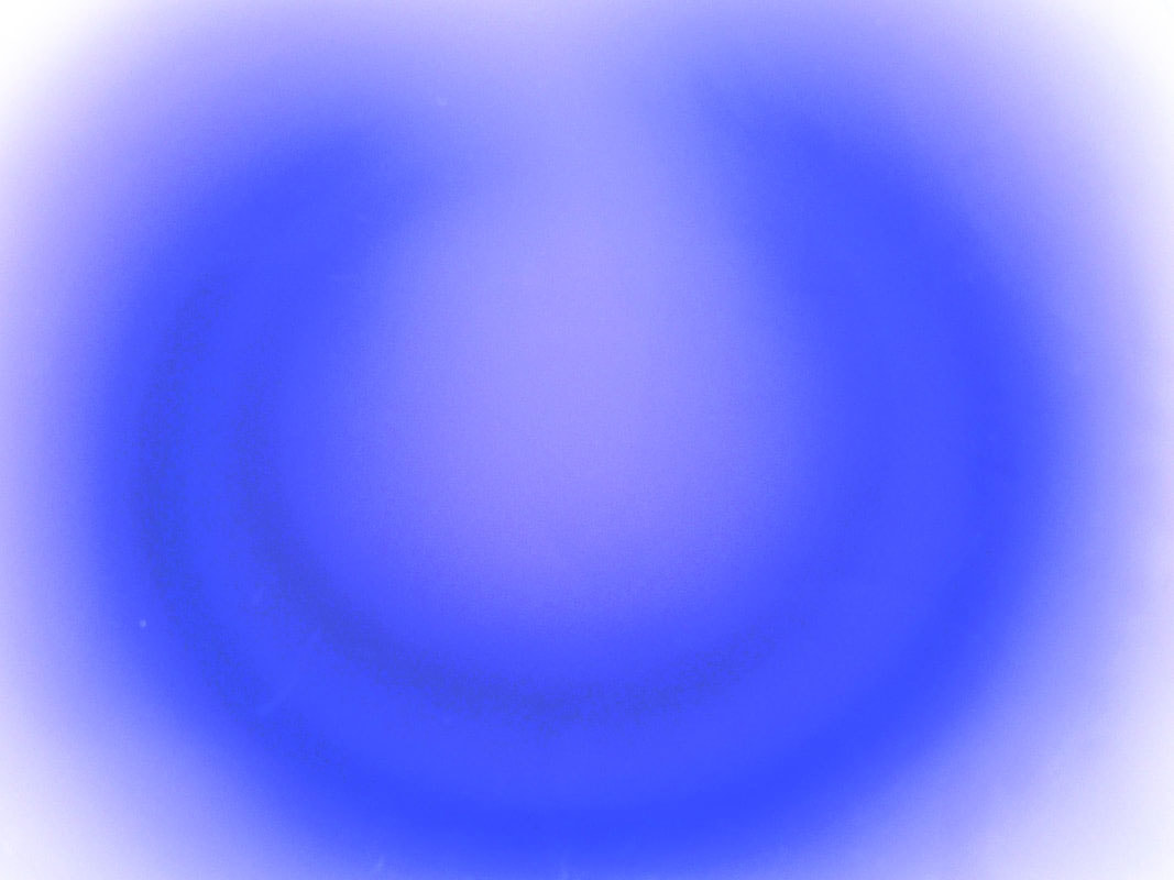
Light: It is a thing that defines and makes things visible. Photography is the capturing of light.
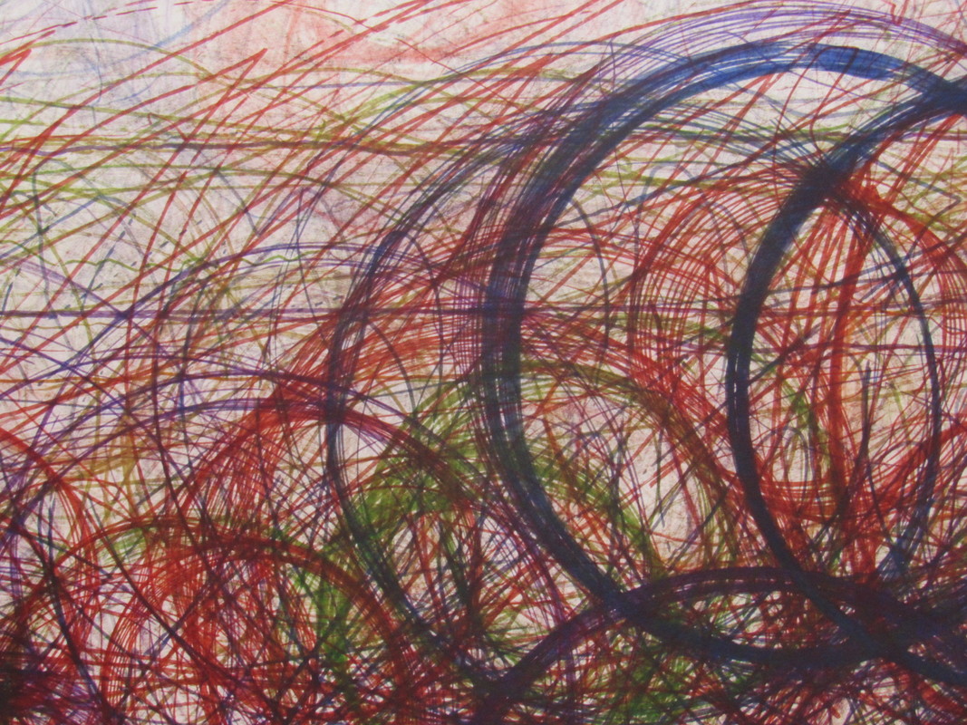
Line: A straight or curved thing, moves continuously for a period. It outlines things and can define objects.
Repetition: The act of repeating something. Like a pattern, it recurs and is a familiar aspect in an image.
Shape: A geometric shape, for example a square. It can be seen through outlines of familiar things. An outline can be considered as a shape.
Space: Positive and Negative space. Is there something there? Is it empty? It is a an area that can be filled of left empty, which is the choice of the photographer.
Texture: How something feels or appears to feel. It can be soft, rough or corse.
Value/Tone: Is there a range of light? Dark to Light is an example of a spectrum of tones.
Light: It is a thing that defines and makes things visible. Photography is the capturing of light.
Line: A straight or curved thing, moves continuously for a period. It outlines things and can define objects.
Repetition: The act of repeating something. Like a pattern, it recurs and is a familiar aspect in an image.
Shape: A geometric shape, for example a square. It can be seen through outlines of familiar things. An outline can be considered as a shape.
Space: Positive and Negative space. Is there something there? Is it empty? It is a an area that can be filled of left empty, which is the choice of the photographer.
Texture: How something feels or appears to feel. It can be soft, rough or corse.
Value/Tone: Is there a range of light? Dark to Light is an example of a spectrum of tones.
Abstraction Examples -
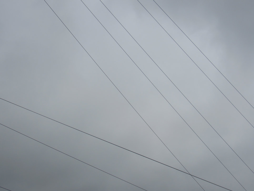
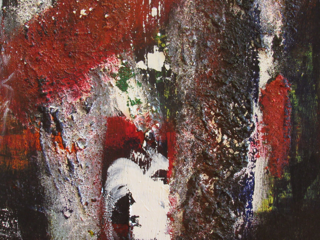
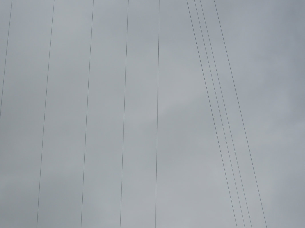
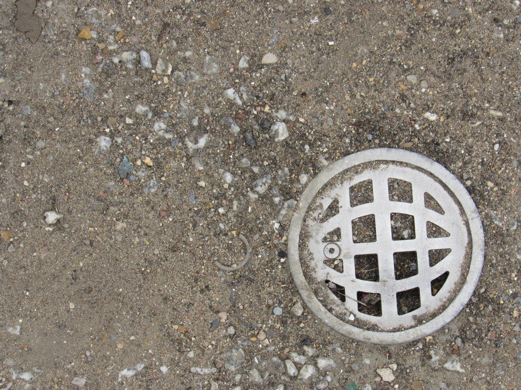
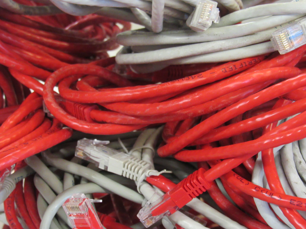
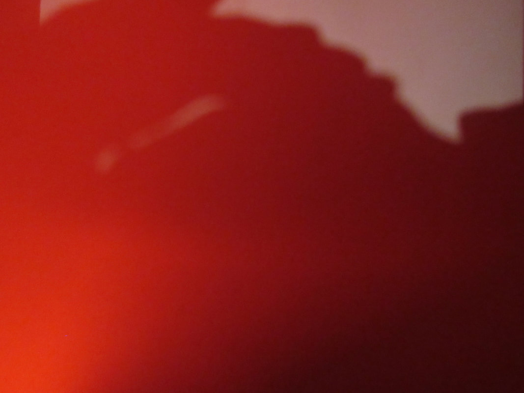
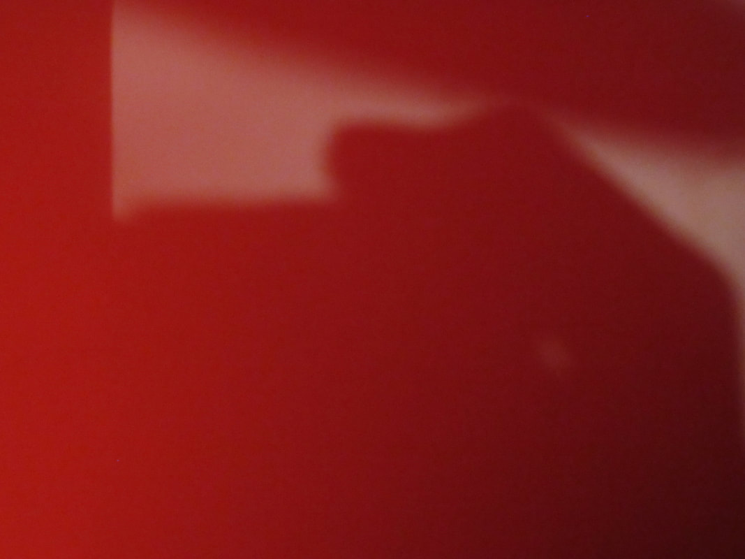
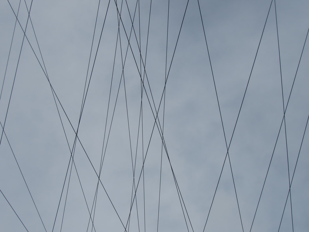
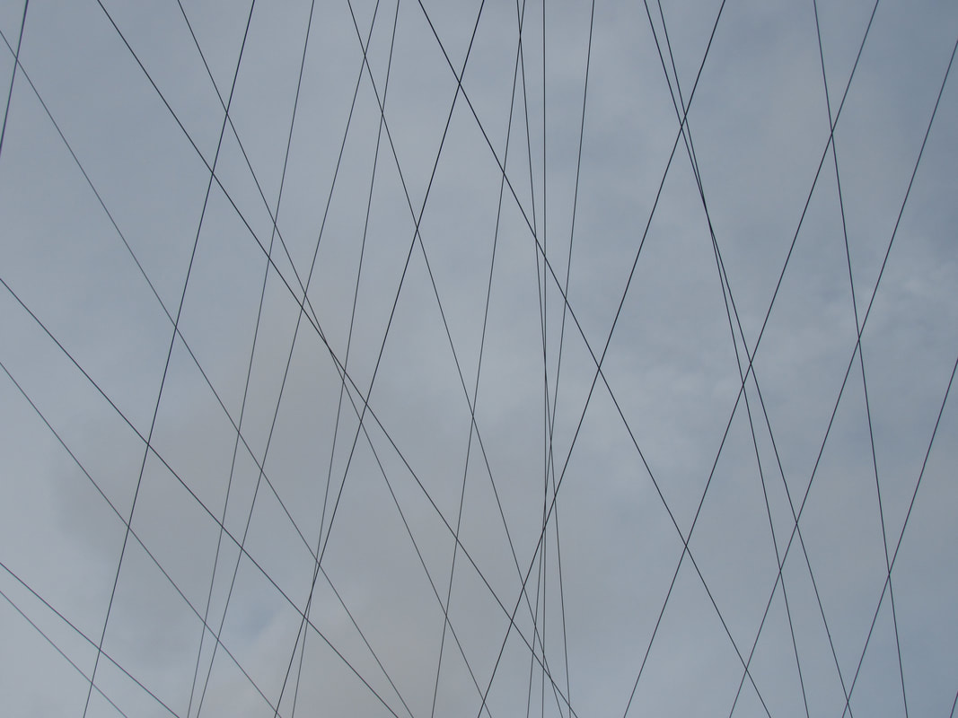
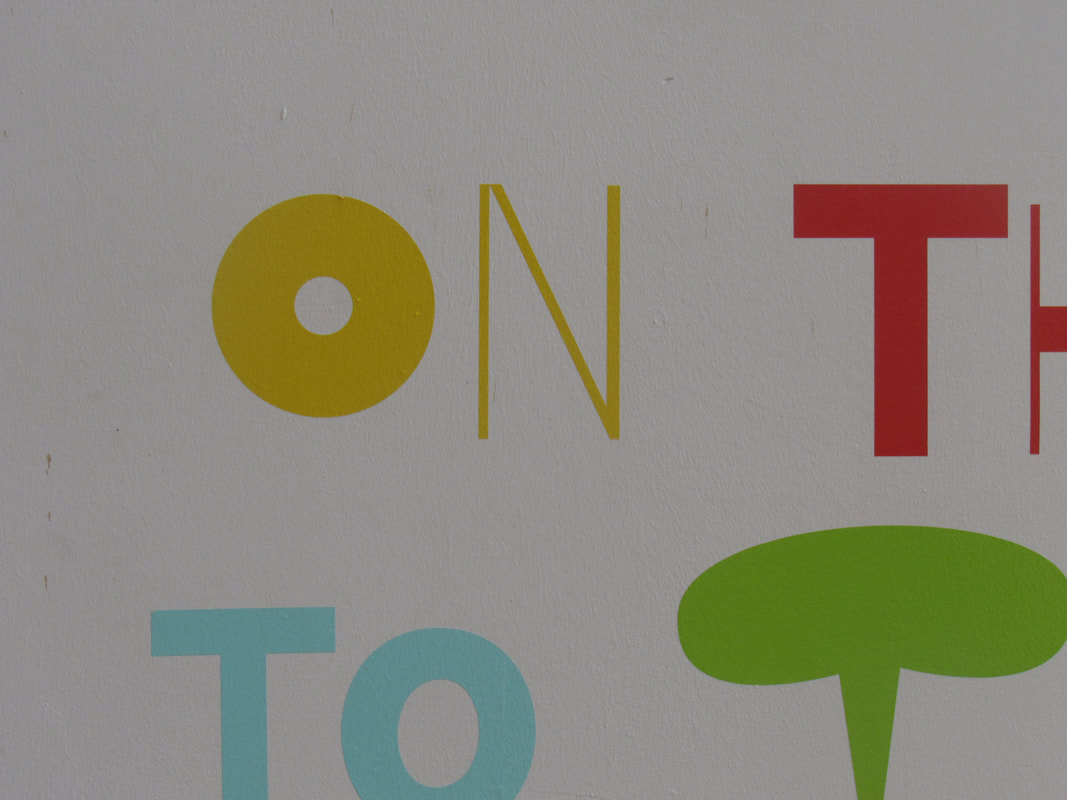
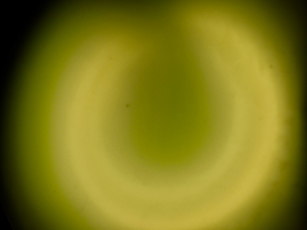
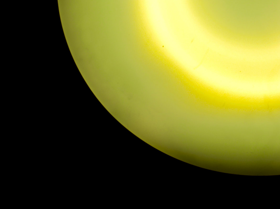
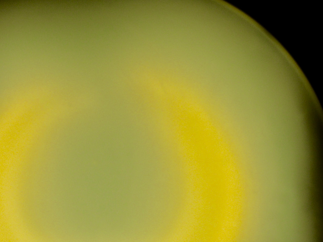
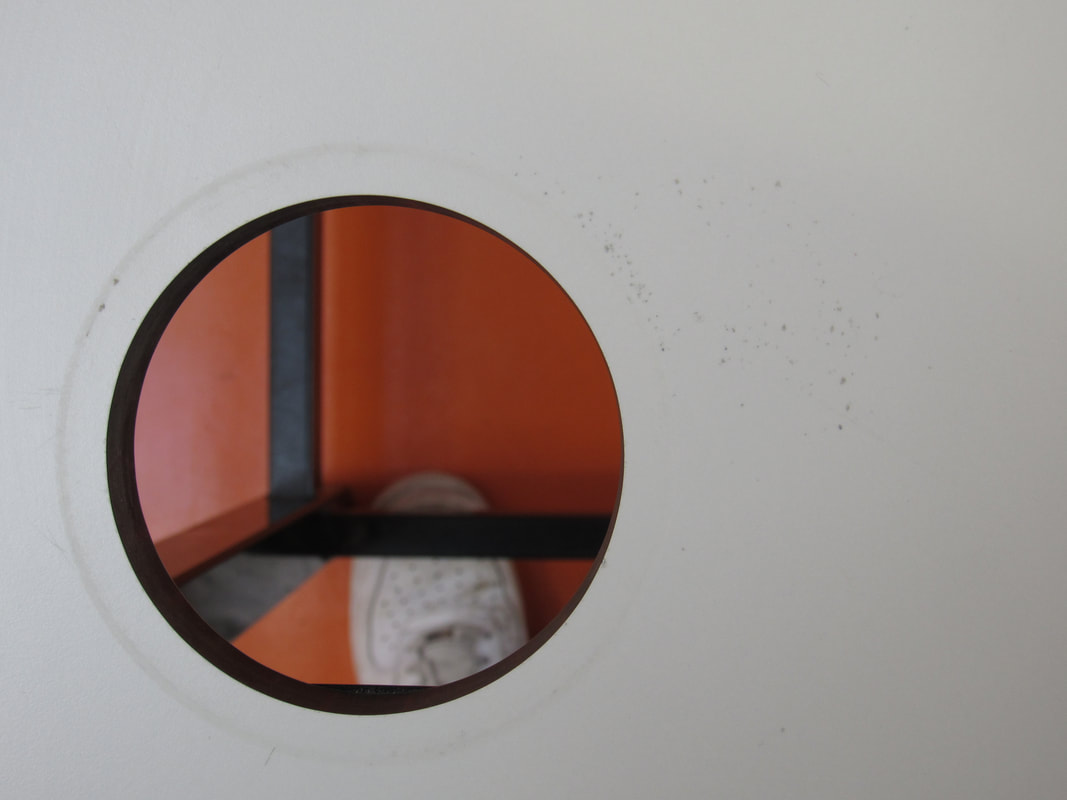
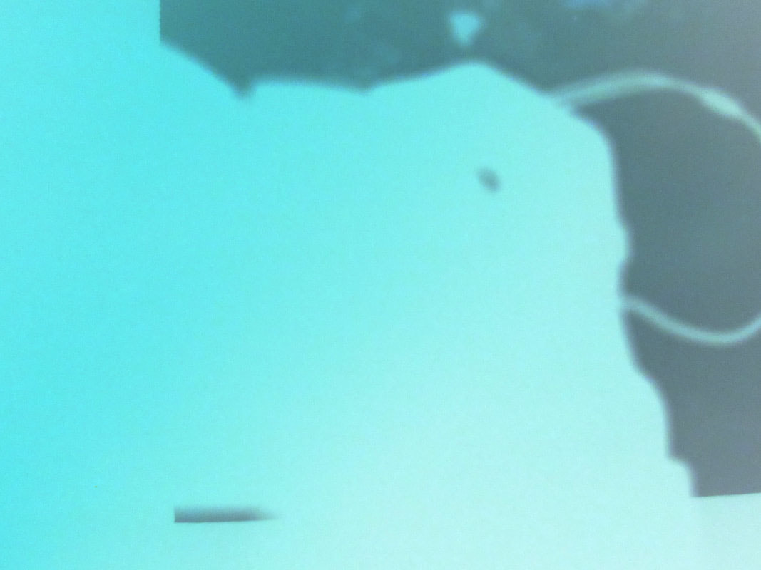
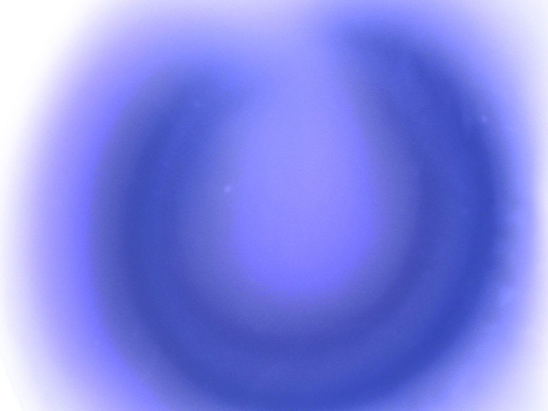
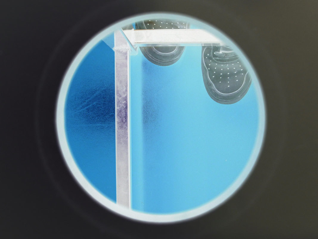
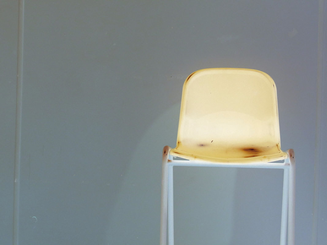
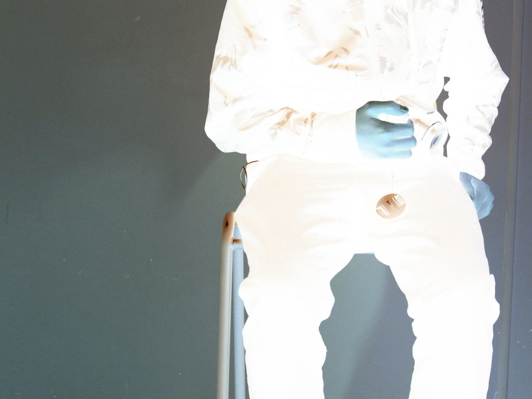
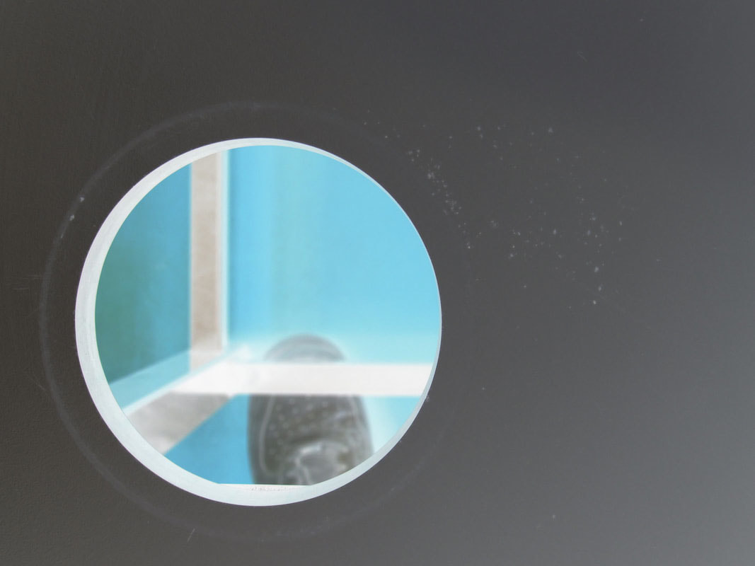
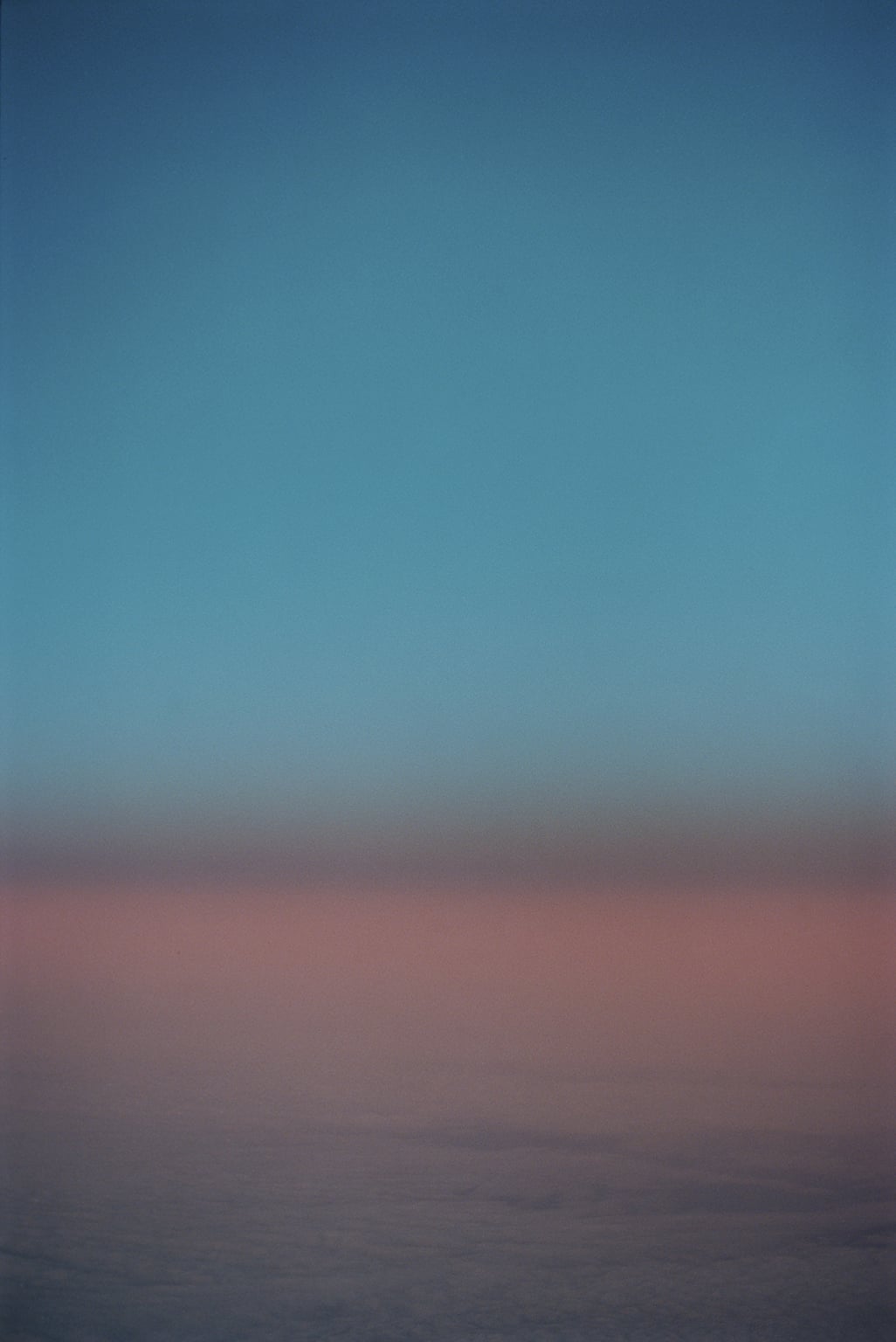
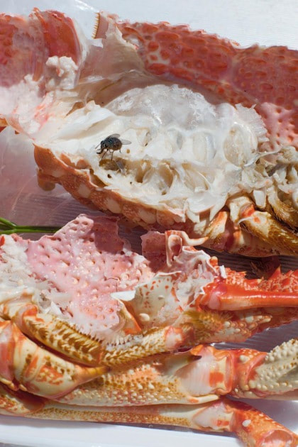
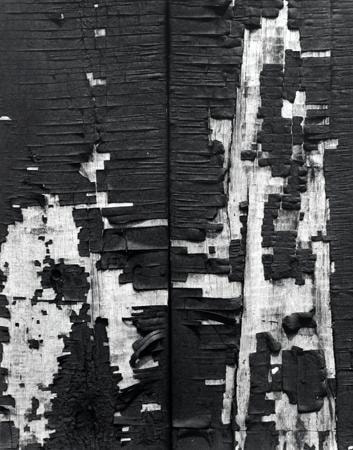
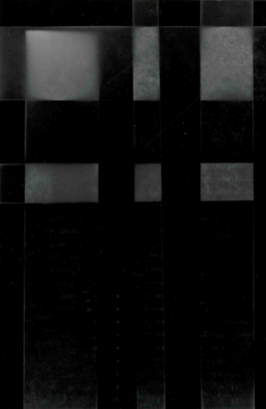
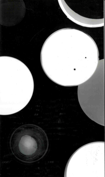
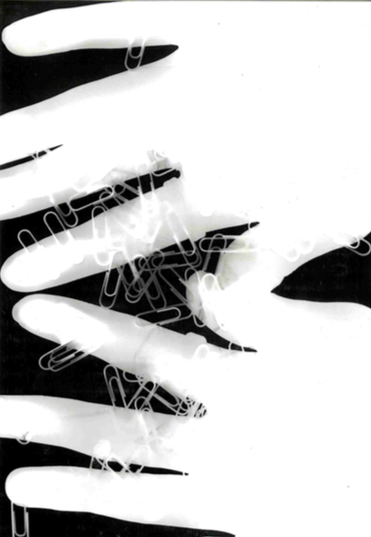
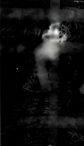
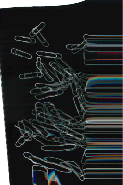
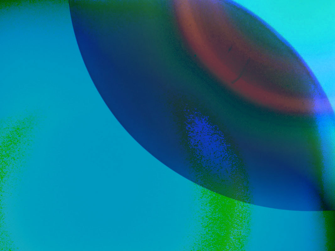
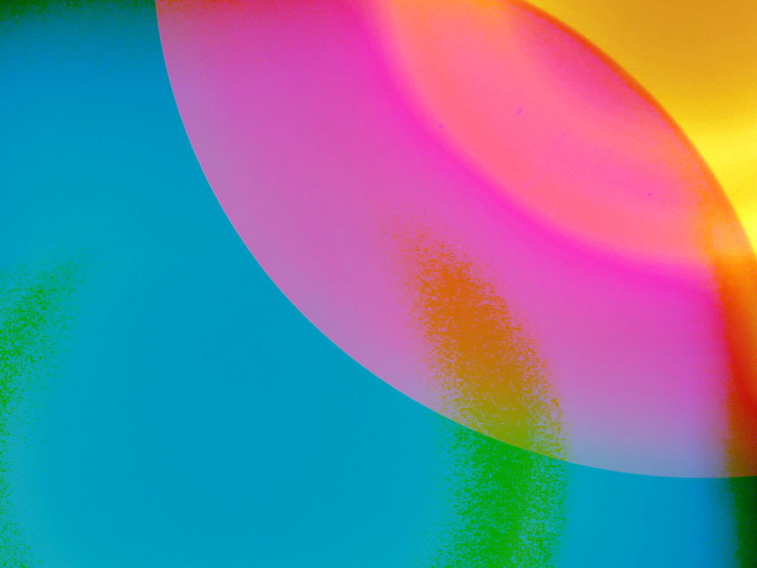
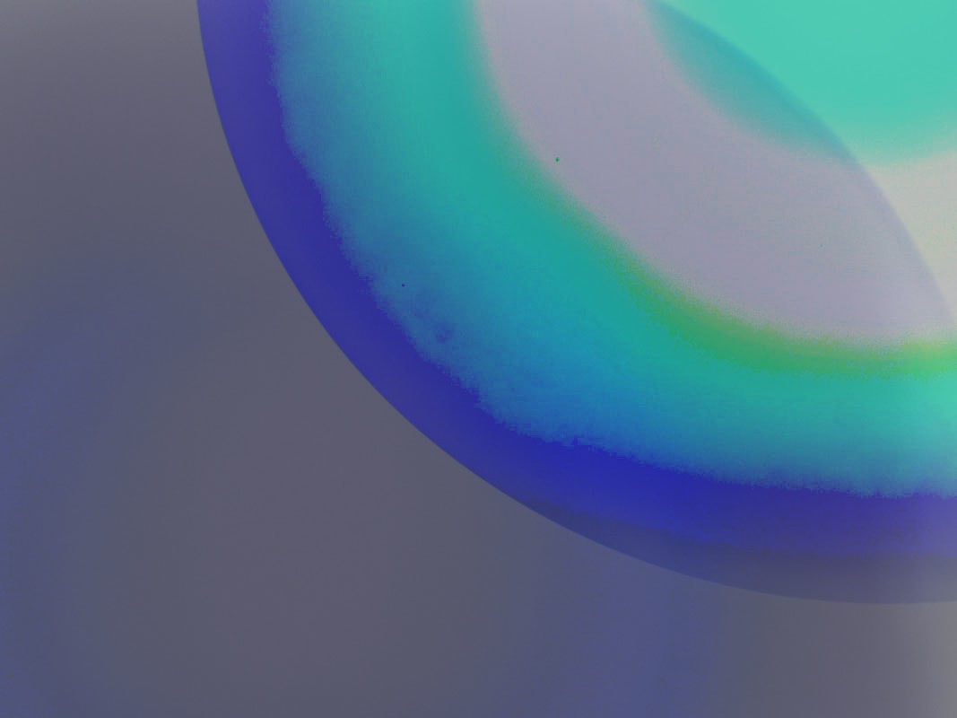
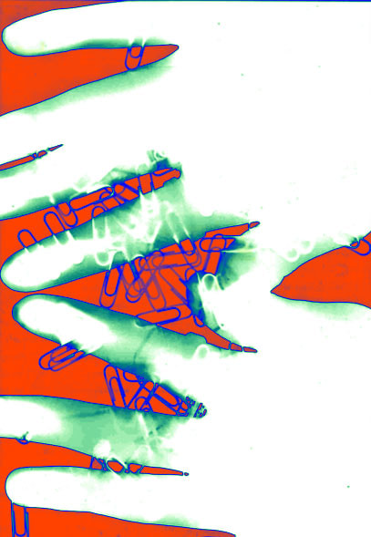
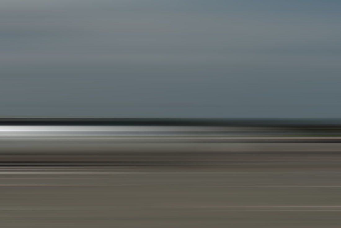
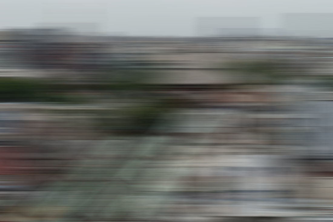
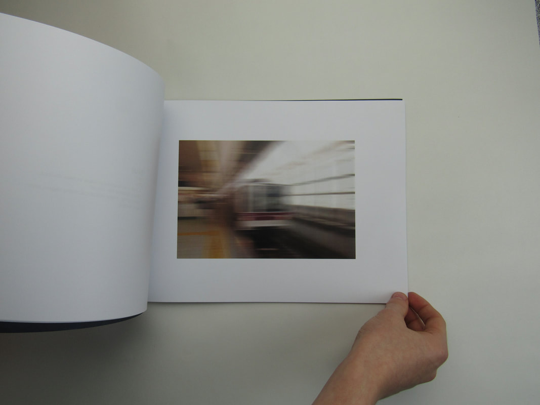
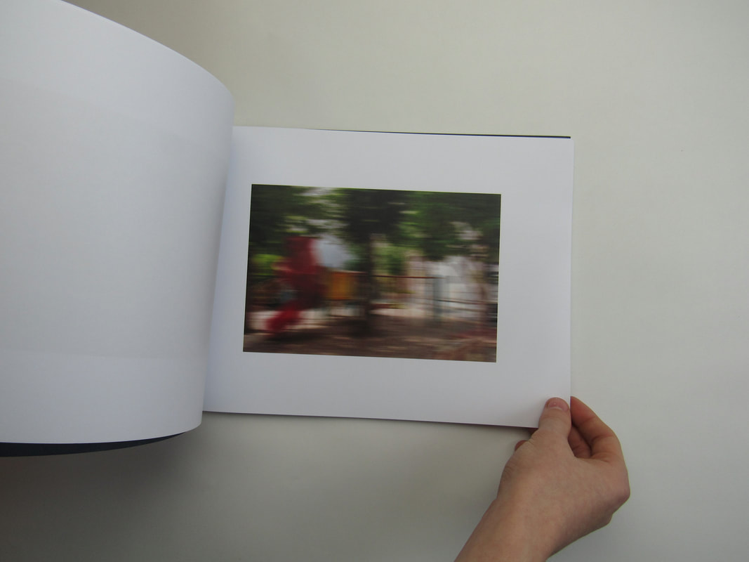
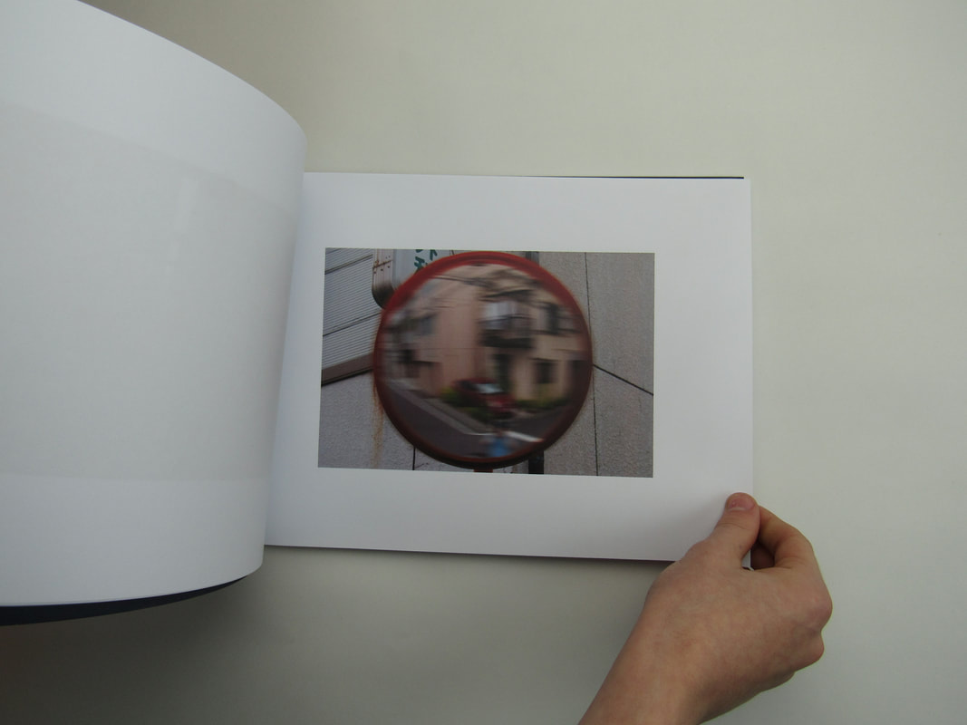
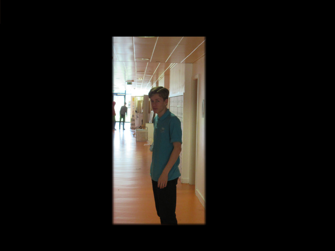
I feel like some of my images are very abstract, yet some aren't as abstract. With some you can easily tell what they are and some are more obscure. I have tried to emphasise 'Line', 'Light' and 'Composition'. The ones of the wire really hit my target of taking images of Lines. With Light I used this formal element by taking images in the darkroom with the Photo Sensitive light on. I'm trying to use objects and shapes. I'm attempting to use of focus in my new lot of images as I think the idea of things being in focus and out of focus really links back to my personal idea of what Abstraction is, focusing on certain things to get through an idea or motive.
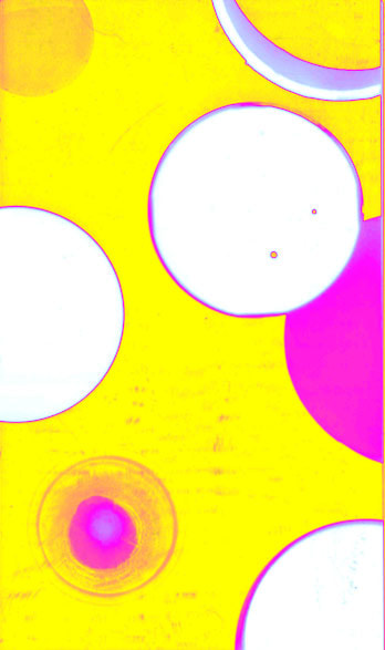
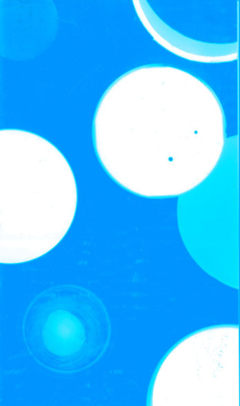
Abstract (Invert) -
Abstract Photographers -
Wolfgang Tillmanns -
Wolfgang Tillmans is a German photographer. He was born in 1968 and is largely known today fro being the first non-British person and photographer to win the Tate Annual Turner Prize. I think Wolfgang Tillman's work is some of my favourite in the field of photography as he takes a different view on how to take a photo. In the first image, he has created this work through experience as he has made the errors he used to make in the dark room, into a very beautiful piece of work. Which I think represents the beauty in our errors.
Steps to Replicate Wolfgang Tillmann's work :
To replicate the idea of Tillman's work, I think you need to get into the mindset of Tillman. I think he looks at the imperfections of the world and shows it as something beautiful. For example, in his Photograms he used his years of experience making errors in the dark room to purposely make his work more Abstract. He also photographs humans showing their imperfections. This emphasises the idea that our imperfections is what makes us beautiful.
Salvador Dalí -
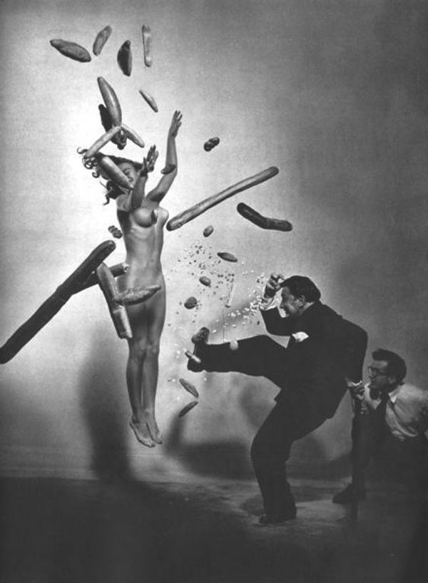
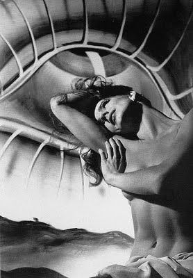
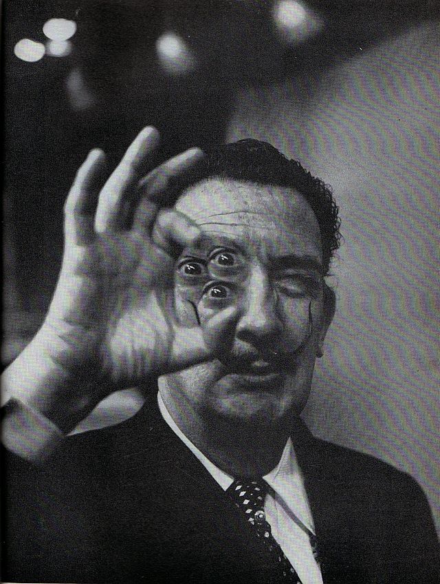
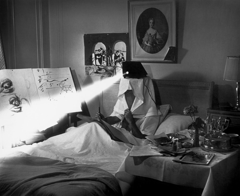
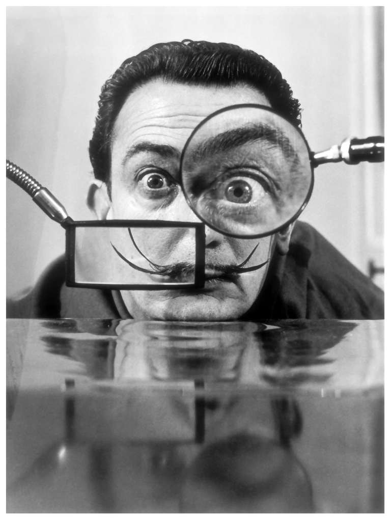
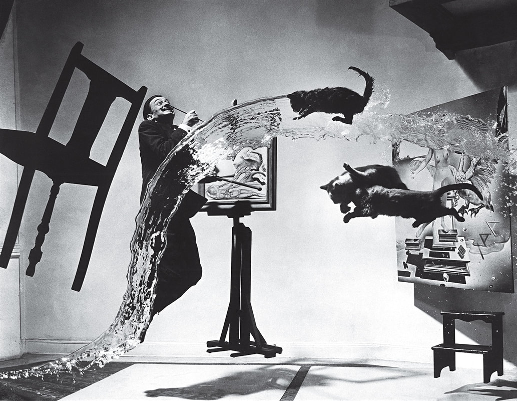
Salvador Dalí was a very a prominent Spanish surrealist born Figueres, Catalan, Spain. Dalí was a talented draftsman, best known for the abstract and bizarre images in his surrealist work. Dalí's work was revolutionary for his times as he incorporated some of the surrealist aspects of his paintings and put it into his photography. This imaginative and slightly humorous work is something that was not yet seen in art during the peak of creativity.
I personally really like his work. I think, not only is it abstract, but it is humorous and interesting. While analysing his works I really thought about his processes and how the produced the final results.
My favourite of Salvador Dalí's images is the third one on the top row. I think the use of Illusion and the three eyes creates a sense of confusion and really makes you think how he created the image without the technology we have today.
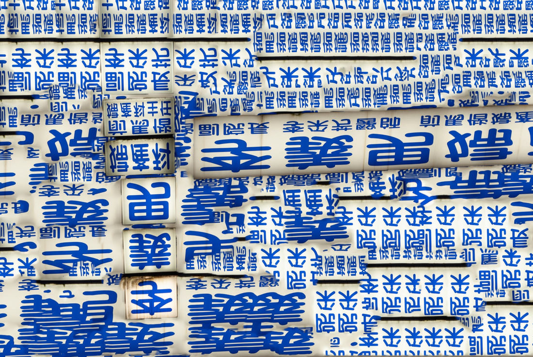
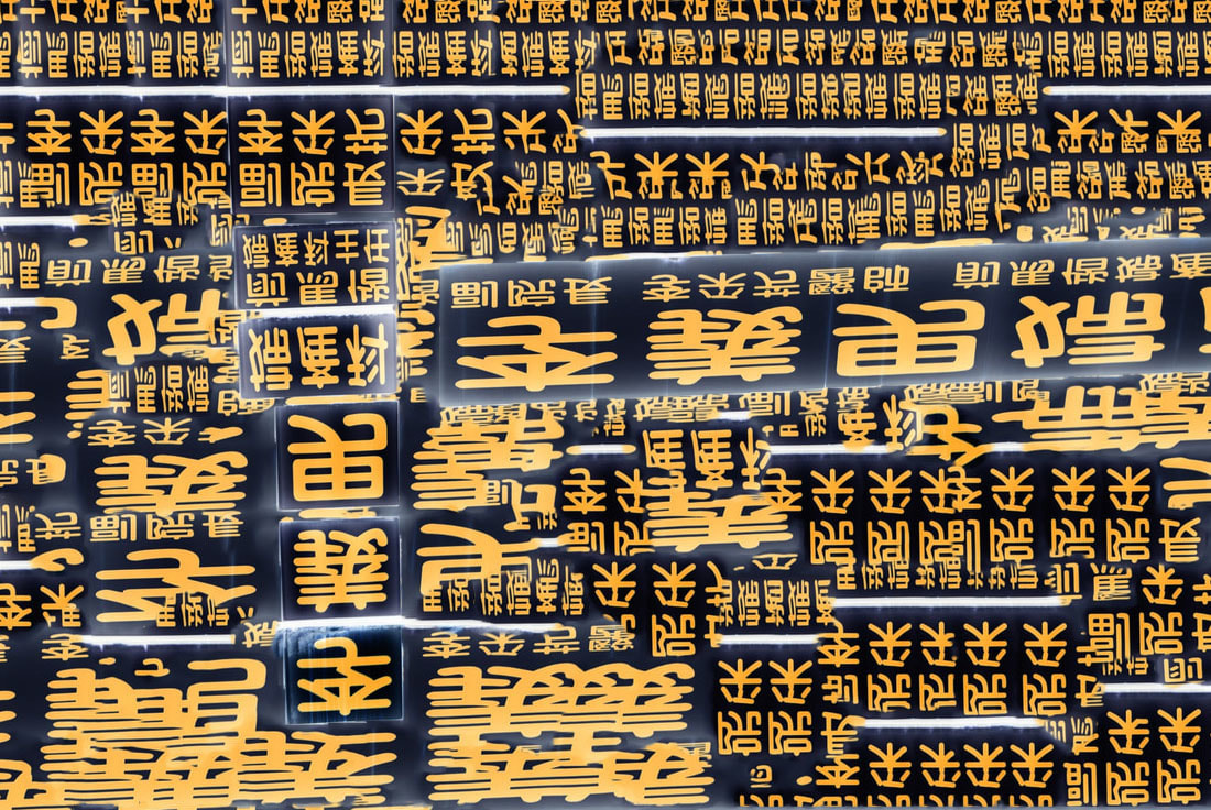
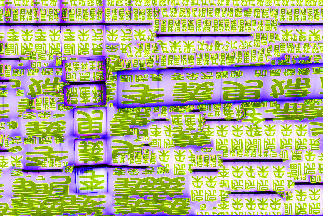
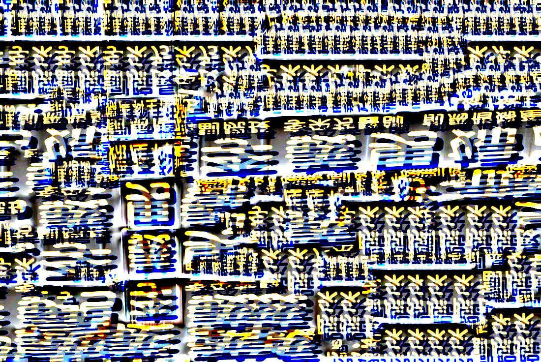
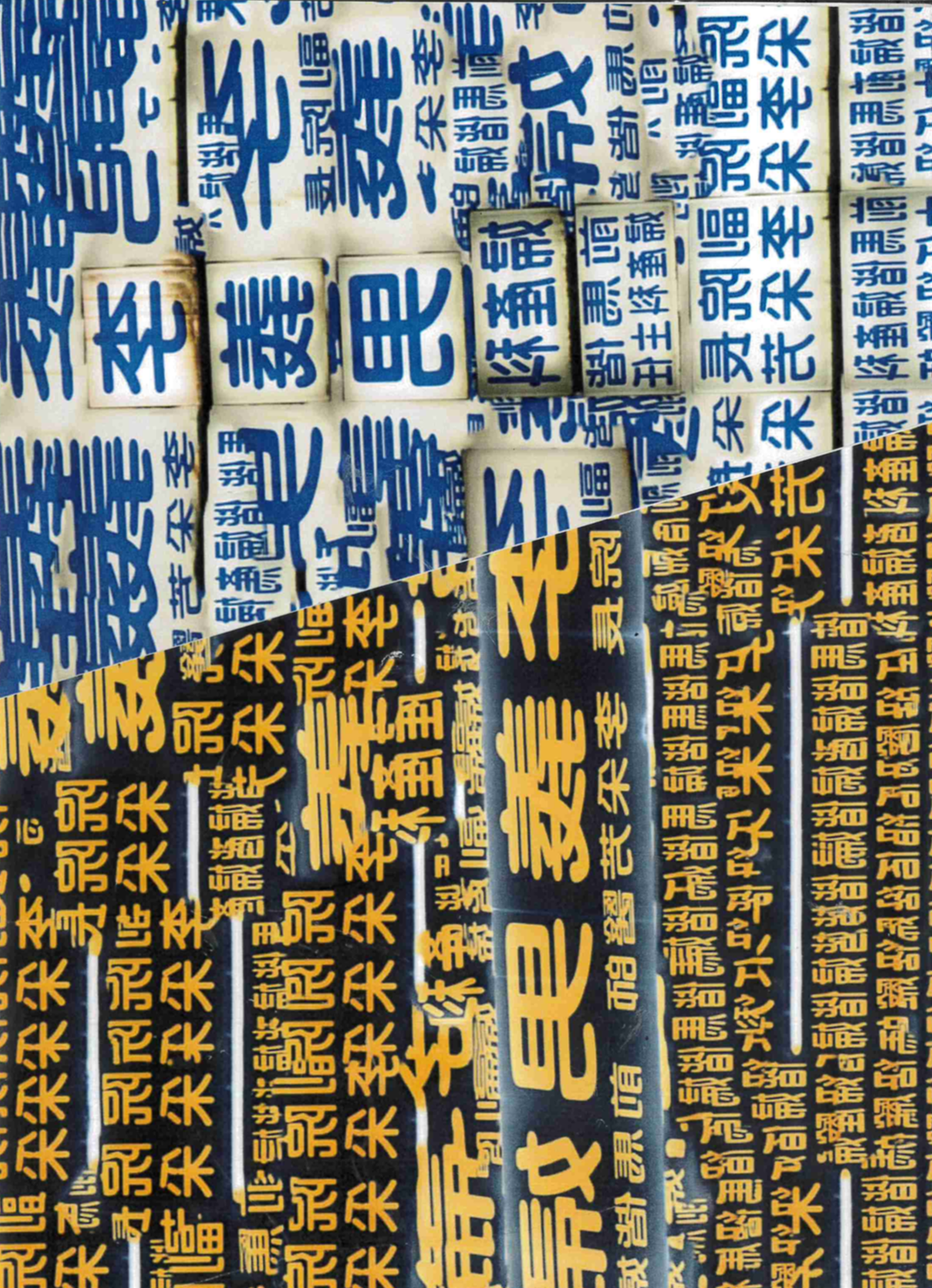
Aaron Siskind -
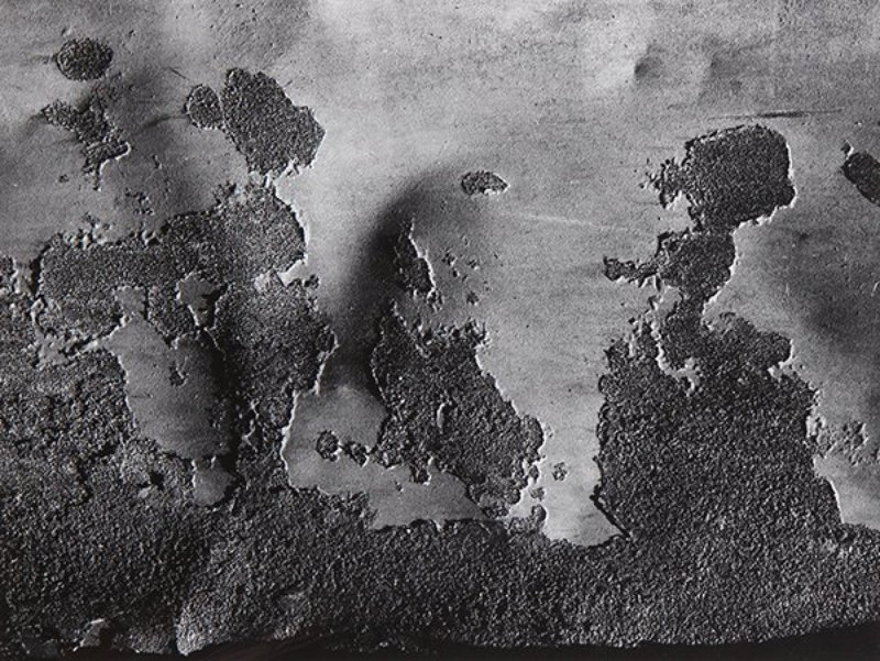
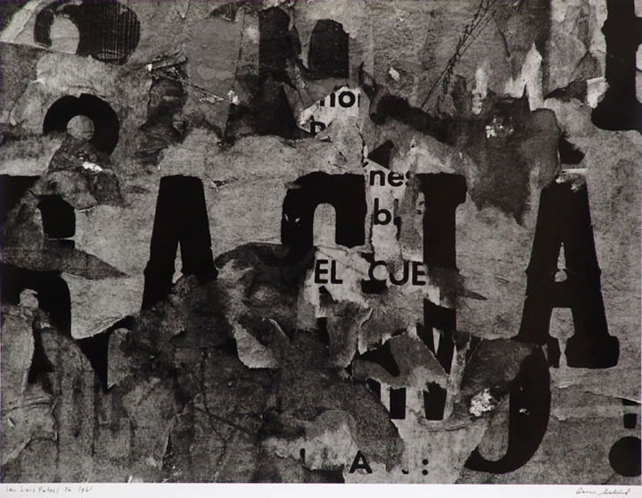
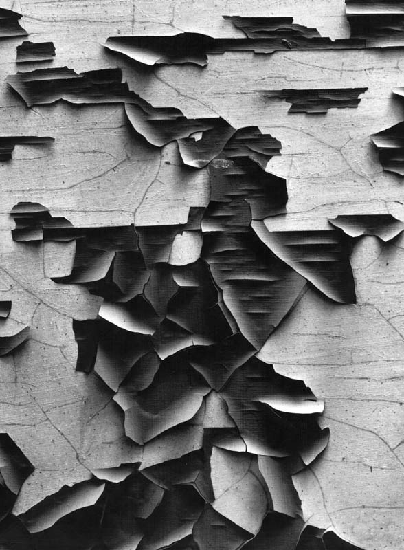
Aaron Siskind was a well-known American photographer. He is widely considered to be closely involved with the Abstract Expressionist movement. Siskind's work focuses on nature and architecture. He took images of Flat-Surfaces. For some his work has been described as crossing the line between photography and painting, his photographs are works unique to the art form of photography. I think by taking the image very close the subject it creates a very cramp, claustrophobic composition which forces you to look into what's happening in the photo. And when you can notice all the folds and ridges in the photo it forces you to see the beauty in something that's worn down.
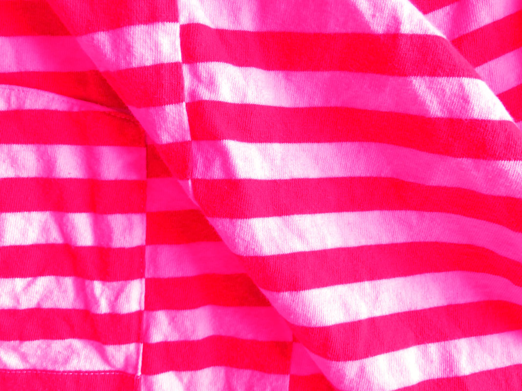
I like his work as it is quite similar to my Abstract H/W, where I took images of interesting fabrics. I think his work was also ahead of his time and he was fundamental to the expansion of Abstract photography.
My personal favourite work is the 1st one in the 2nd row. I think he has spotted and photographed a really interesting abstract surface. The fact that you can't really read the text makes you think harder.
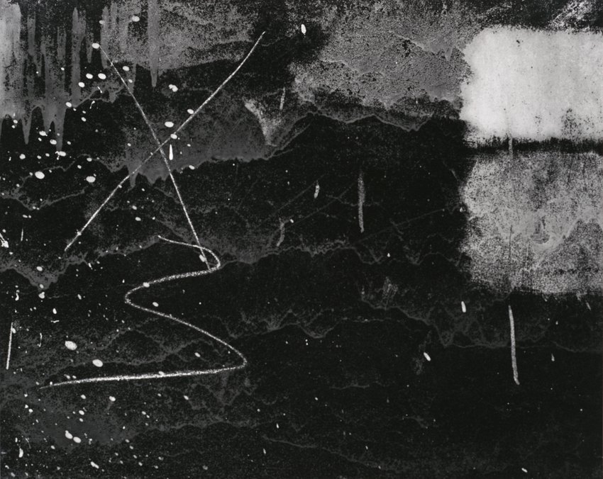
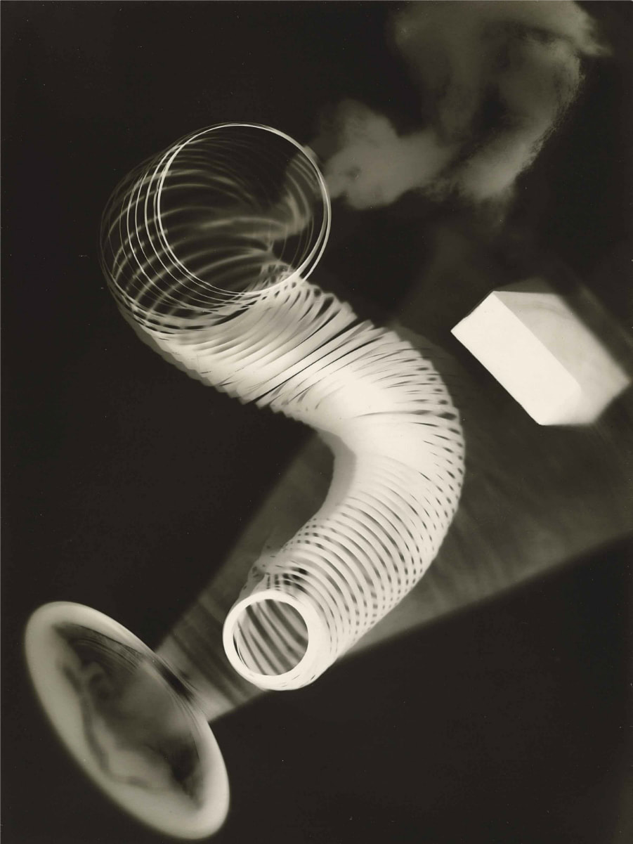
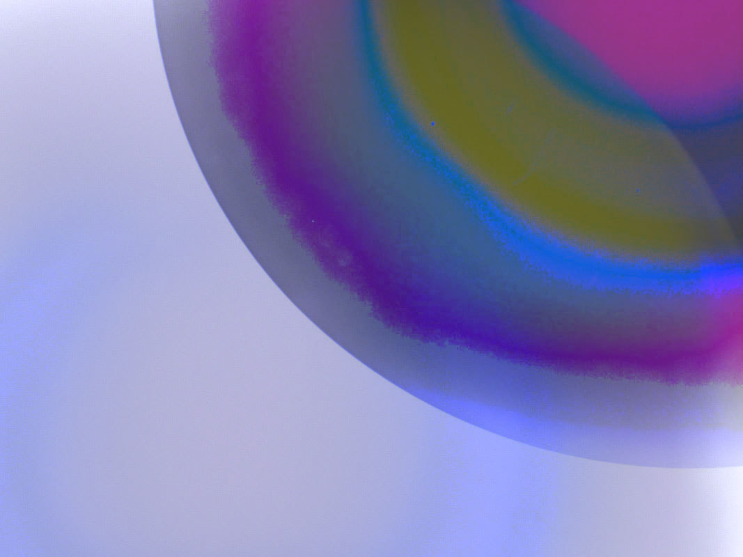
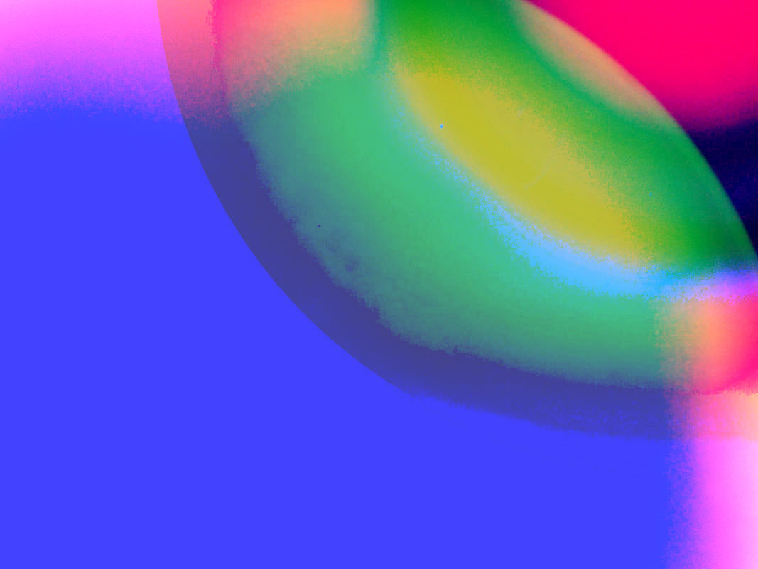
James Welling -
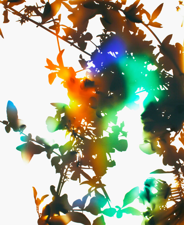
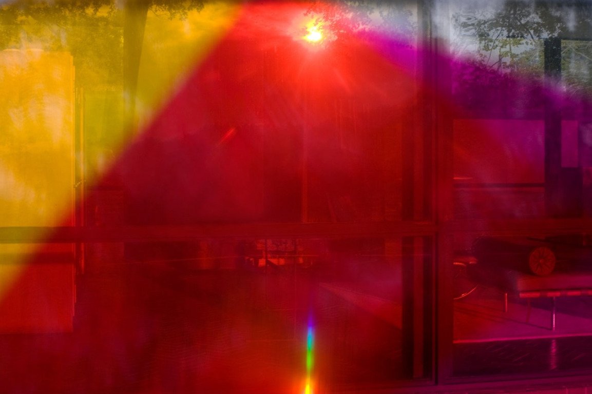
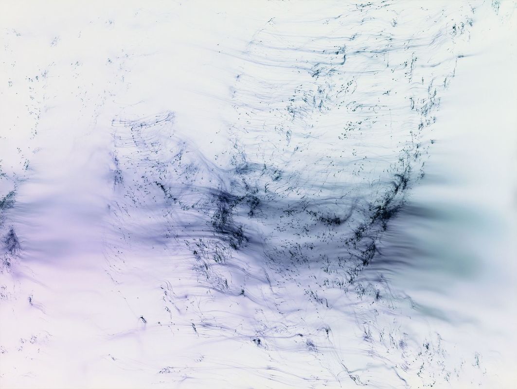
James Welling is an American photograph. He is considered a 'Post Modern' artist who did not comply with the trends of Photography at the time. In his work we can see his experiments with lights and reflection that create these beautifully ominous photos. In the first one, the way the white light has been pierced into a spectrum gives me a feeling of just waking under a tree, bewildered to how you got there.
I personally think his work is very interesting. The way he has incorporated refractions of light and reflections to create more abstract work. The use of colour also helps his further expand on the sense of abstraction. The vibrant reds and blues further removes the forms and makes you concentrate on the colours.
I personally think his work is very interesting. The way he has incorporated refractions of light and reflections to create more abstract work. The use of colour also helps his further expand on the sense of abstraction. The vibrant reds and blues further removes the forms and makes you concentrate on the colours.
Photograms -
Man Ray: Photograms -
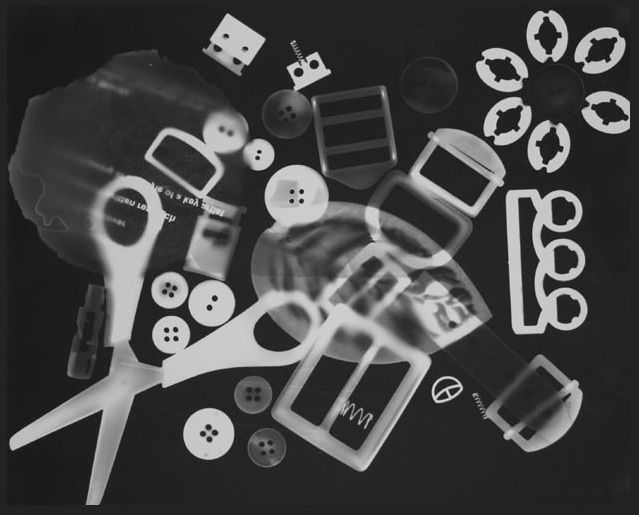
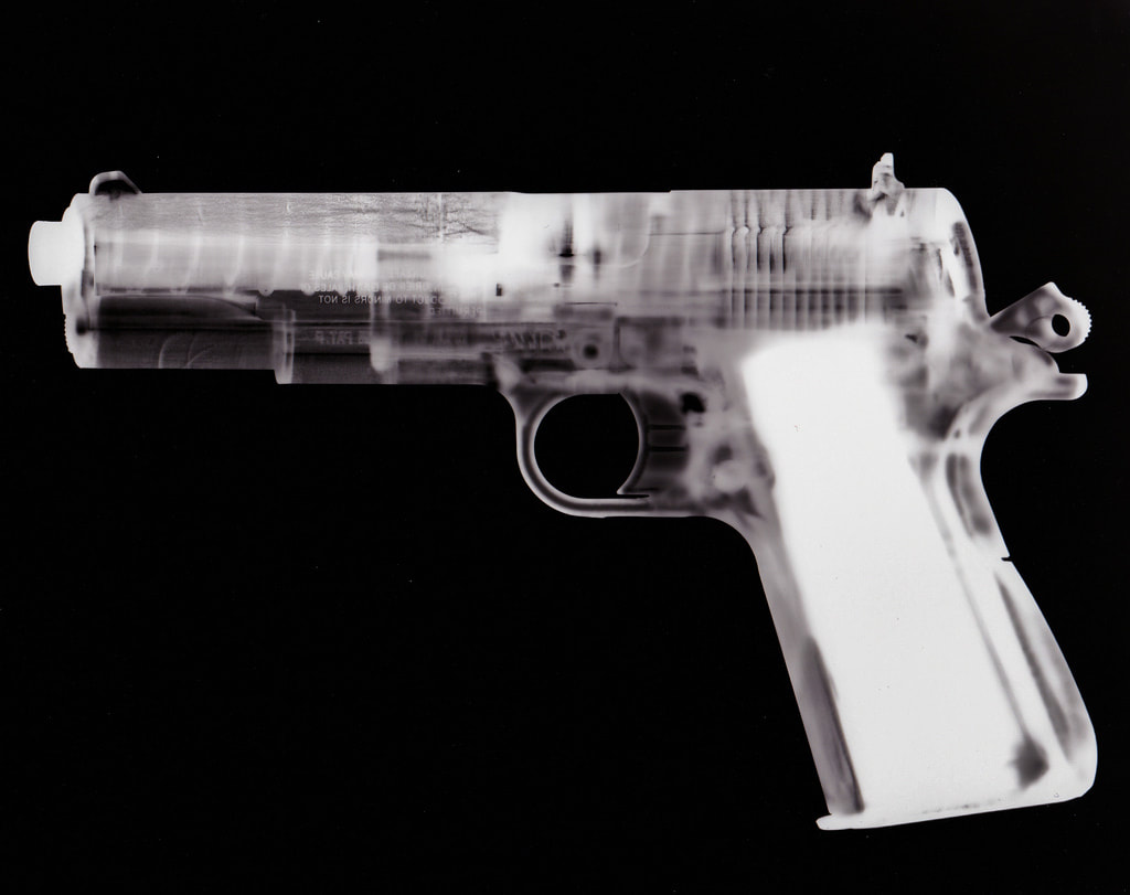
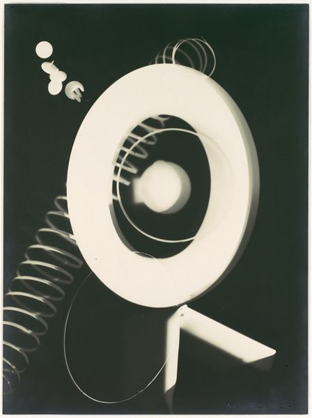
Man Ray, born Emmanuel Kadnitzy, was an American visual artist. He was both an Artist and Photographer who was very successful in both fields. He was a significant contributor to the Dada and Surrealist movements, although he never associated himself with these Genres of Art / Photography. He was largely known for his Photography as he was a renowned Fashion / Portrait photographer. He is also well known for his 'Rayographs' named after himself. My favourite Photogram is the one of the BB gun. I think it has a lot of meaning behind it, to me I see an almost X-Ray into the gun. I think it has a great Composition and the Black and White tones add a sense of mystery, almost a homage to Film Noir.
How to make an Abstract Photogram -
To make a good photogram: I think you need to use quite unfamiliar shapes. To me Abstract images are quiet unfamiliar and have unrecognisable, simple shapes, or they have an idea behind them and the contents of the images represent the idea behind the image.
Abstraction Worksheet (Rough / Sketch Work) -
Abstract Photograms -
These are my attempts at Abstract Photograms. I tried to obscure certain things and use the formal elements needed to create an abstract photogram (Lines, Shapes, Patterns). On the second one, the scanner could not properly picture it, you can see the shapes and forms when viewing it in real life. My last one is coming from a mistake,. It got stuck in the scanner and created a interesting effect, which I think is very abstract and has actually made a good result. This has been included in the "Loss" section of my Abstract Book.
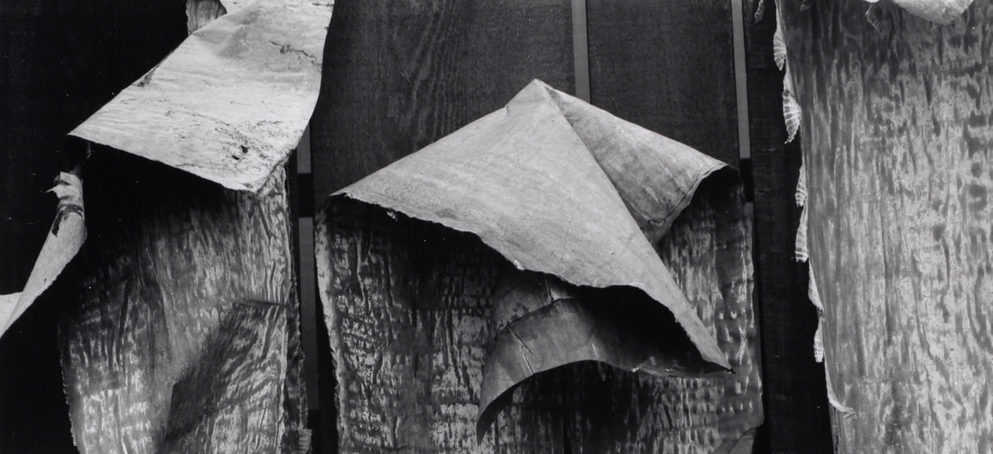
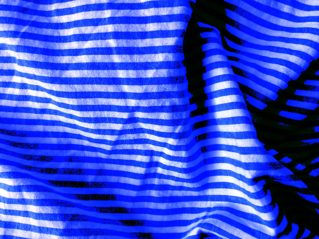
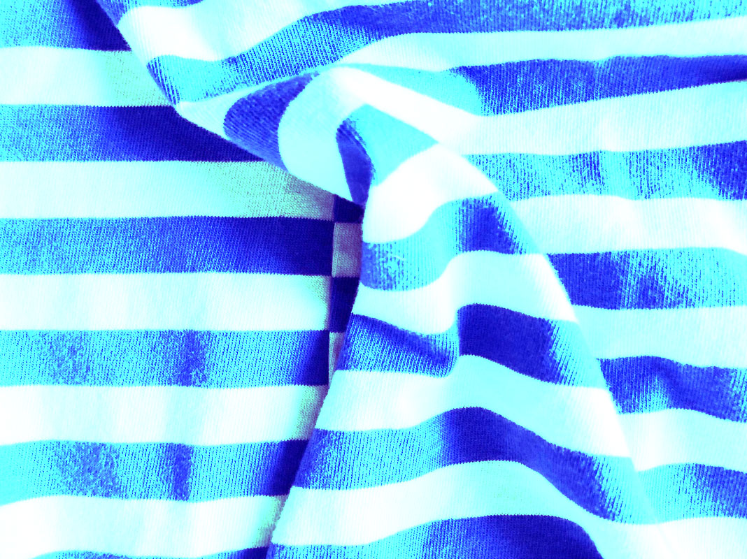
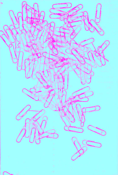
Abstract Images H/W -
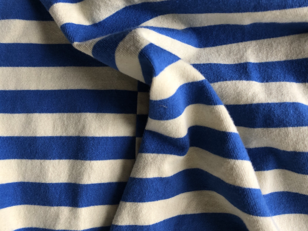
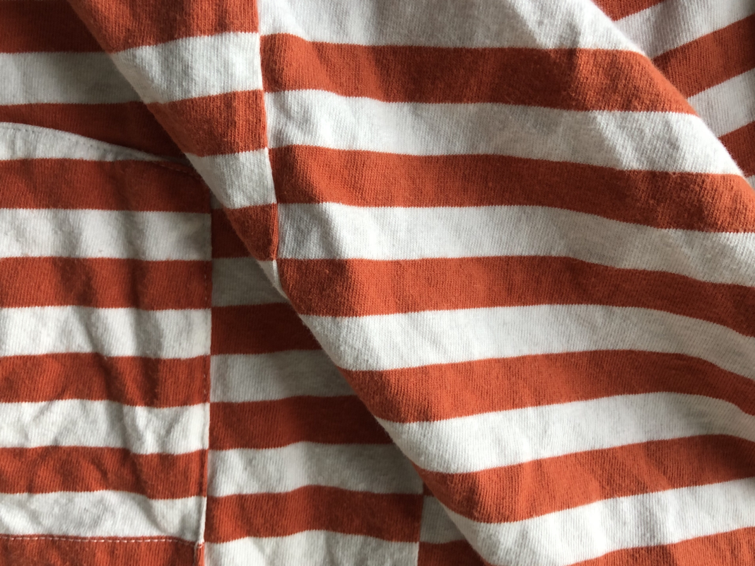
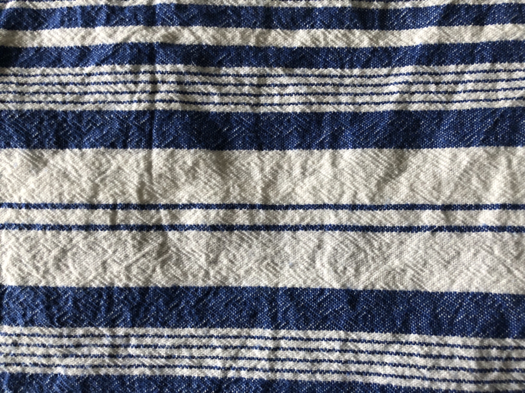
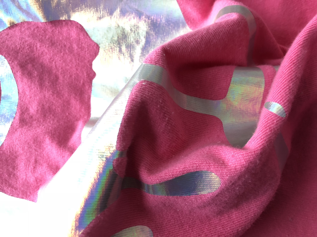
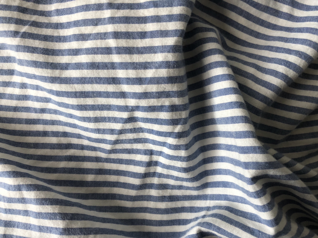
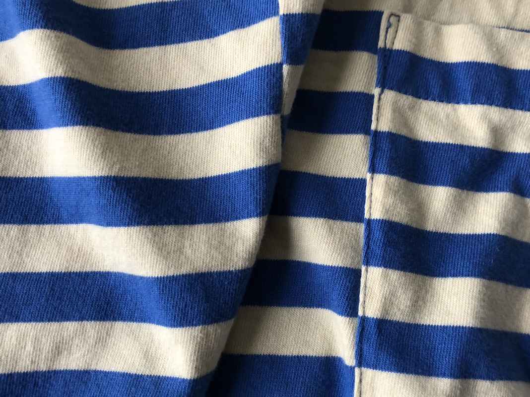
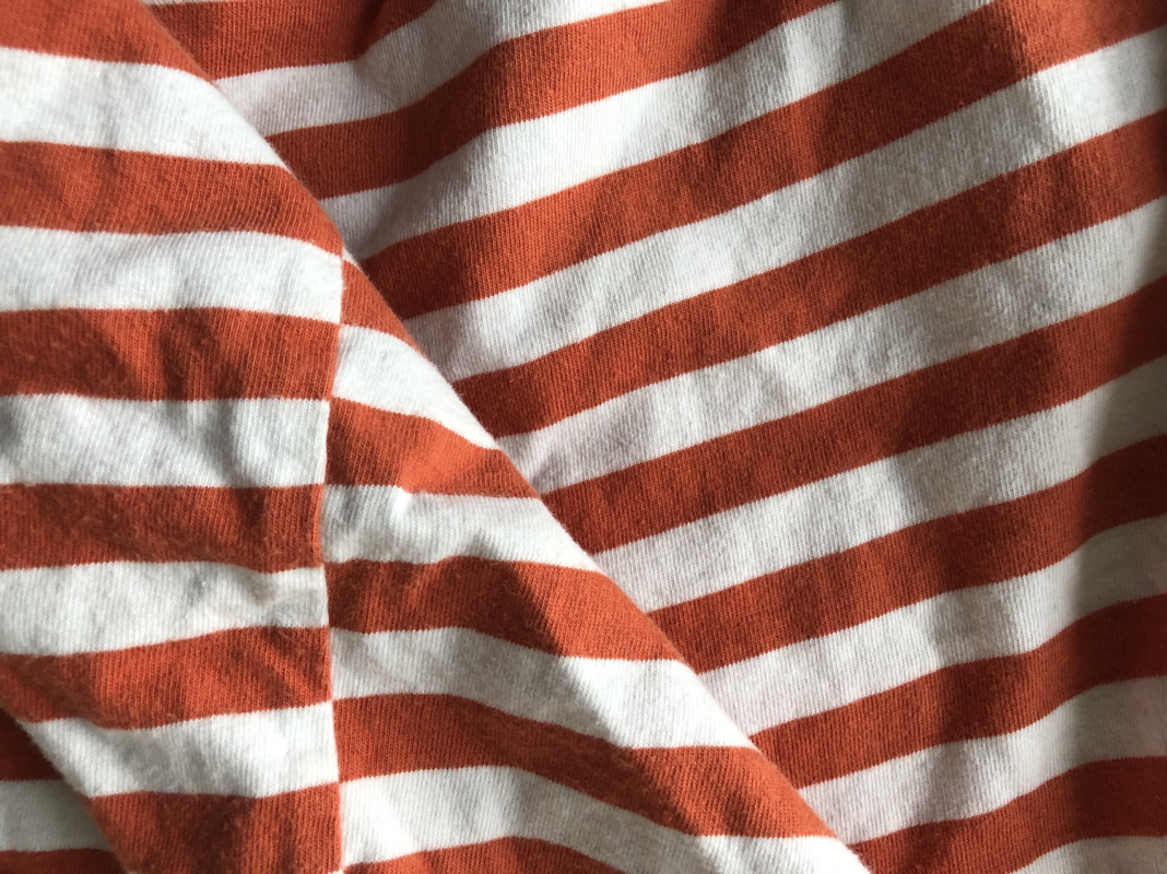
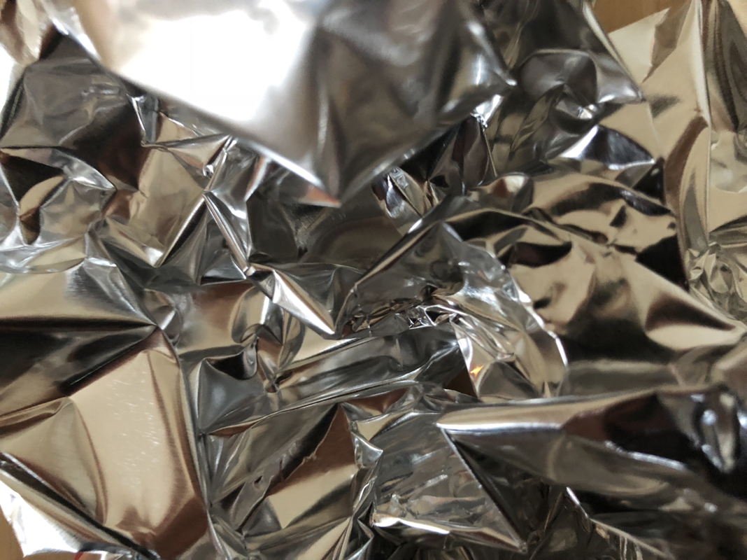
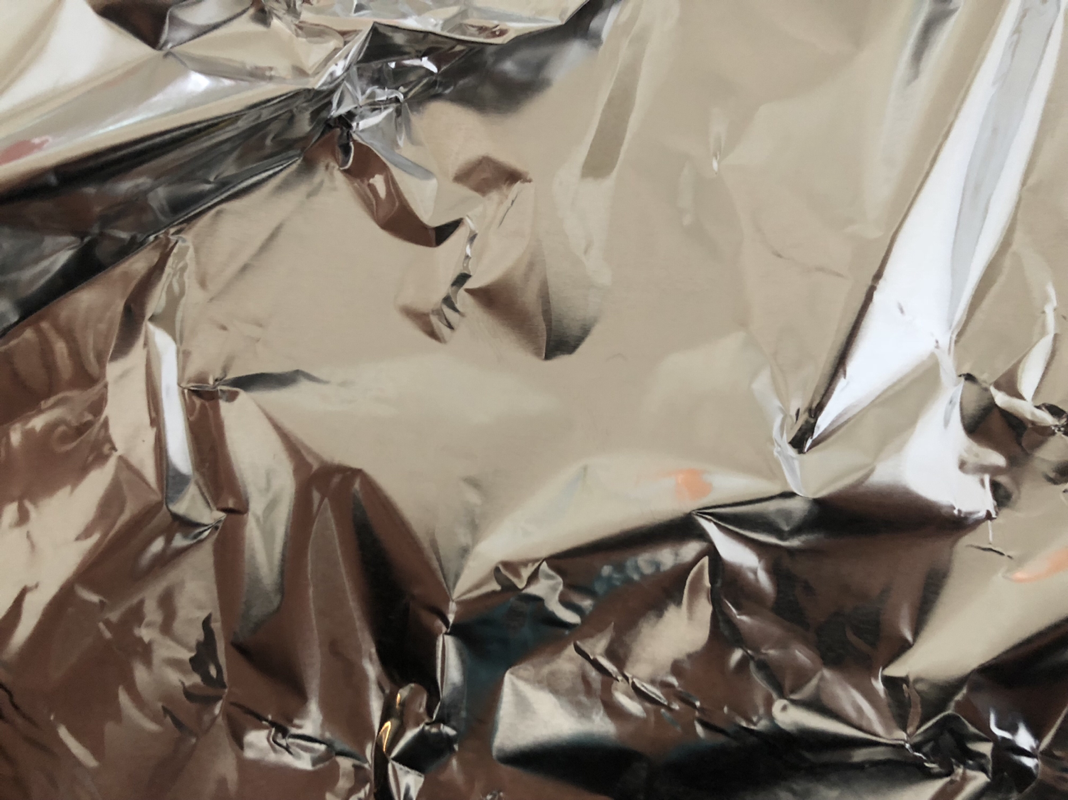
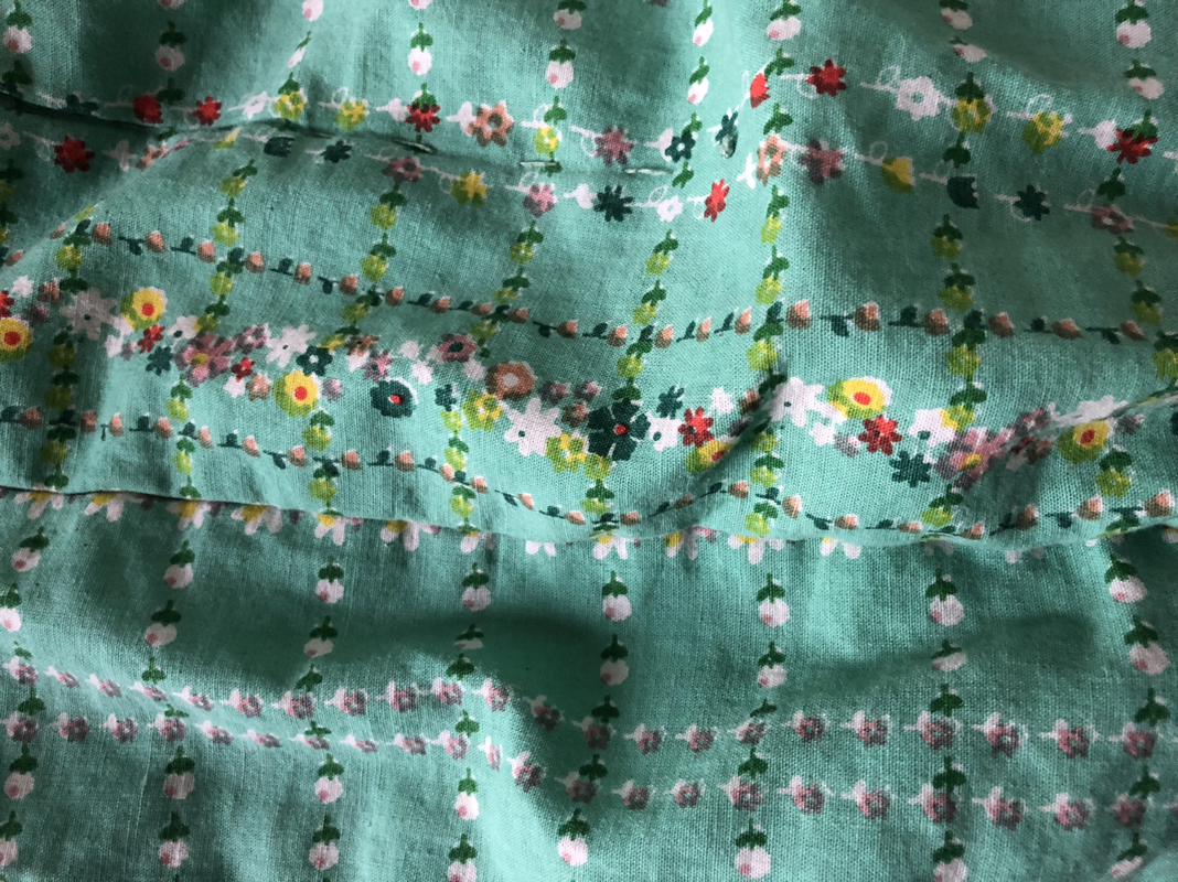
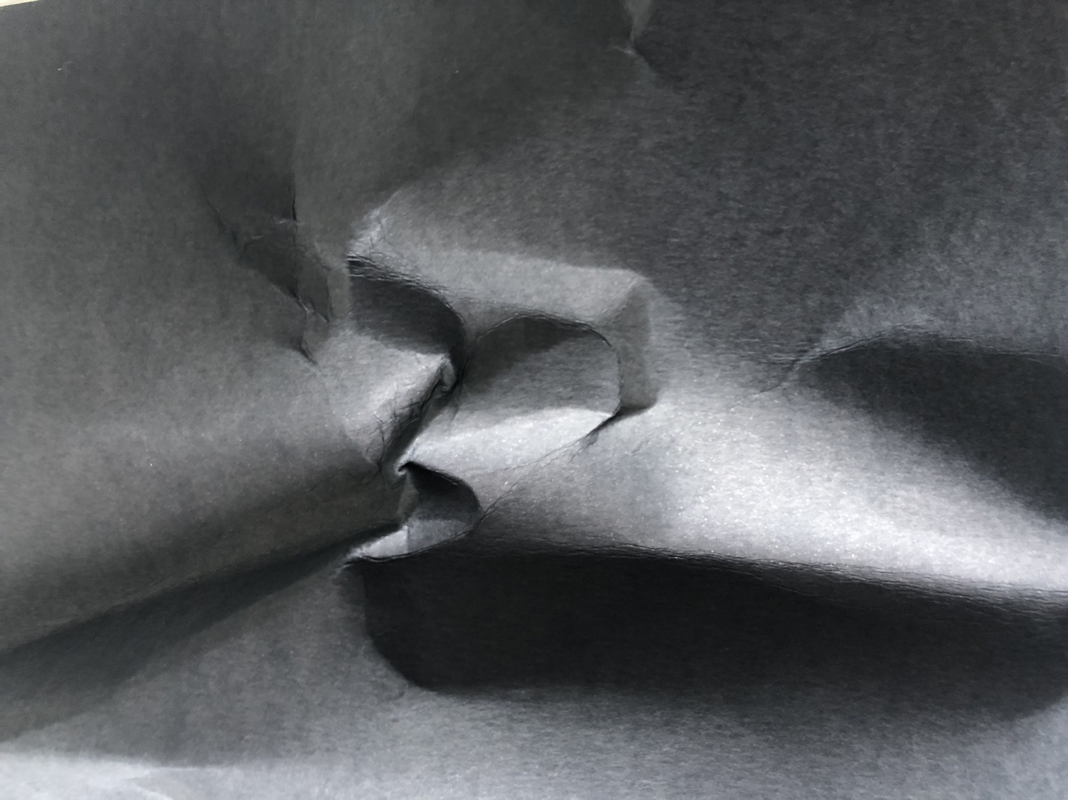
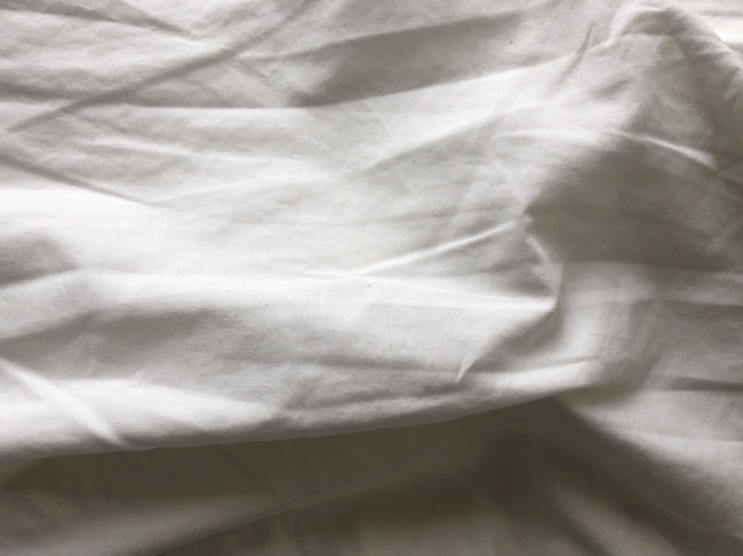
In my new images I looked into interesting surfaces and focused on the crinkles and lines in the surfaces. I think when I focused on stripes it provided some aesthetically pleasing results. I tried to experiment here by breaking or disrupting patterns, with for example the crinkles in the stripes. As this destroyed the simple rule for what defines stripes. I also feel like the crinkles also create some interesting views of the light and it's interesting to see how you can change the direction of light by simply pinching something to create something more interesting.
Final Piece Research -
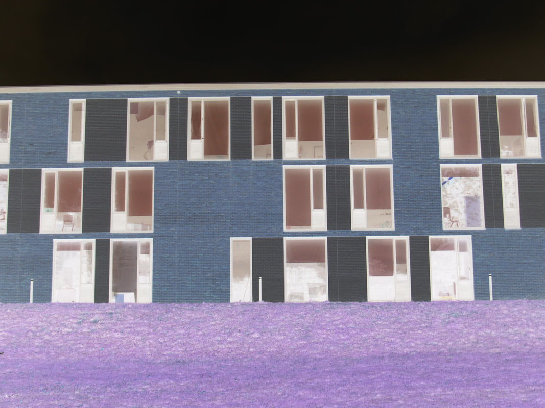
Image of School (In Photoshop has been inverted) :
- It's a 3-Dimensional Sculpture.
- It has been made Abstract by having certain colours in the piece edited.
- The contrast and vibrancy of the colours add to the sense of Abstraction.
- The interesting form and structure of the Sculpture has added to the sense of Abstraction.
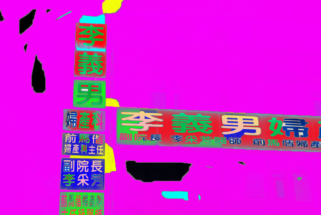
Photograms with objects / materials on top :
- It's a 2-Dimensional Piece.
- It has been made Abstract by having Paint, other Photograms and Shapes remove to create a sense of
Abstraction, this covers the forms and shape.
- The Pink against the exposed Photogram paper (black) exaggerates and emphasises the pink.
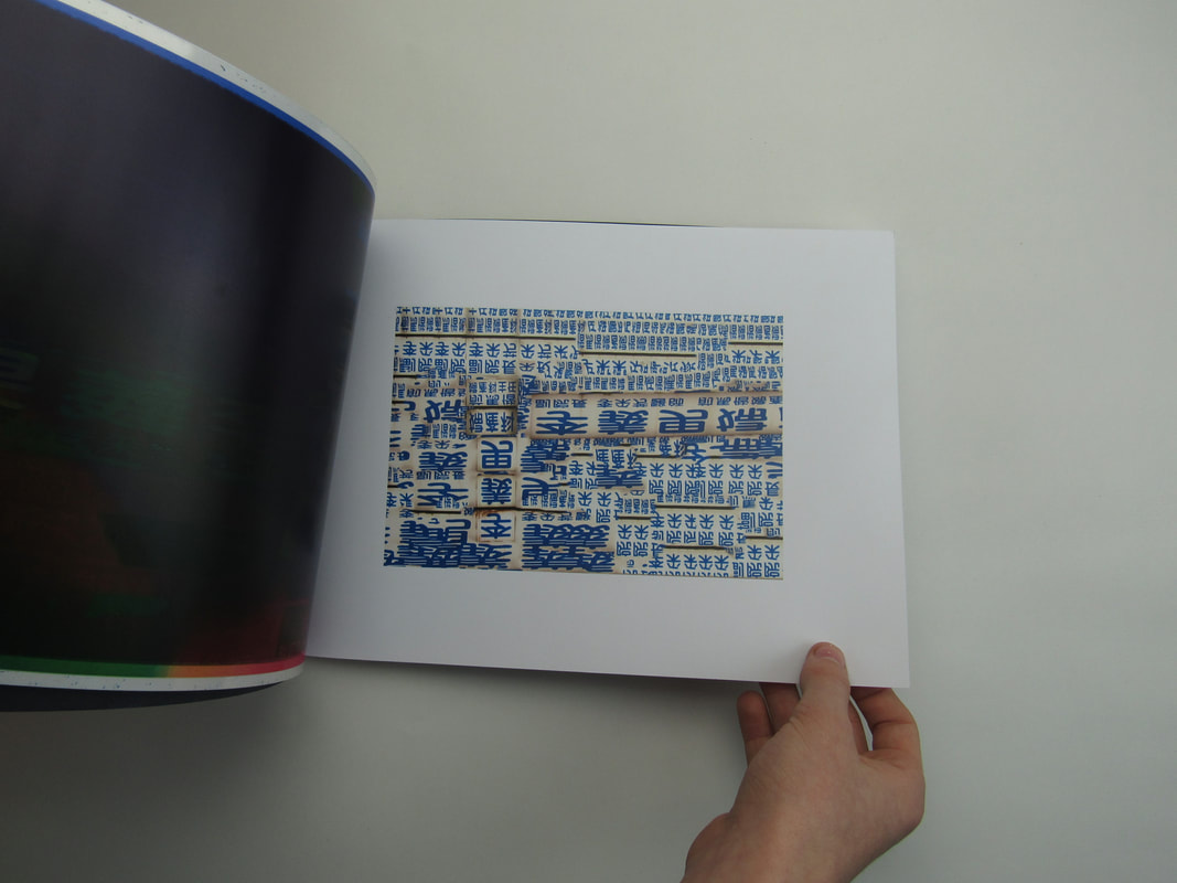
Photograms arranged into an orderly formation :
- It's a 2-Dimensional Piece.
- It's been made Abstract by the Dual-Tone photograms. This changes the conventional look of a photogram and
creates a sense of unfamiliarity.
- It's been orderly arranged.
- The Photograms are very Abstract.
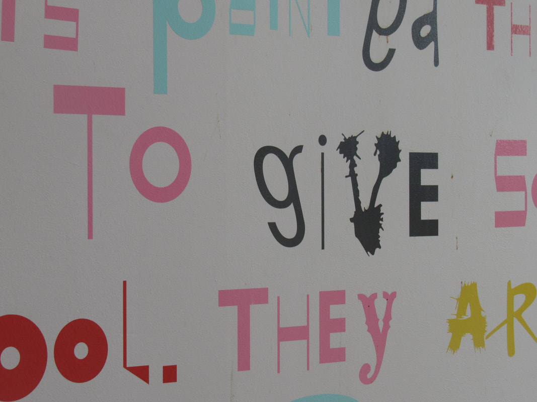
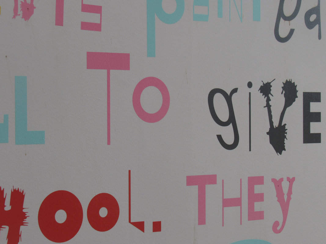
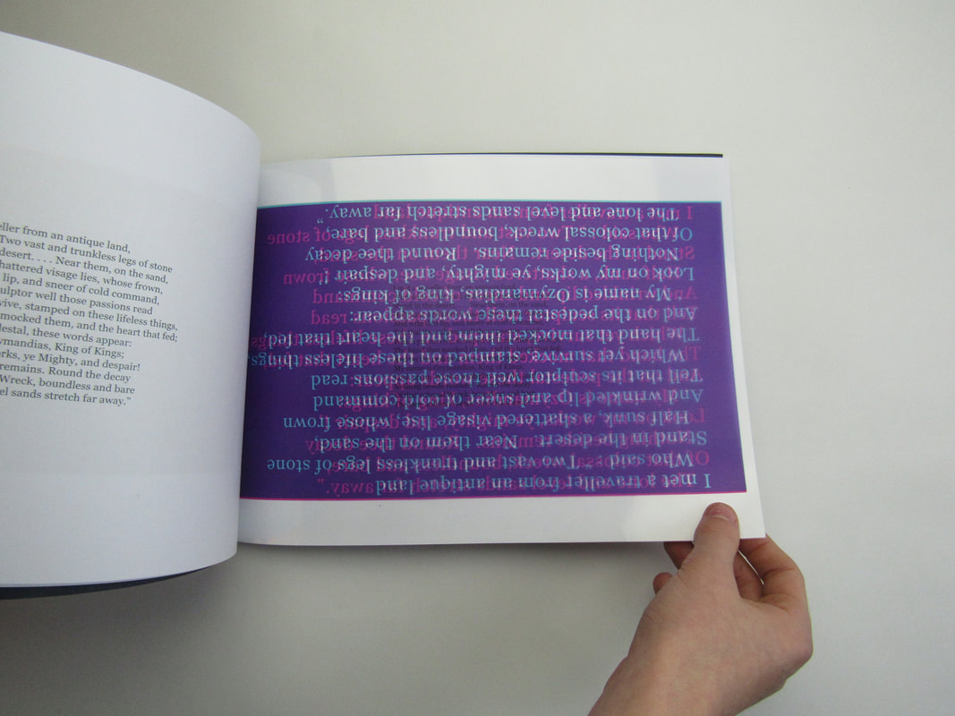
Poem Abstract Images :
- It's a 2-Dimensional Piece.
- It has been made Abstract with clever layering and the images have very little space between them.
- The addition of an Abstract poem.
- The clouds could have a deeper meaning to them.
- It's a 3-Dimensional Sculpture.
- It has been made Abstract by having certain colours in the piece edited.
- The contrast and vibrancy of the colours add to the sense of Abstraction.
- The interesting form and structure of the Sculpture has added to the sense of Abstraction.
Photograms with objects / materials on top :
- It's a 2-Dimensional Piece.
- It has been made Abstract by having Paint, other Photograms and Shapes remove to create a sense of
Abstraction, this covers the forms and shape.
- The Pink against the exposed Photogram paper (black) exaggerates and emphasises the pink.
Photograms arranged into an orderly formation :
- It's a 2-Dimensional Piece.
- It's been made Abstract by the Dual-Tone photograms. This changes the conventional look of a photogram and
creates a sense of unfamiliarity.
- It's been orderly arranged.
- The Photograms are very Abstract.
Poem Abstract Images :
- It's a 2-Dimensional Piece.
- It has been made Abstract with clever layering and the images have very little space between them.
- The addition of an Abstract poem.
- The clouds could have a deeper meaning to them.
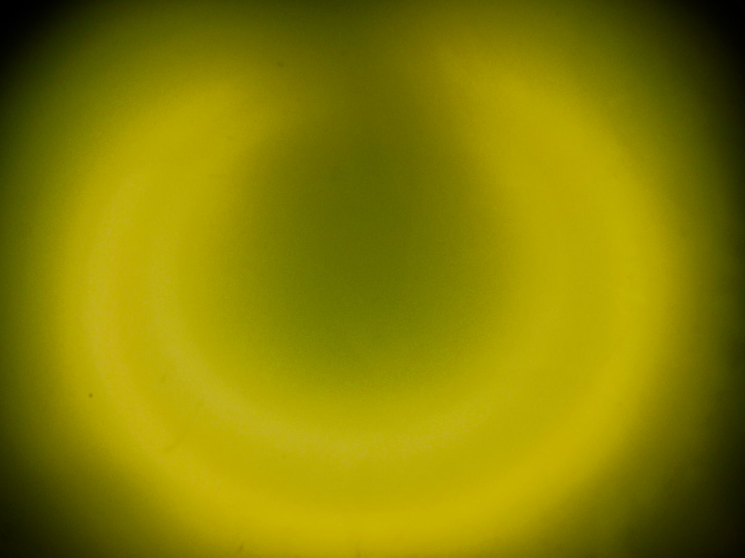
Abstract Video -
| circles_video.mov |
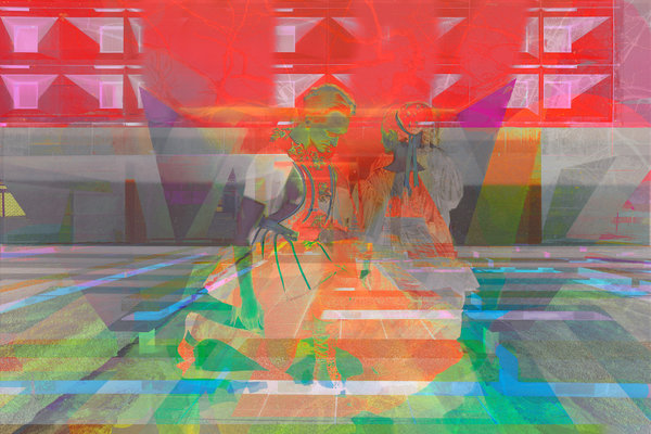
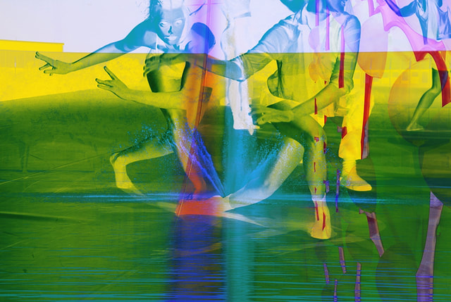
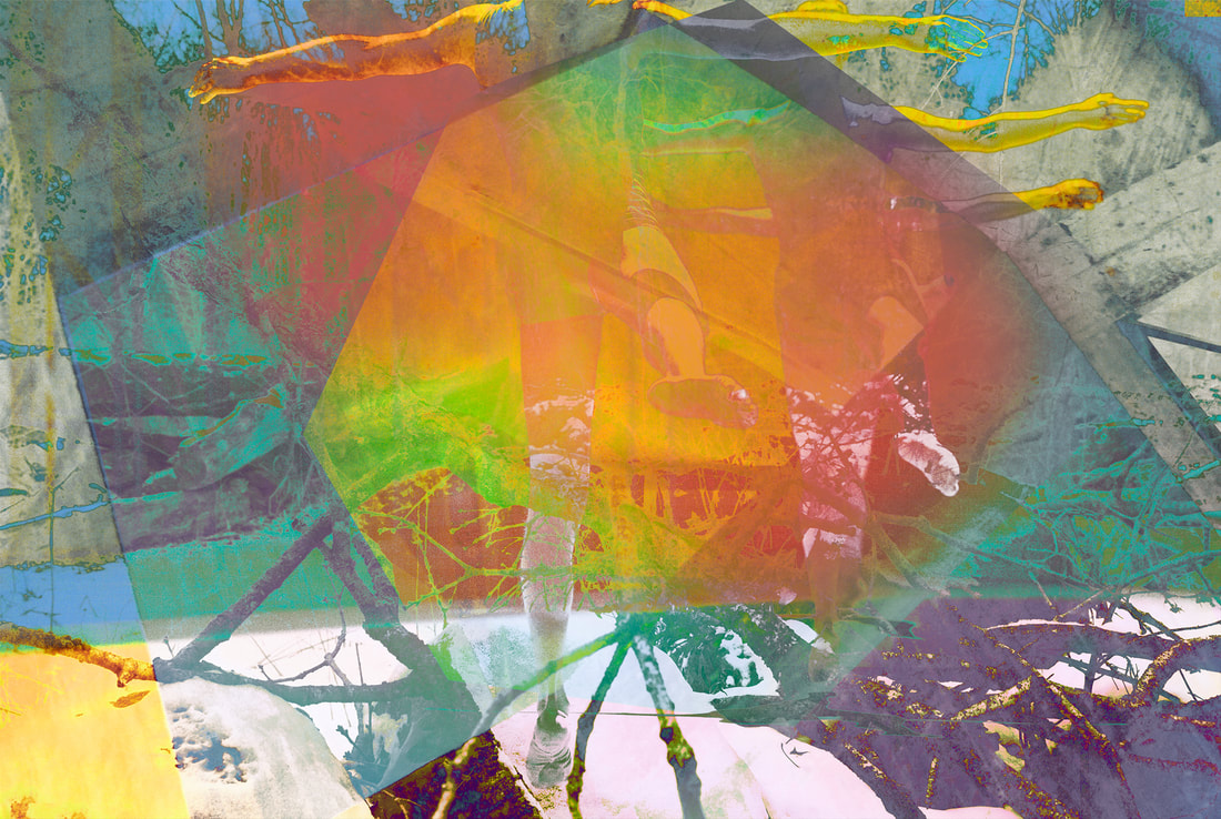
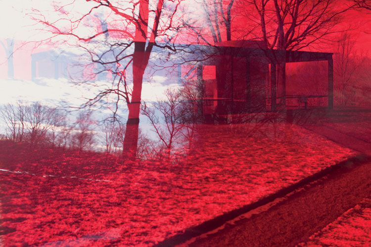
Photoshop Experiments -
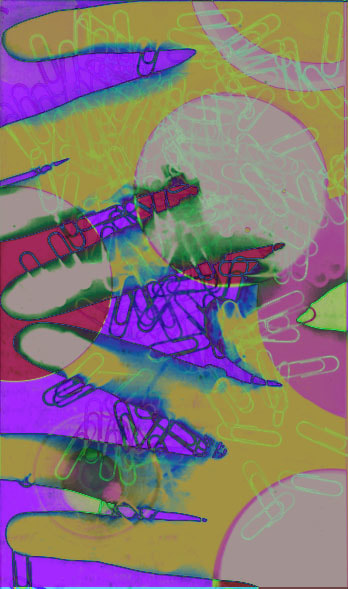
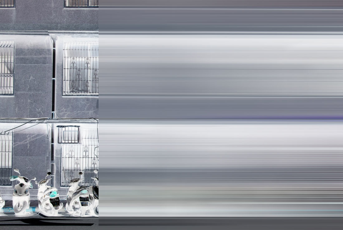
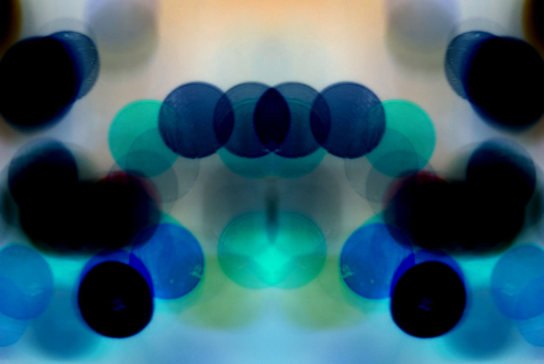


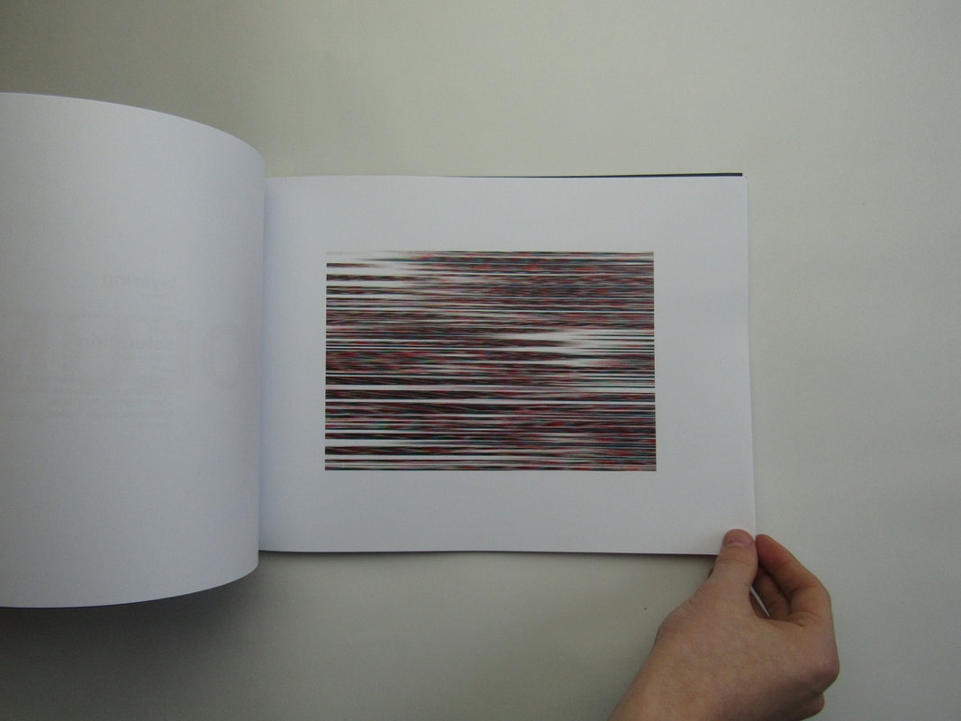
These are my Photoshop experiments I made in and out of school. I think some of my experiments came out with very high results. I used layering and different levels of opacity to lay some of my images over some of my other ones to merge the colours and edges. I also played around with Saturation and different pre-set filters on Photoshop such as 'Half-Tone'. I tried to use contrasting colours and bright colours to blend what is real and what is not.
Collage -
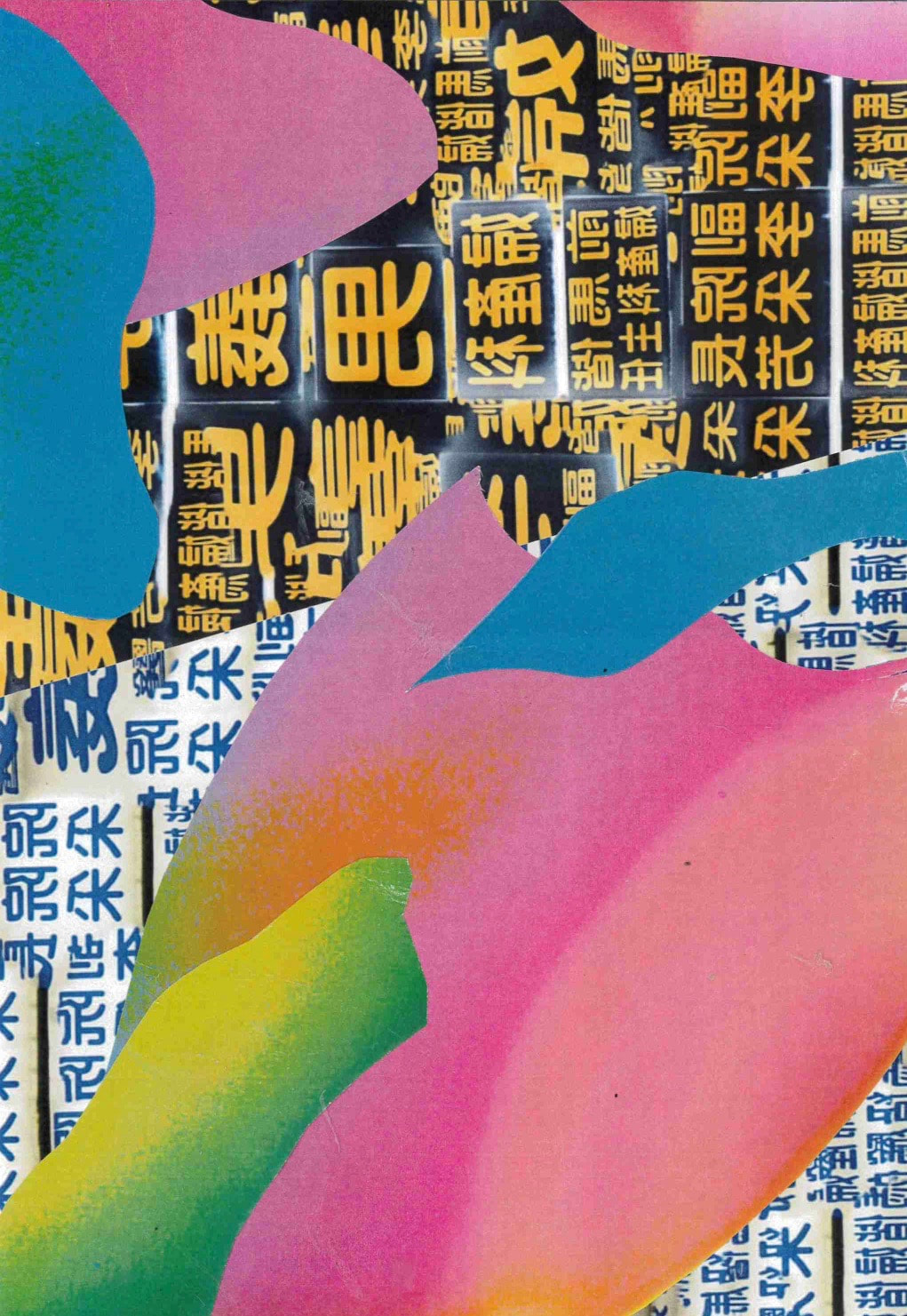
In this one I tried to replicate what I could easily do in Photoshop
Final Pieces -
Abstract Photobook -
Abstract Photobook from Thomas Tallis School on Vimeo.
Abstract Photobook (Volume 2) -eit.
Abstract Mount -
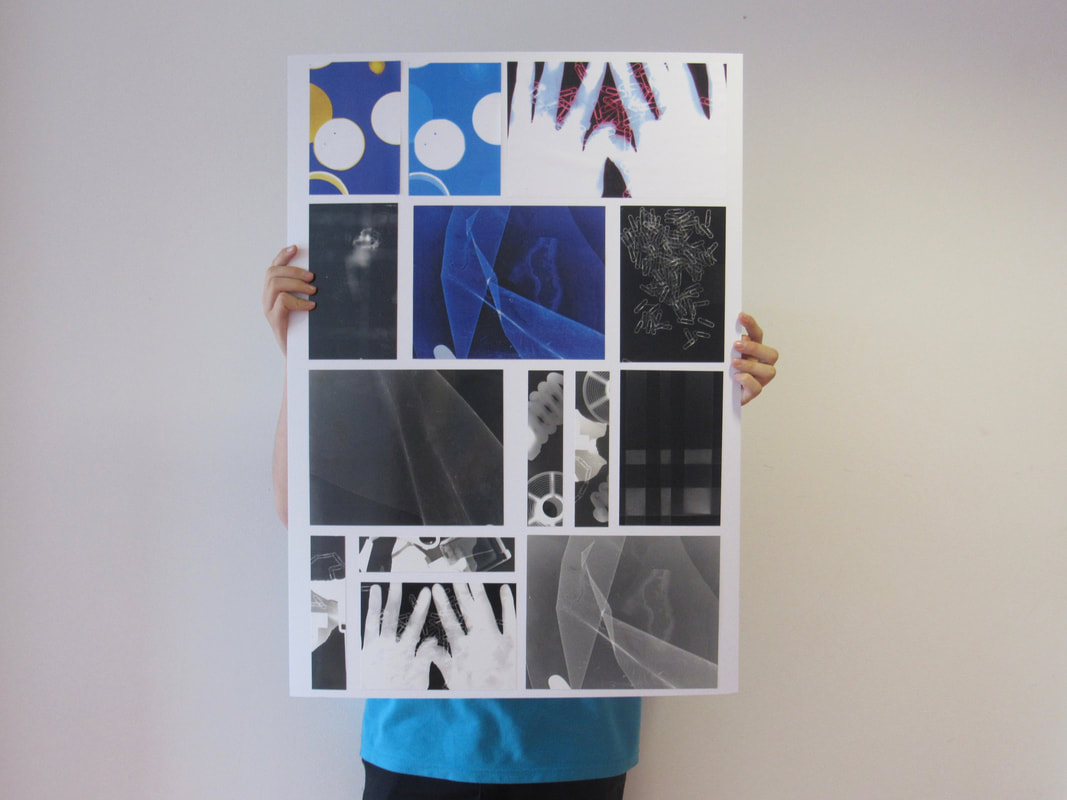
This is my abstract mount and how I chose to present my attempt at Abstract Photograms. I made a nice board, I think, and I am very pleased with the final result of my Abstract Photograms. I personally love my duotones with the use of the Blue and Yellow which added a nice touch. I also included some cut up strips to fill some space, however I think it turned out quite nice.
Experimentation -
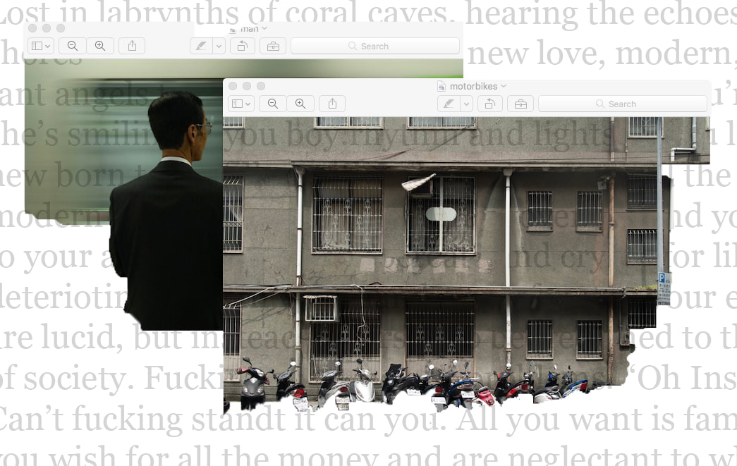
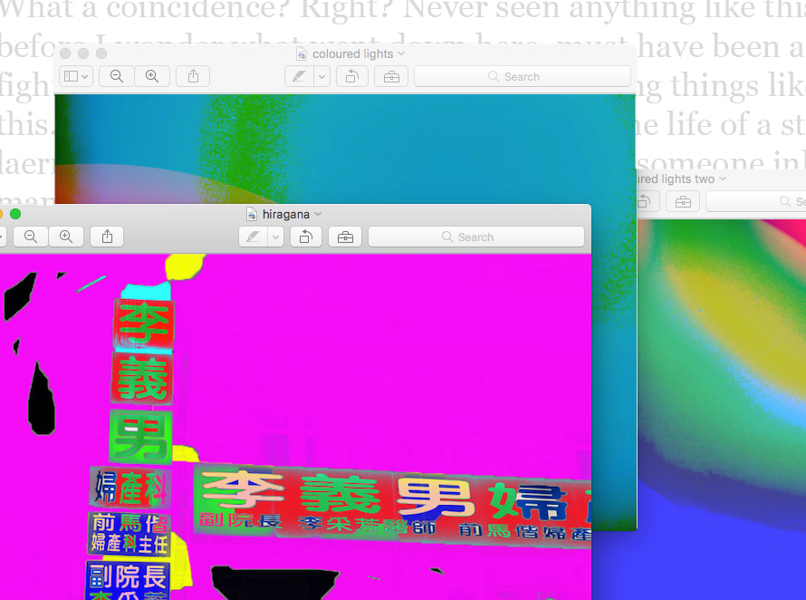
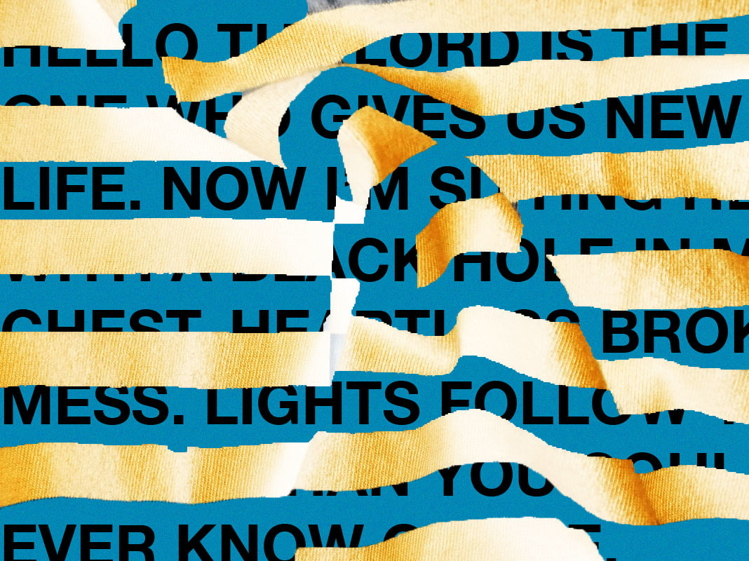
This is just general experimentation, where I tried to mess around with layering and integrating text and the Mac Operating System to create this pre-edited raw feel and that this work isn't quite finished and isn't polished.
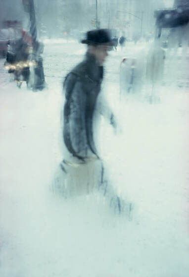
Saul Leiter -
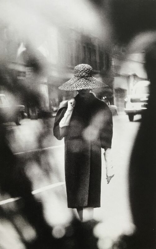
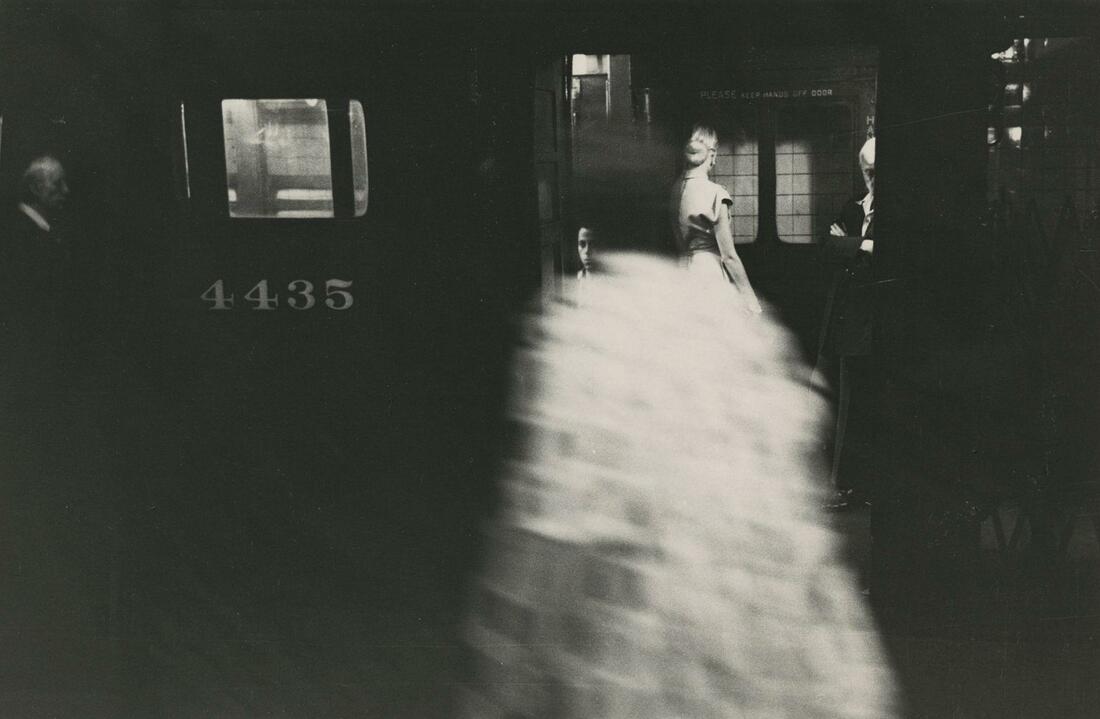
Saul Leiter is an American photographer whose early work in the 40s and 50s was incredibly important to the New York school of photography. He was known for his experimenting with focus and composition to create stunning images. He is also well known for the vividness and prominent use of colour in his work. His work is extremely compelling to me as he took photographs of people in normal life, his work for me can show the beauty in the normal everyday lives of us all, through his bold uses of colour and composition. His work, emotionally, for me is very ambiguous as in many, what sort of emotion you can gain from it all depends on the viewer.

|
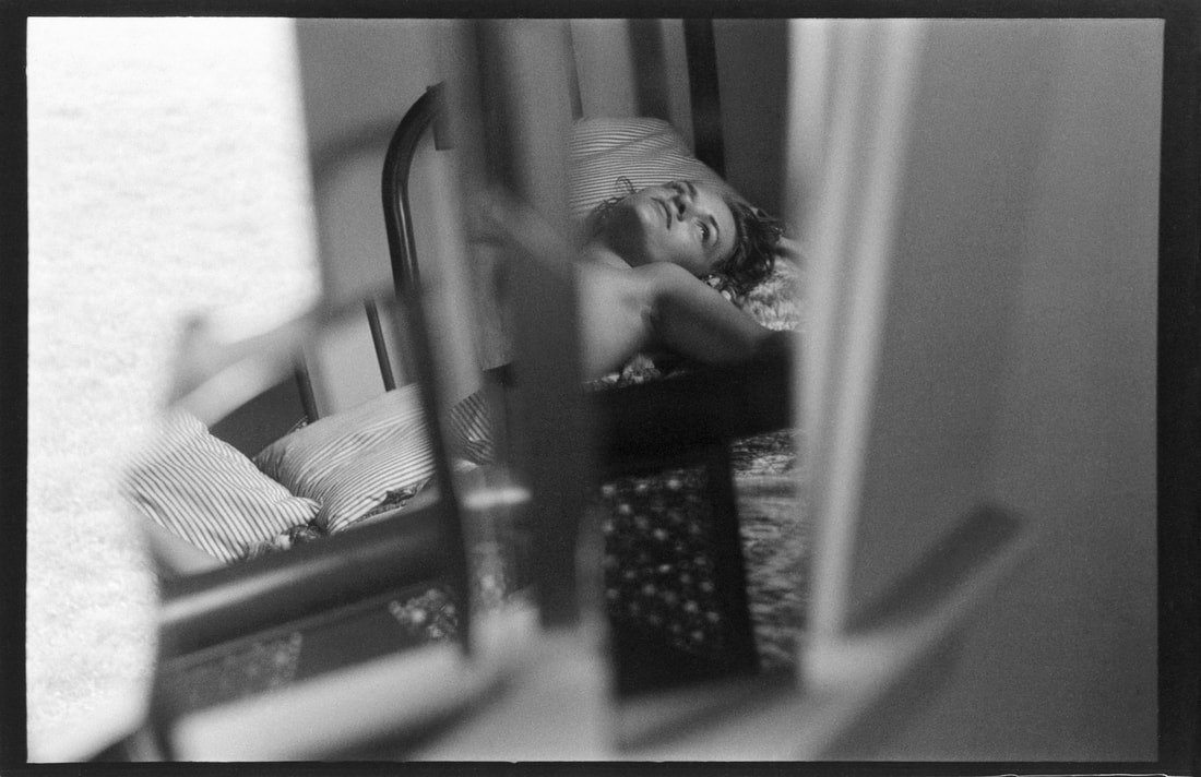
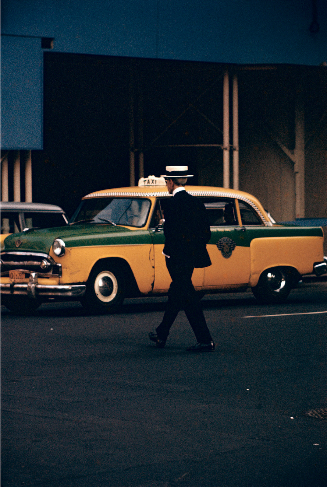
This is my personal favourite image by Saul Leiter.
I personally like this as the composition is incredible, with the man in the centre and his white hat contrasting against the yellow of the car. I think in this photo he has used composition and tones to make the photo special. I don't think this photo is particularly abstract as you can clearly see what it is, but it represents an idea about the lives of normal people. |
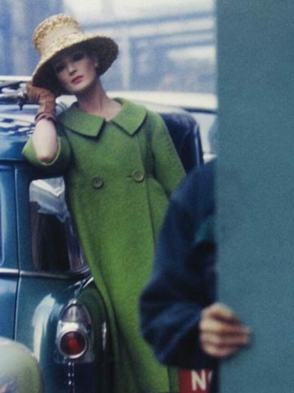
Saul Leiter Painting -
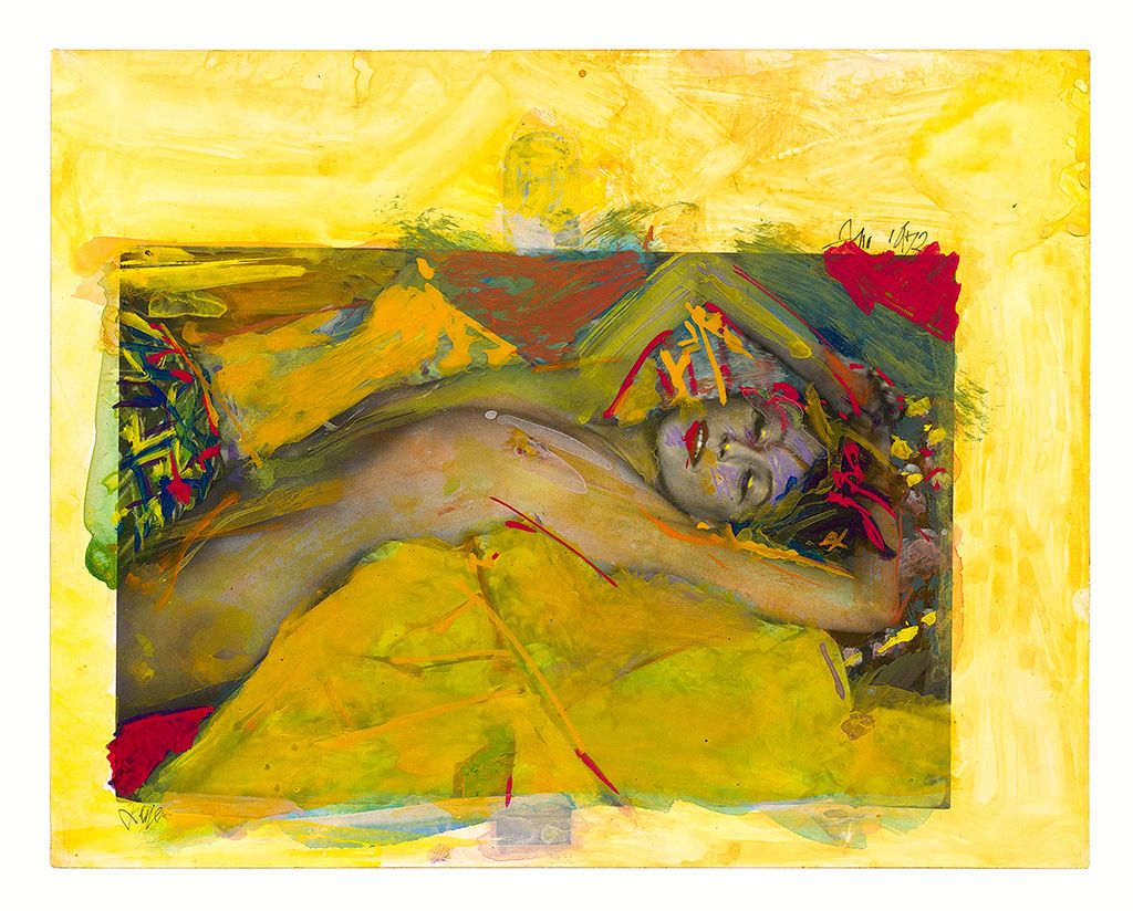
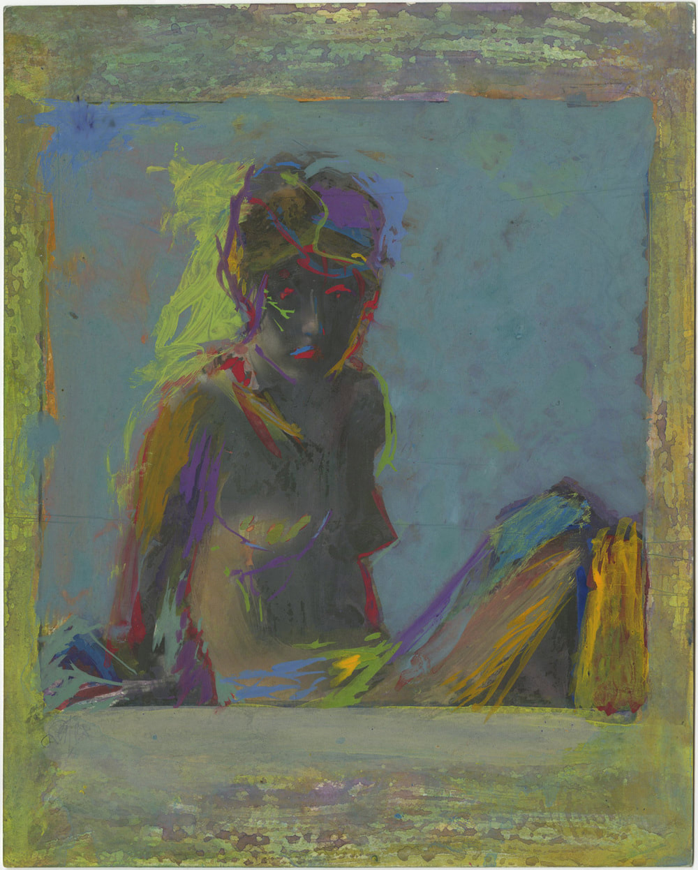
Saul Leiter Comparisons -
|
|
The differences between Saul Leiter's paintings and photographs can mainly be seen through the methods he uses to reach his final result. In terms of similarities we can see them in terms of how he composes his work. In the two images we see a clear subject yet I think that not the entire subject is in focus. For example, in the photograph we see the subject (the man) be partially obscured by the fog on the window. I also think how he has used colour in the painting has obscured and pushed the focus to certain areas. Another difference is the colour palette of the works. The painting having very vibrant colours, with the photograph having a very muted and cold tone to it.
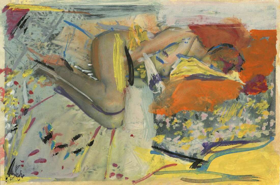
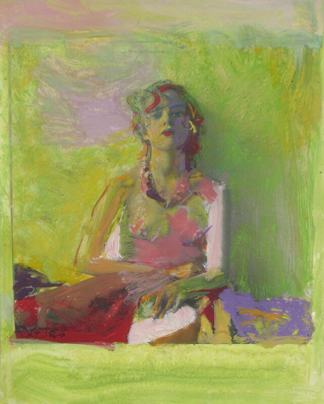
Saul Leiter Response -
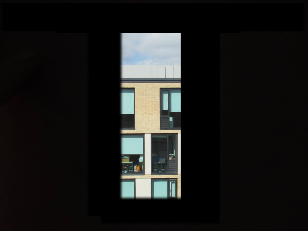
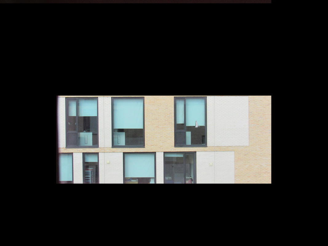
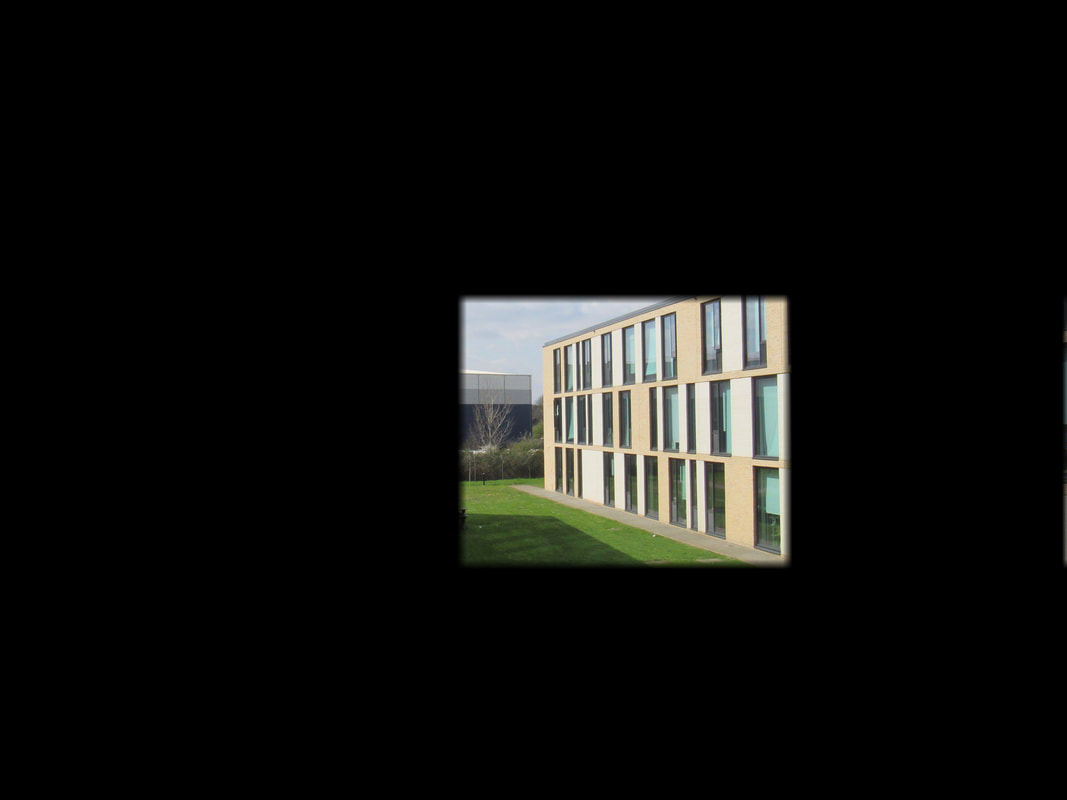
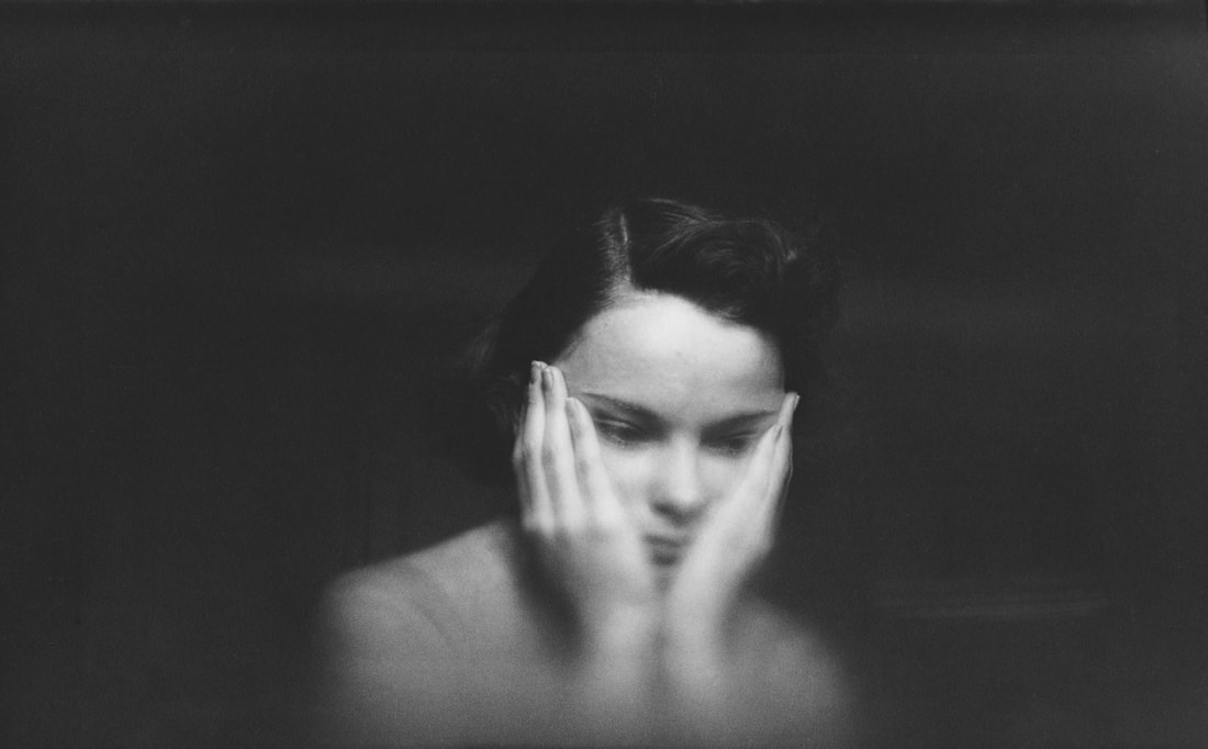
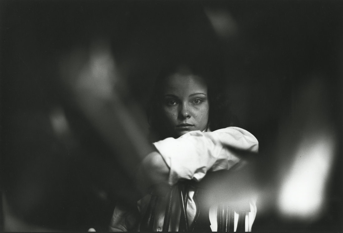
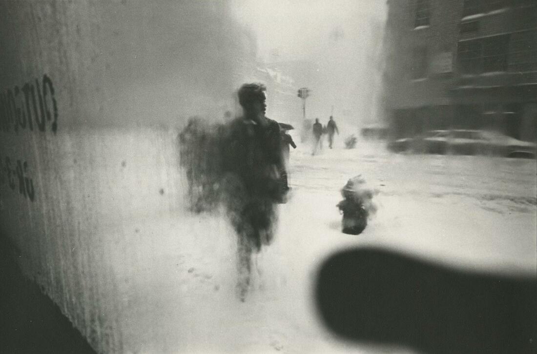
My images above have been inspired by the work of Saul Letter. You can see my direct influence through the use of obscuring things and cropping certain views out. I initially used a pink viewfinder and I used Photoshop to create the black border/frame you see in the final results.
I personally really enjoy these images as I have used aspects of Saul Leiter's work and brought it into my own. I could have taken more images in the time I was given, however of the many that I took these were the only ones I liked.
I personally really enjoy these images as I have used aspects of Saul Leiter's work and brought it into my own. I could have taken more images in the time I was given, however of the many that I took these were the only ones I liked.
