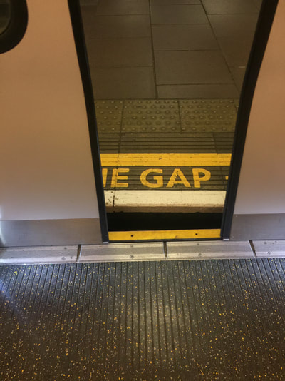
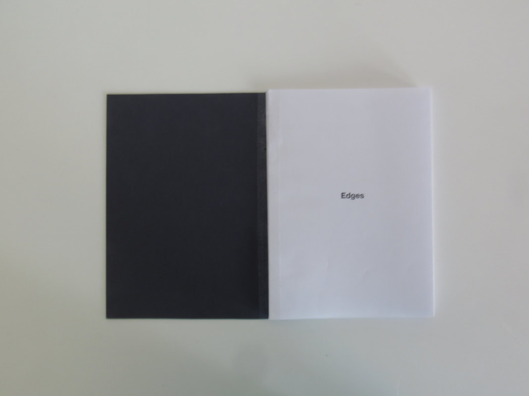
Edges -
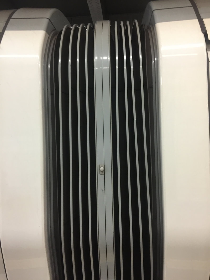
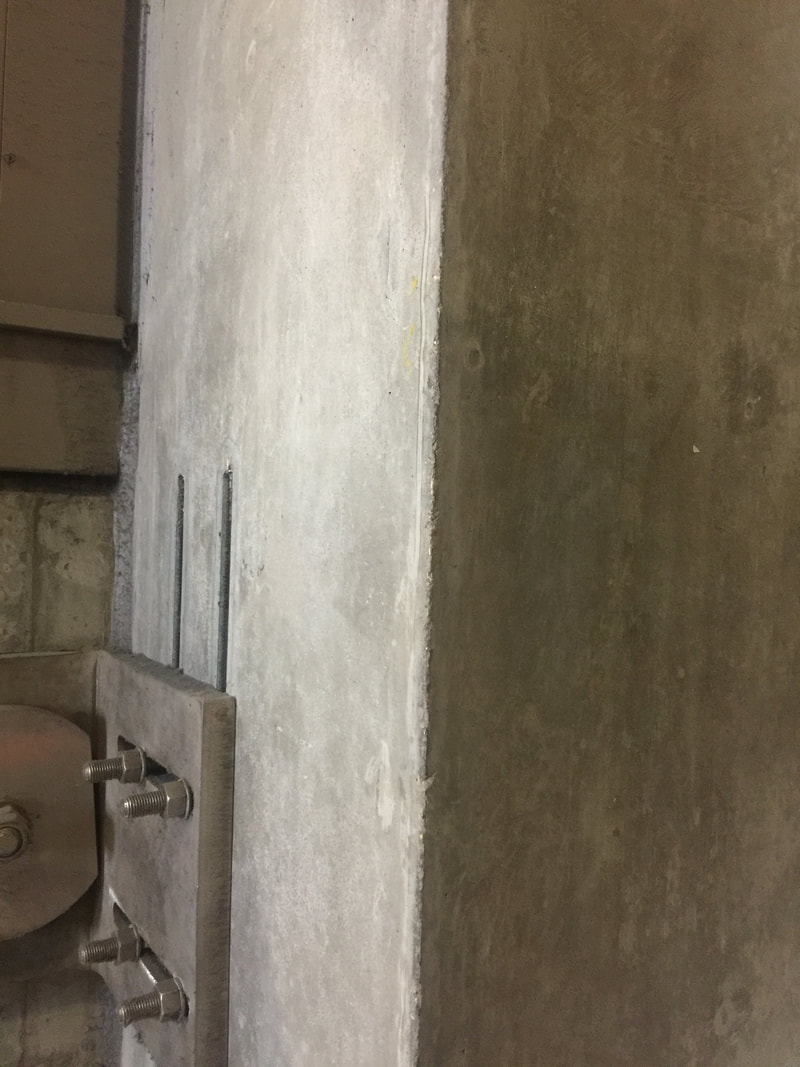
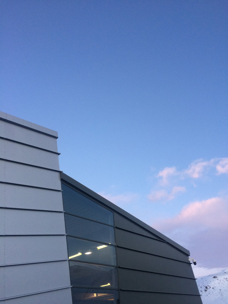
In this task we went around school looking for interesting edges on buildings and in or on the surrounding area. I find the task very interesting as you had to look for a fair bit of time for edges but eventually I found that the nicest edges usually are position in front of the sky. I found photographing things not on buildings the most interesting as they were different and quite unusual, these kind of edges were also the most difficult as they were very little.
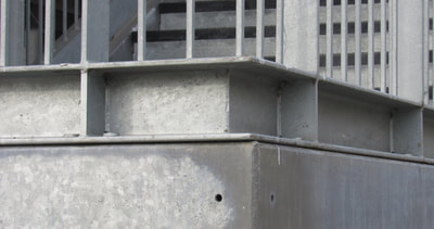
There are many examples of edges:
- Edge of a Table
- Edge of a Whiteboard
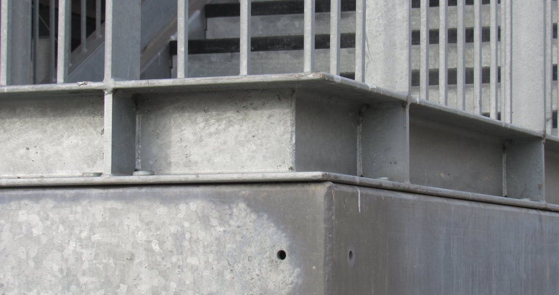
- Edge of a Building
- Edge of a Staircase
There are many examples of edges:
- Edge of a Table
- Edge of a Whiteboard
- Edge of a Building
- Edge of a Staircase
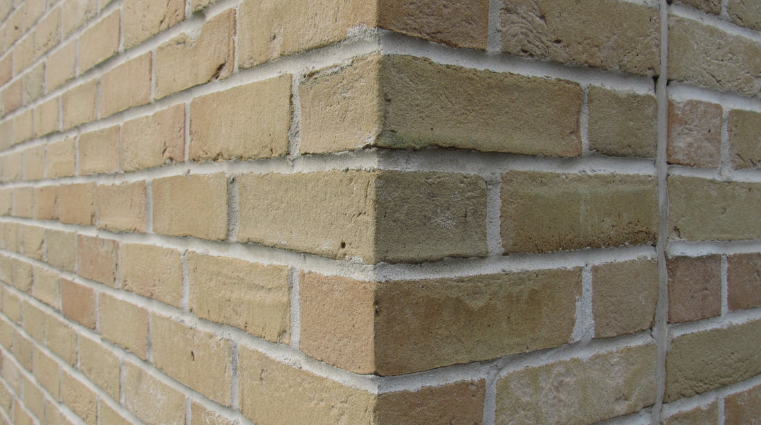
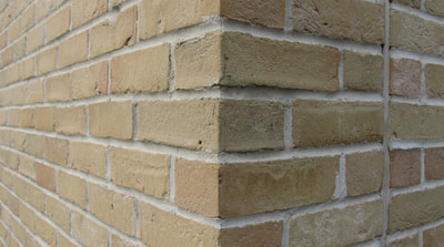
WWW - I think I took some nice images of edges. I used the viewfinder effectively to pin point interesting edges around the school. My personal favourite is the one of the brick wall (middle/top row). I like this as the edges is in the centre of the image and one side has a shadow. I also like that you can tell it has a form (3D) from the perspective of the lines.
EBI - In total I took 10 images, but I only selected 5. Those images above were my best ones and the other ones, due to my error, is out of focus and the composition was not very nice. I could have made my work better by paying more attention to the viewfinder on the camera.
EBI - In total I took 10 images, but I only selected 5. Those images above were my best ones and the other ones, due to my error, is out of focus and the composition was not very nice. I could have made my work better by paying more attention to the viewfinder on the camera.
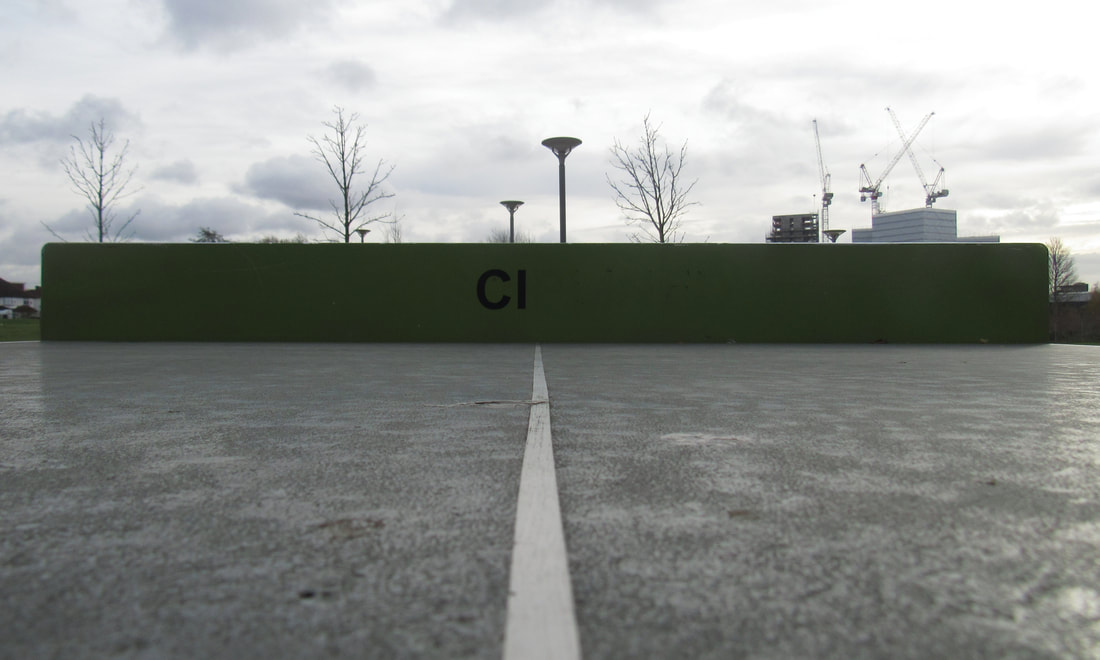
Homework -
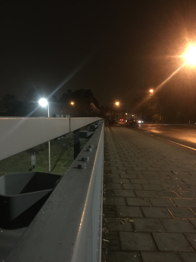


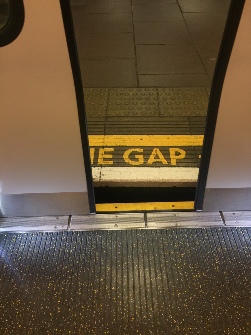

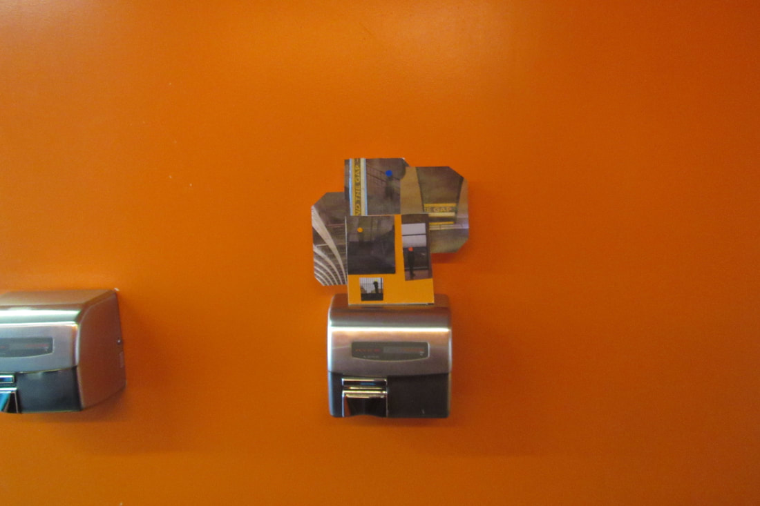
My theme was London, things with interesting edges.
WWW - I considered interesting edges when I went into London. I considered colour, space and lines when taking my images. My personal favourite is the Black and Yellow one. I found a billboard and saw the contrast and line in between the Black and Yellow and decided to take an image.
EBI - I could have looked at pattern a bit more when taking my images and the framing.
Dolorés Marat -
Img 1 - This image is of a young man hanging off the back of a train. The colours are very muted and the pink stripe on his shirt draws your attention. Even with movement she still gets the lines in the image.
Img 2 - This image is of a woman standing on a escalator. The blue tiled wall contrasts with the dark brown of her jacket . And the edges are angled downwards.
Img 3 - This image is of young girl who looks like a 'Crocmaid'. Marat has cleverly framed this to look like she is part of the crocodile who is lying on the contrasting blue and red.
Img 4 - This image is of a nightclub maybe. The light behind them has created silhouette. It seems like she took this at a decisive moment where she got everyone in the frame.
Img 5 - This image is of a building engulfed in smoke with long bits of cloth hanging out of the windows. The colours are very muted and space around the buildings is used very well.
Img 6 - This image is of a muddy white horse. This image has a high amount of contrast between the white and the black wall then the grey pavement. It is a very Monochrome image.
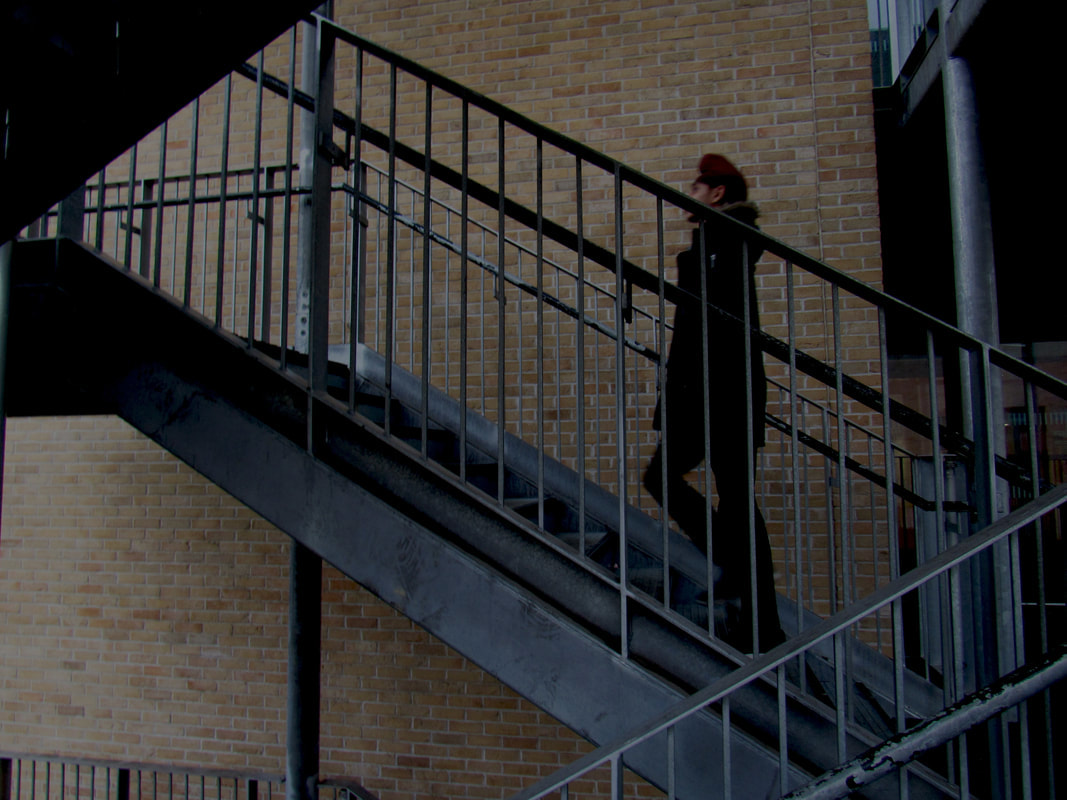
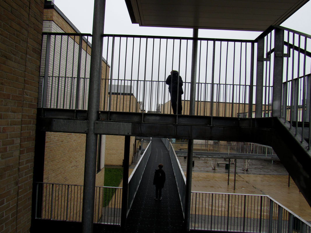
My Own Edges -
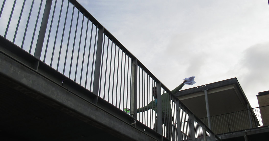
In today's task we took images of edges based on the keyword we came up with about our chosen artist. I chose Dolores Marat as I find her images more inspiring. I tried to show the Marat keywords by taking pictures of people when they aren't expecting it so you get the natural positioning of Marat. I found the task fun as if you took a photo at a 'Decisive Moment' it looks incredible and very similar to the work of Marat. I found it interesting because I had to link back to Marat's work to take images like hers. I found using the mirrors challenging while linking to Marat's work.
In this task I am going to be evaluating my personal favourite images.
In this task I am going to be evaluating my personal favourite images.
|
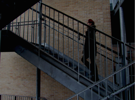
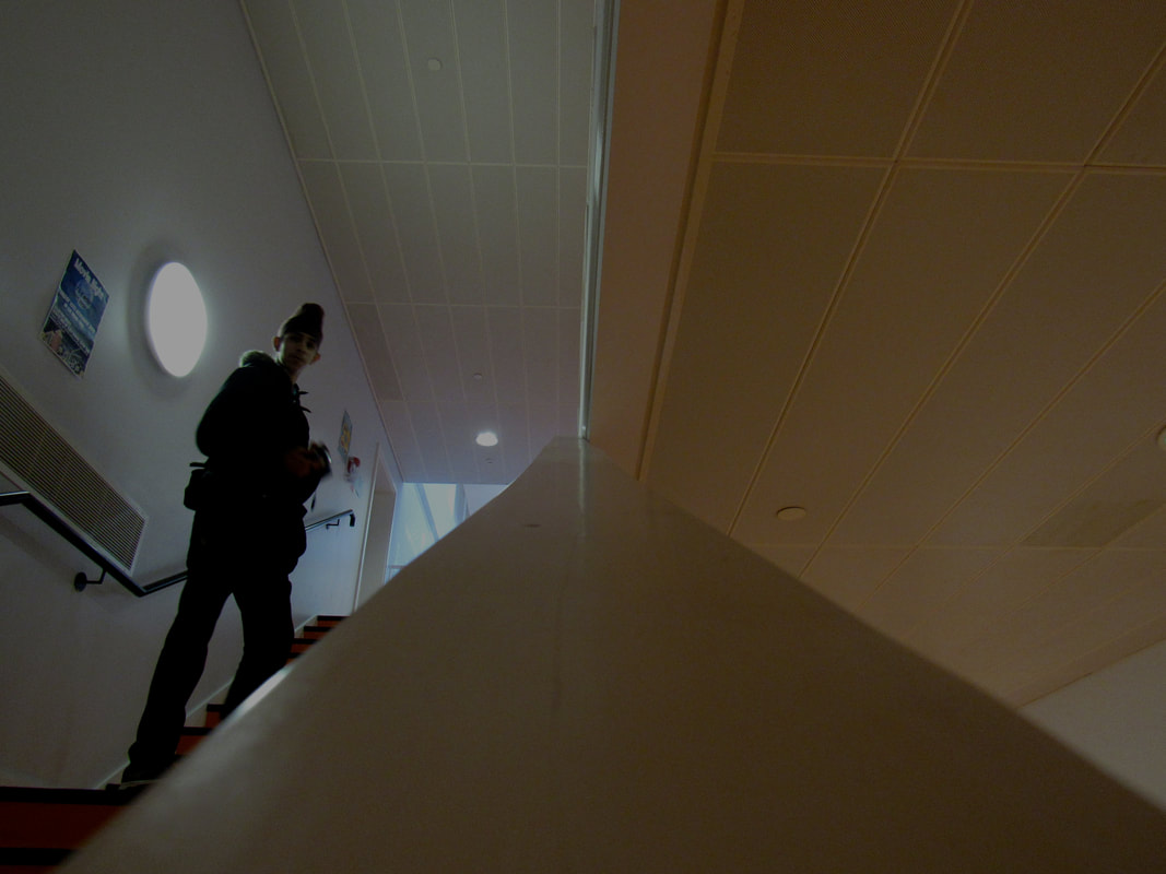
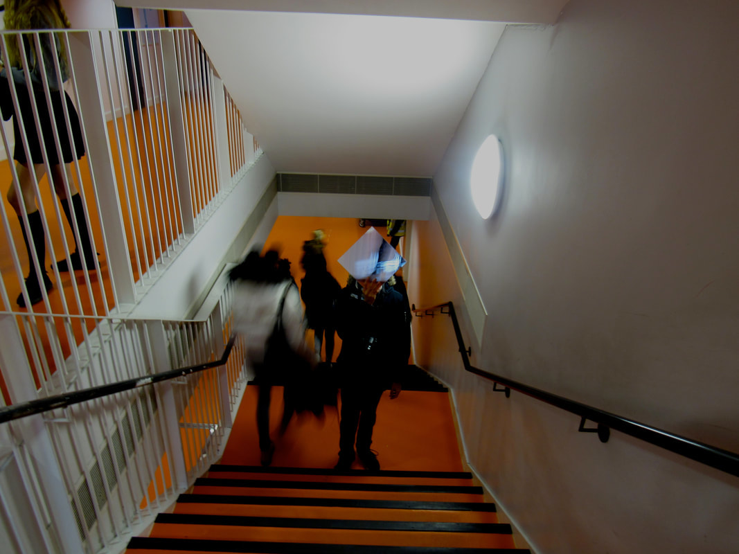
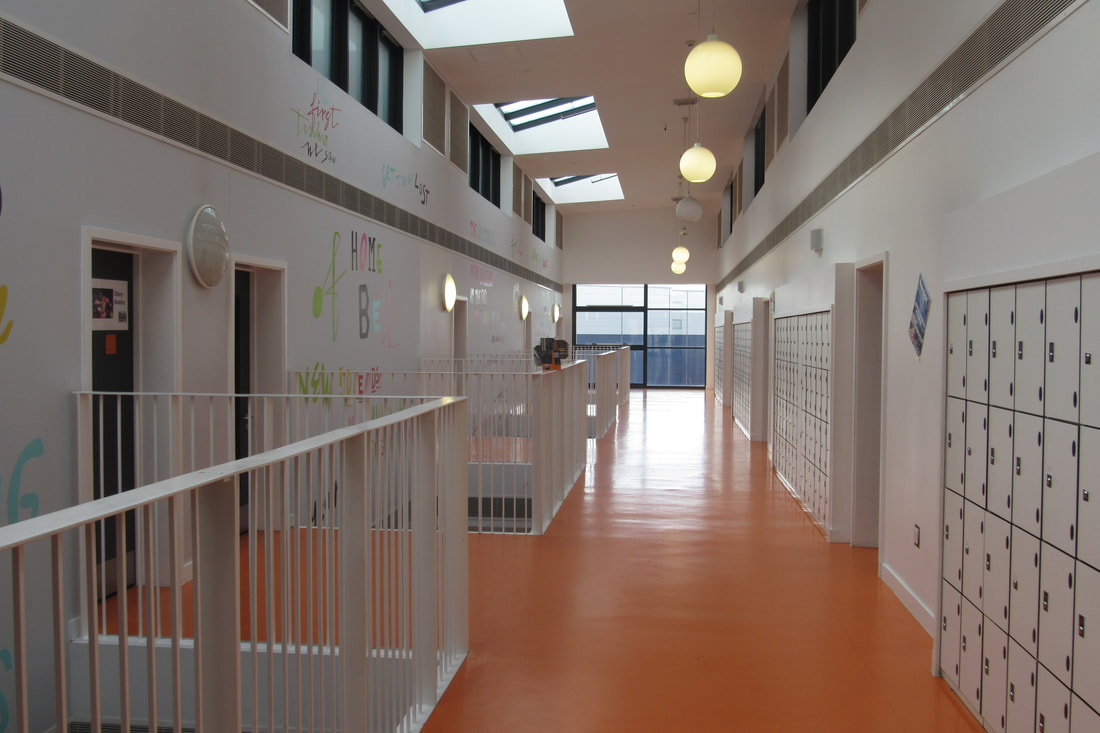
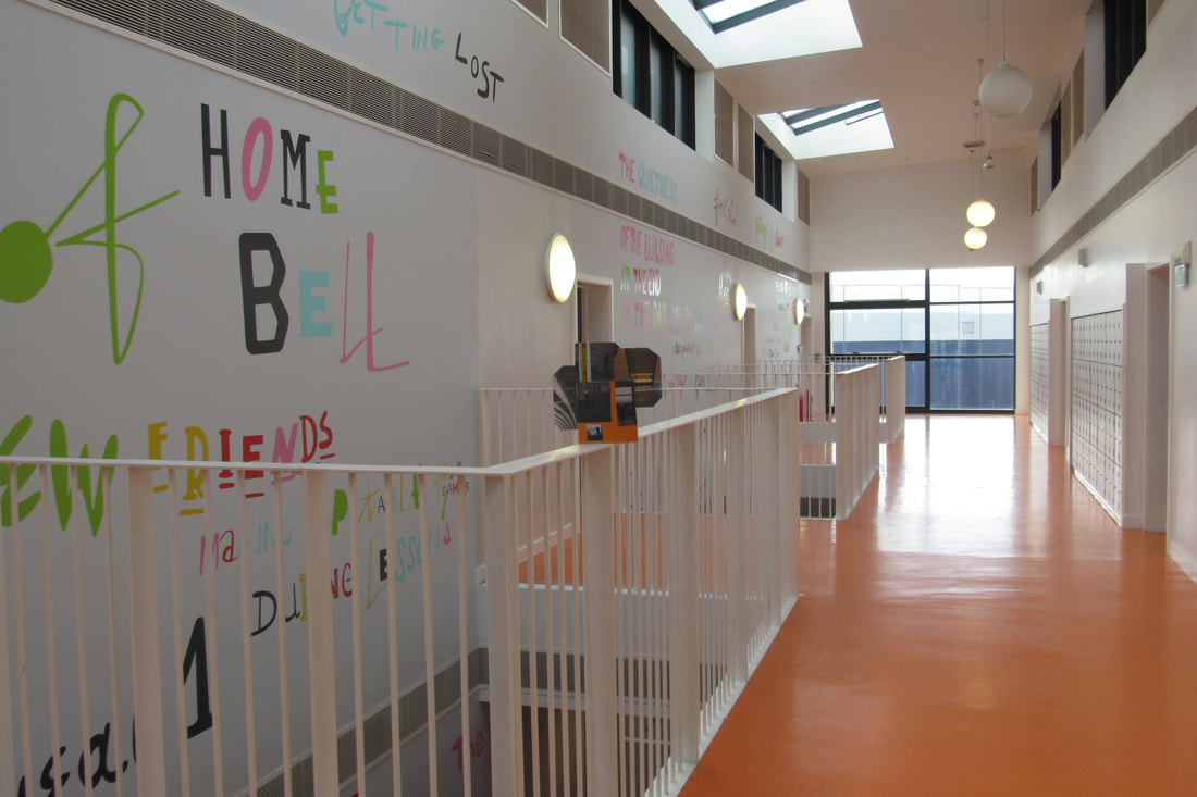
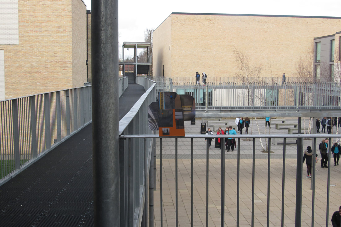
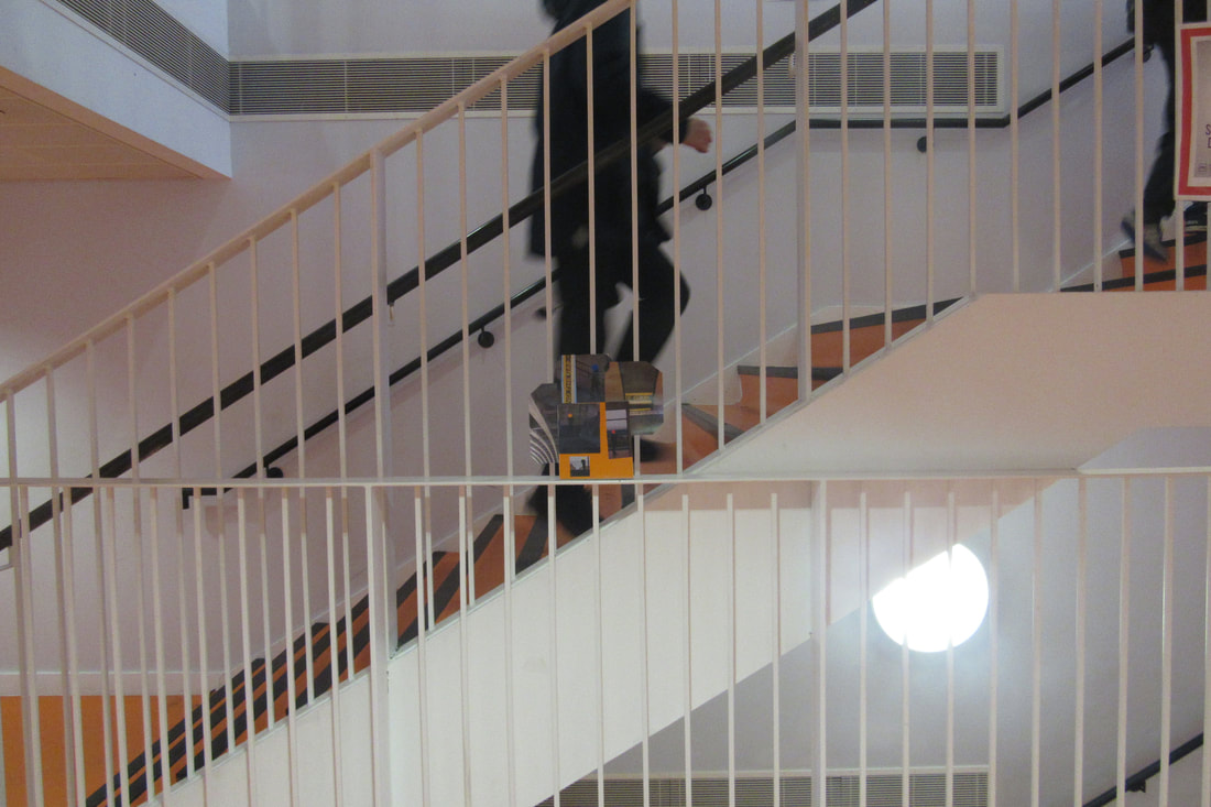
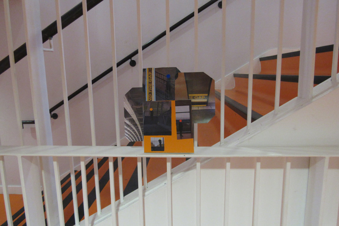
This is my favourite image. My inspiration on this image was Dolores Marat's image of the lady on the escalator. My main focus was on the edges on the handrail of the staircase, focusing on the angles and how they create perspective and movement. I found the task fun as I really had to think to think of how to use the angles and edges to my advantage to replicate Marat. I think some of my images came out really well like the one I am evaluating. I like this one because the handrail shows movement, angles and perspective. To improve I would probably take this image in a better location. For example, with more colour and a darker area to really replicate Marat's work. I have focused on angles and perspective in my images, partially I have focused on the people and how they are standing in my images. I didn't really think about the framing as Marat didn't think about it too much as she took her images at a 'Decisive Moment'. In my composition I tried to put all of the angles, edges into frame with nothing particularly in focus. But in the image of the pair of Nike shoes they were the focus of my image.
|
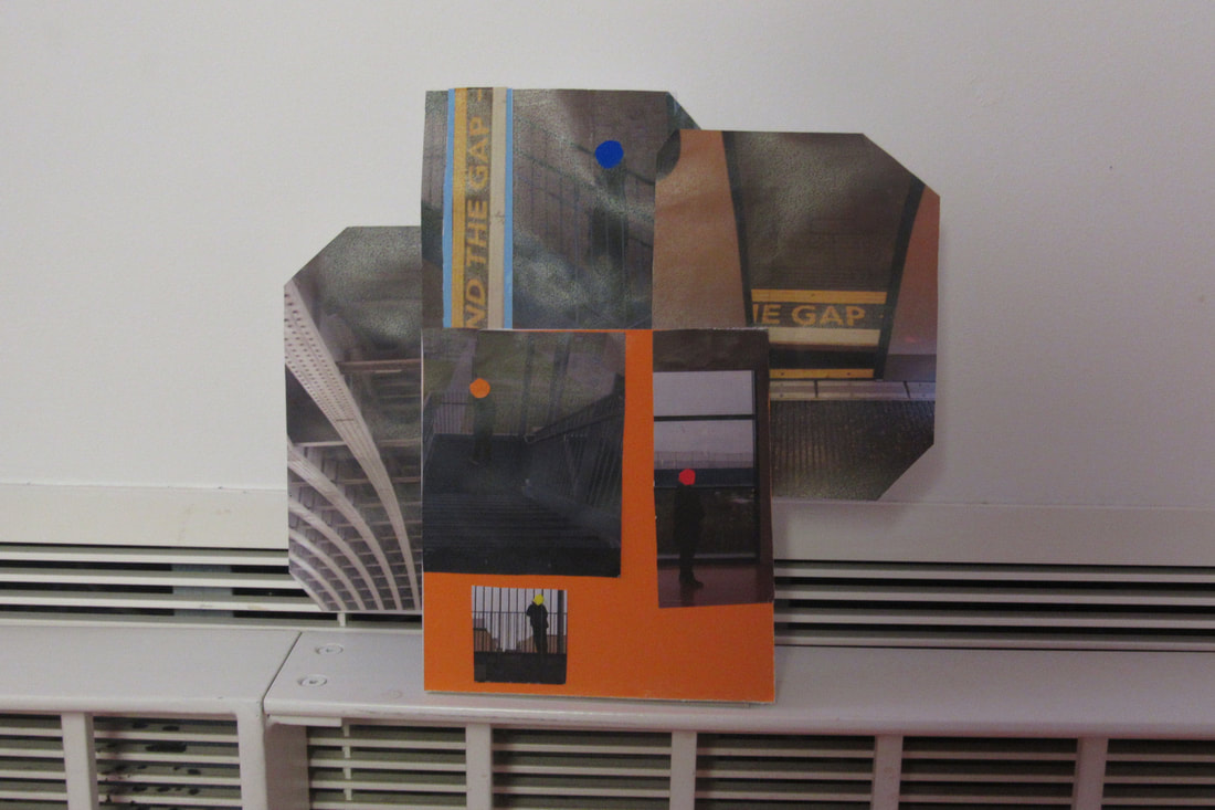
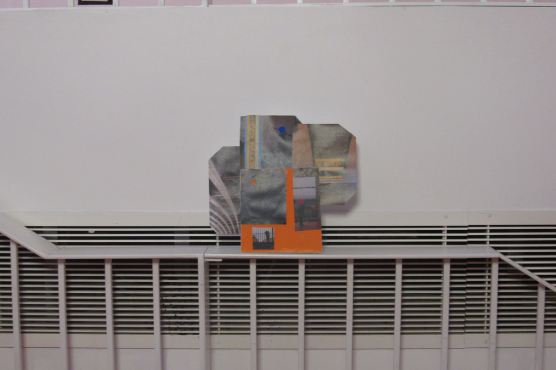
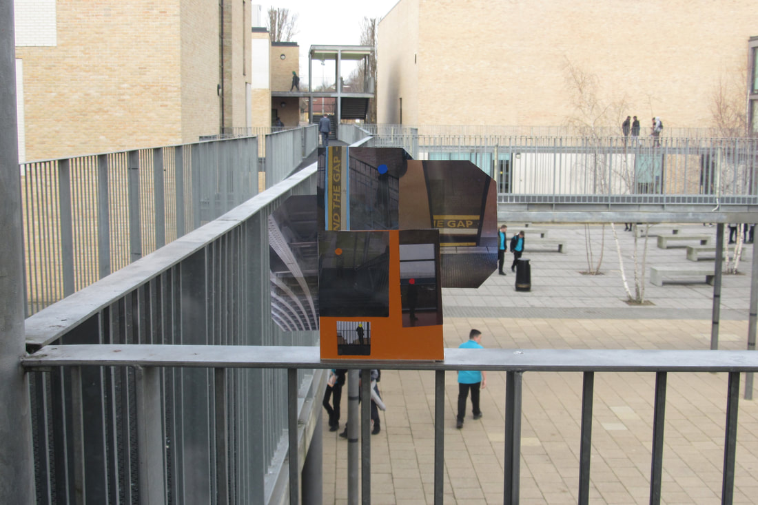
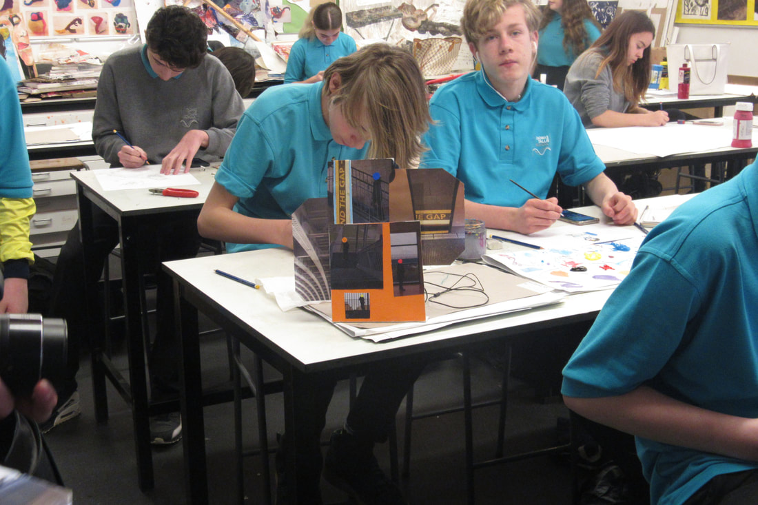
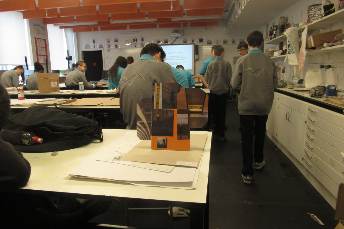
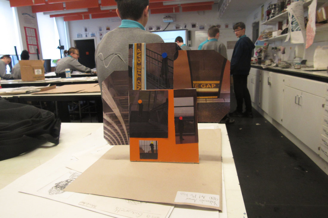
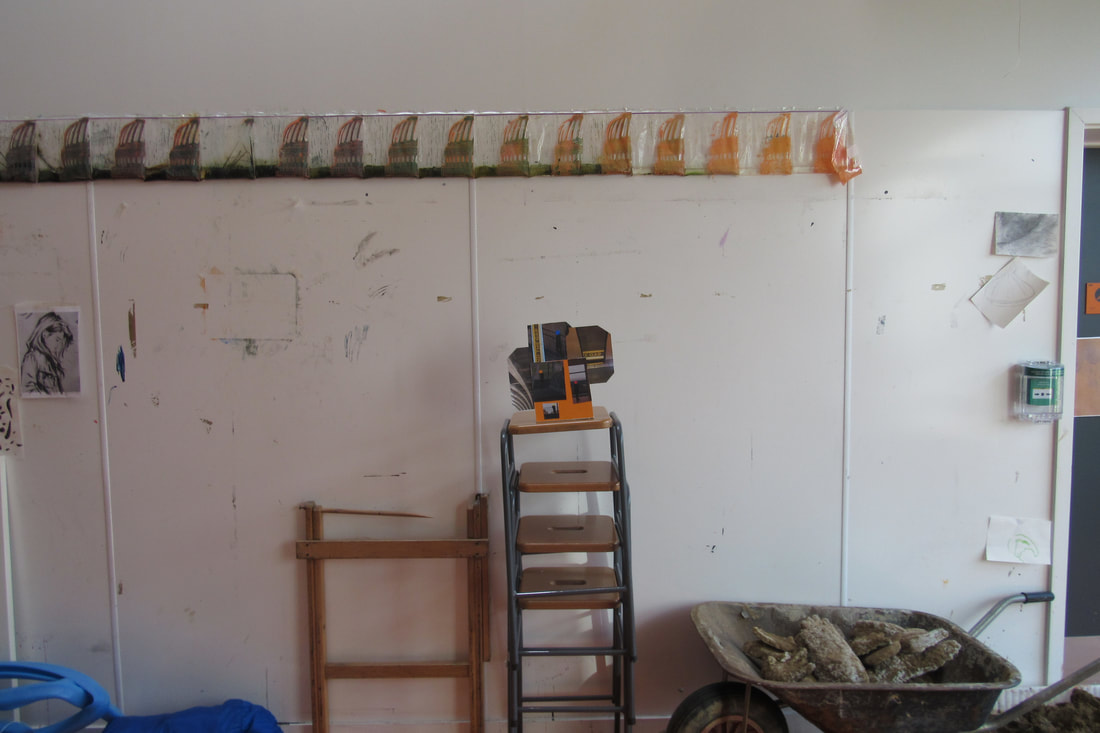
Photo Sculpture -
Out of my images, which I took of my photo sculpture 3, 4, 5, 17 and 19 are my personal favours out o the 20 images I took. These are the most successful as I incorporated everything on my success criteria. In 3, 4 and 5 I used the natural light to my advantage to create shadows and emphasise certs=ain edges.
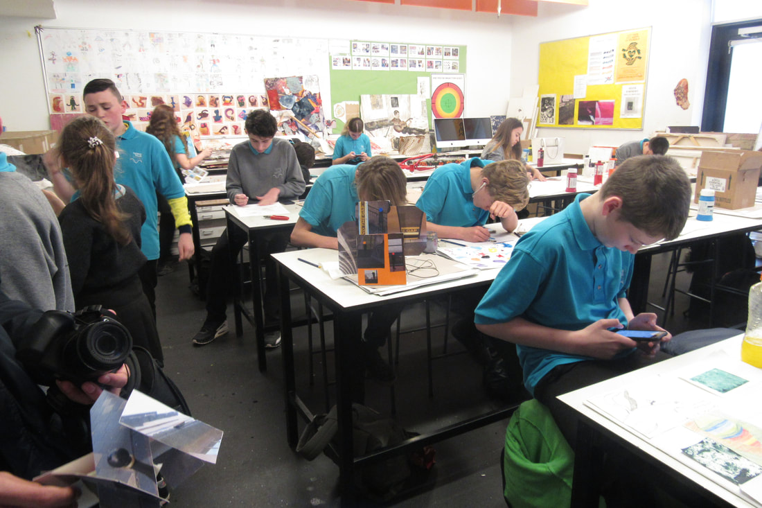
Our task in he first half of the lesson was to create a sculpture with card, scissors and glue. After building our Photo Sculpture, we took a camera and went around Block 1 to take nicely composed images.
I found the task not easy, but not difficult, as I really and to think about how I would use the light to create more edges and lines. As I could have easily taken all 20 images near a windows with the light shining.
WWW - I met the criteria well by using my given word on the post-stick note. I thought about composition and where to keep focus and where to have no focus.
EBI - I could have thought more about other keywords, for example Angles, instead of only focusing on only one keyword. I could have improved my sculpture, by possibly using more interesting materials.
This links to our current theme of edges as we created edges by cutting out shapes against other colours, which could have high contrast. Also using light to create shadows which adds more edges.
In my opinion, the most effective one was Number 19. I chose this one because I considered focus and the edges. I used a black piece of card which made contrast with the bright colours and shapes. I think mine was abstract as I thought it was a simplified verso of a children's playground.
Chosen Images -

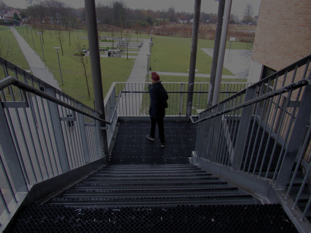
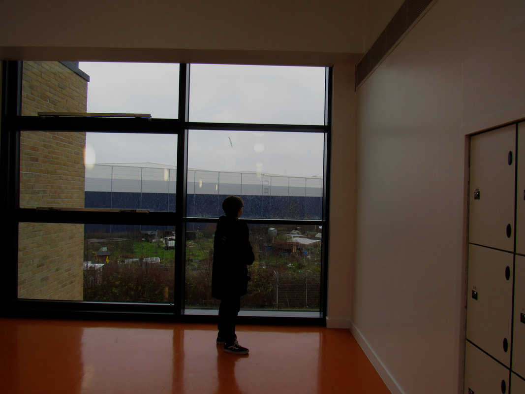
I have chosen these 16 images as they are my favourite out of he 3 sets I have taken. I have chose these as they have either been a good replica of anthers work or I have used edges effectively. My personal favourite out of the 16 is the one of my friend Harkeerat walking up the stairs with the angles of the handrail showing movement parallel to the movement of the person.
Photo Sculptures -s
Tate Visit -
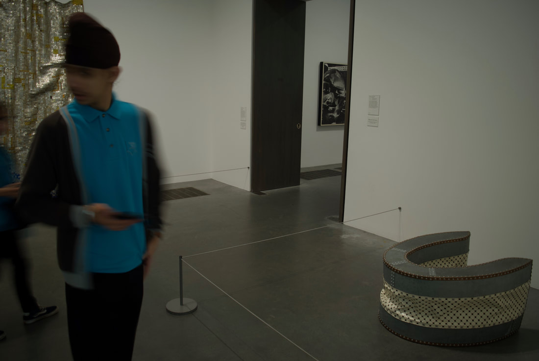

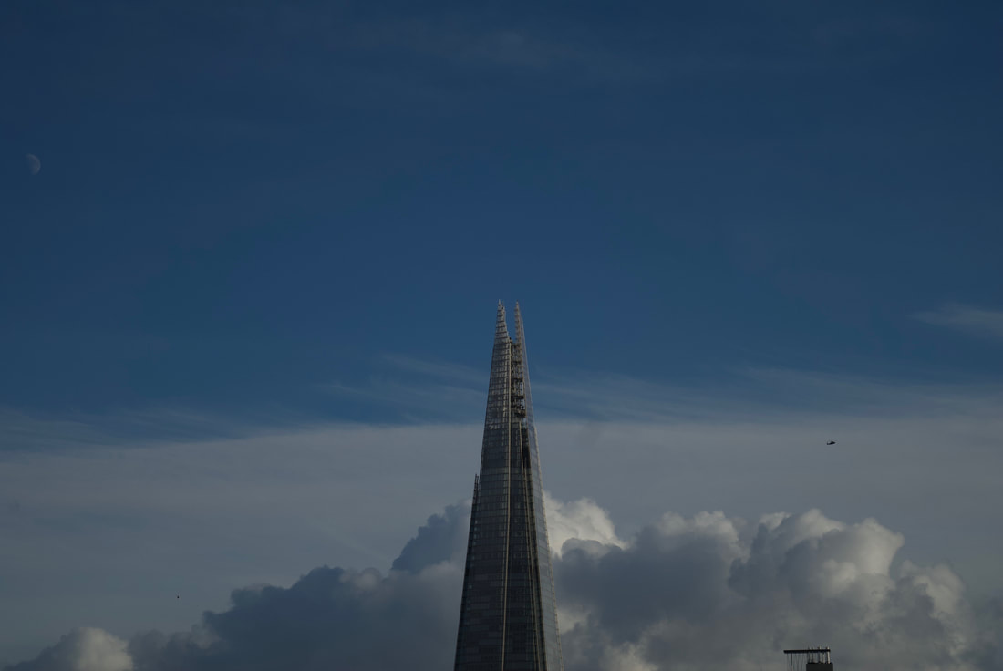
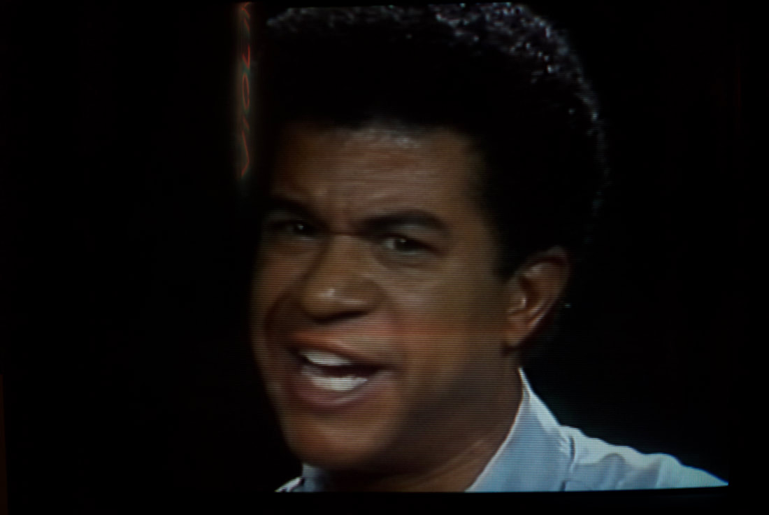
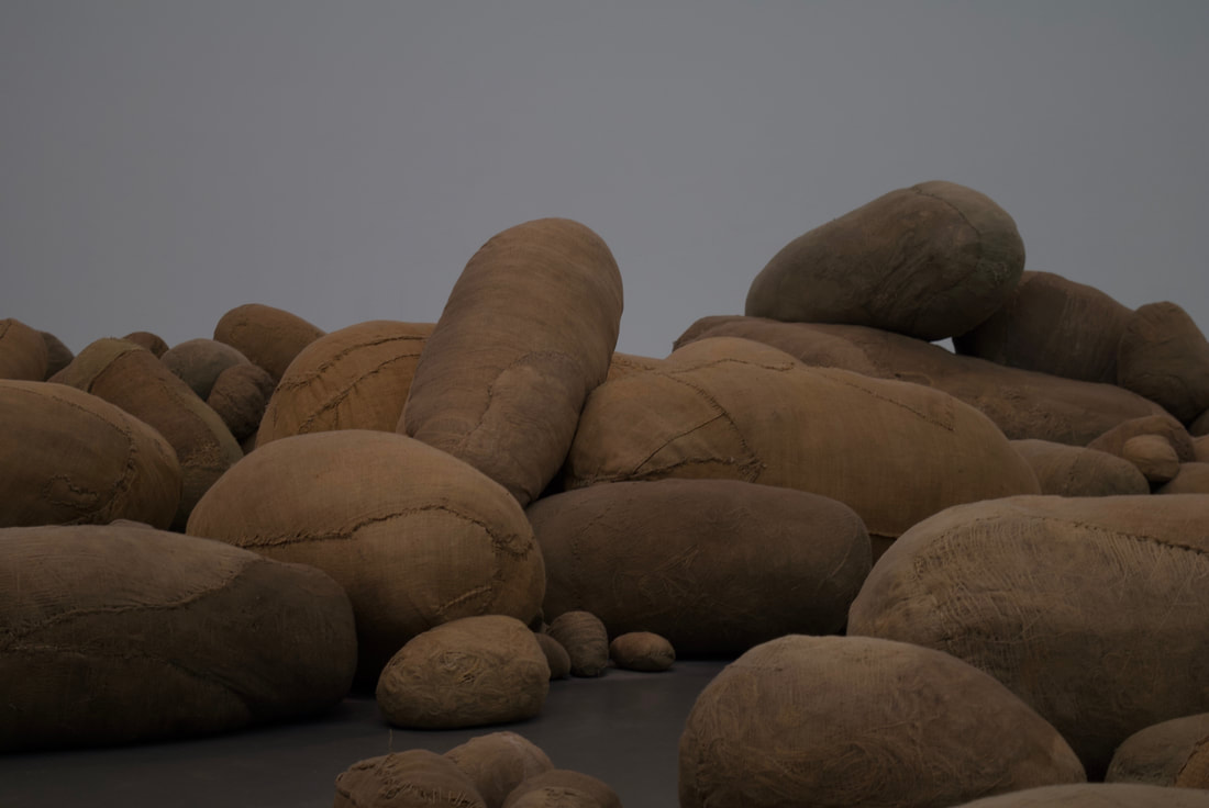
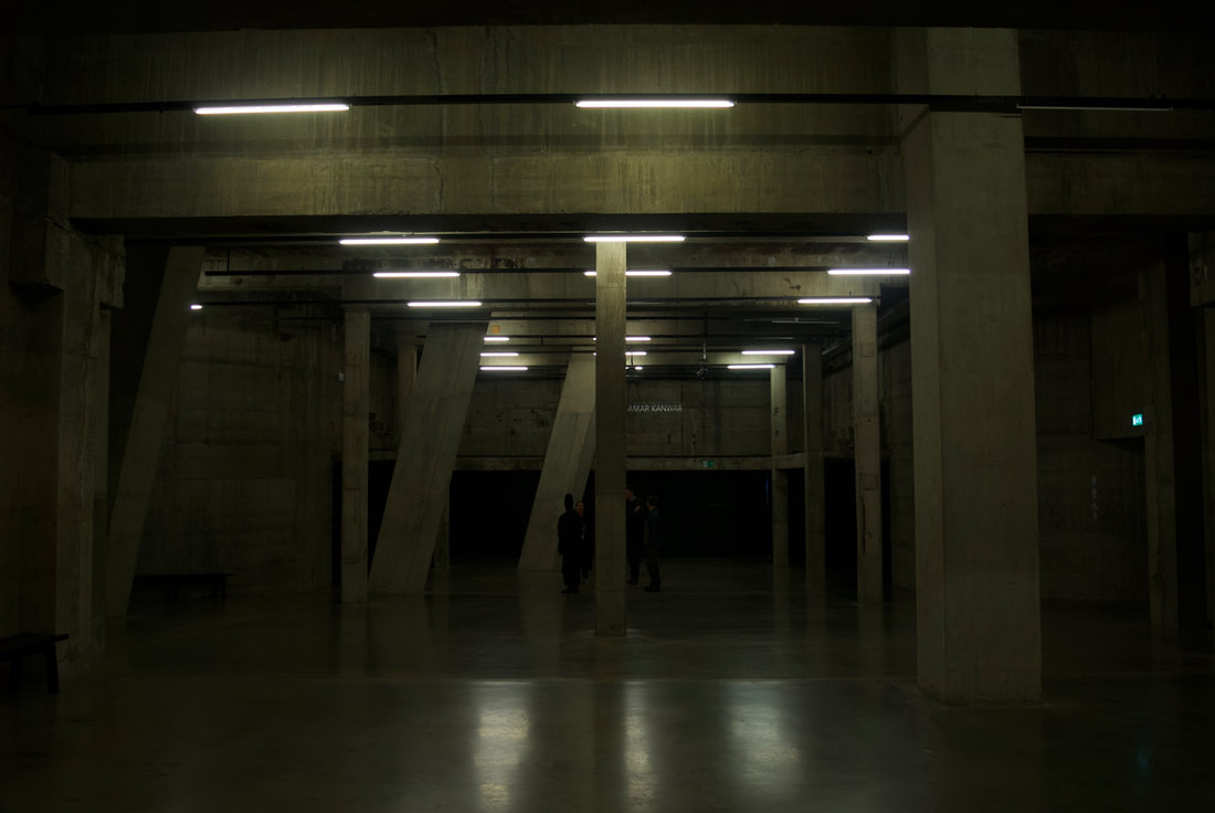
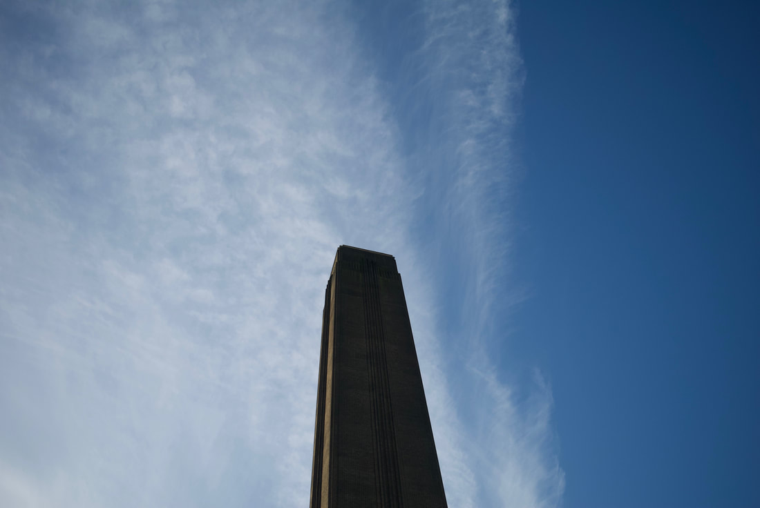
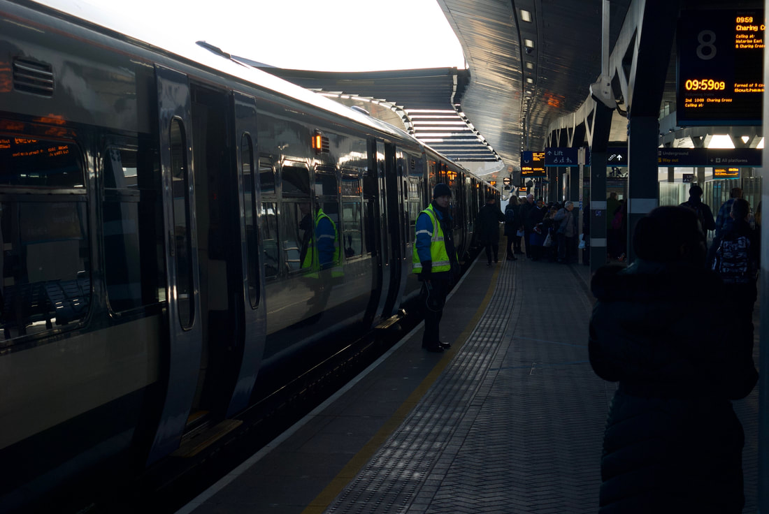
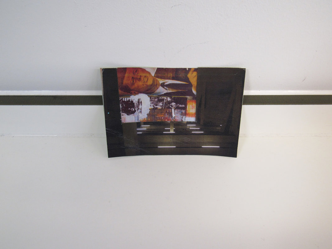
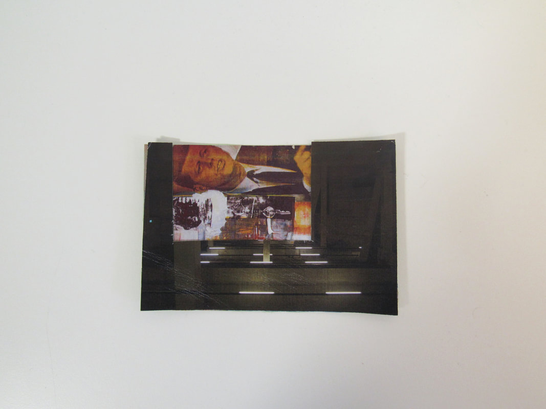
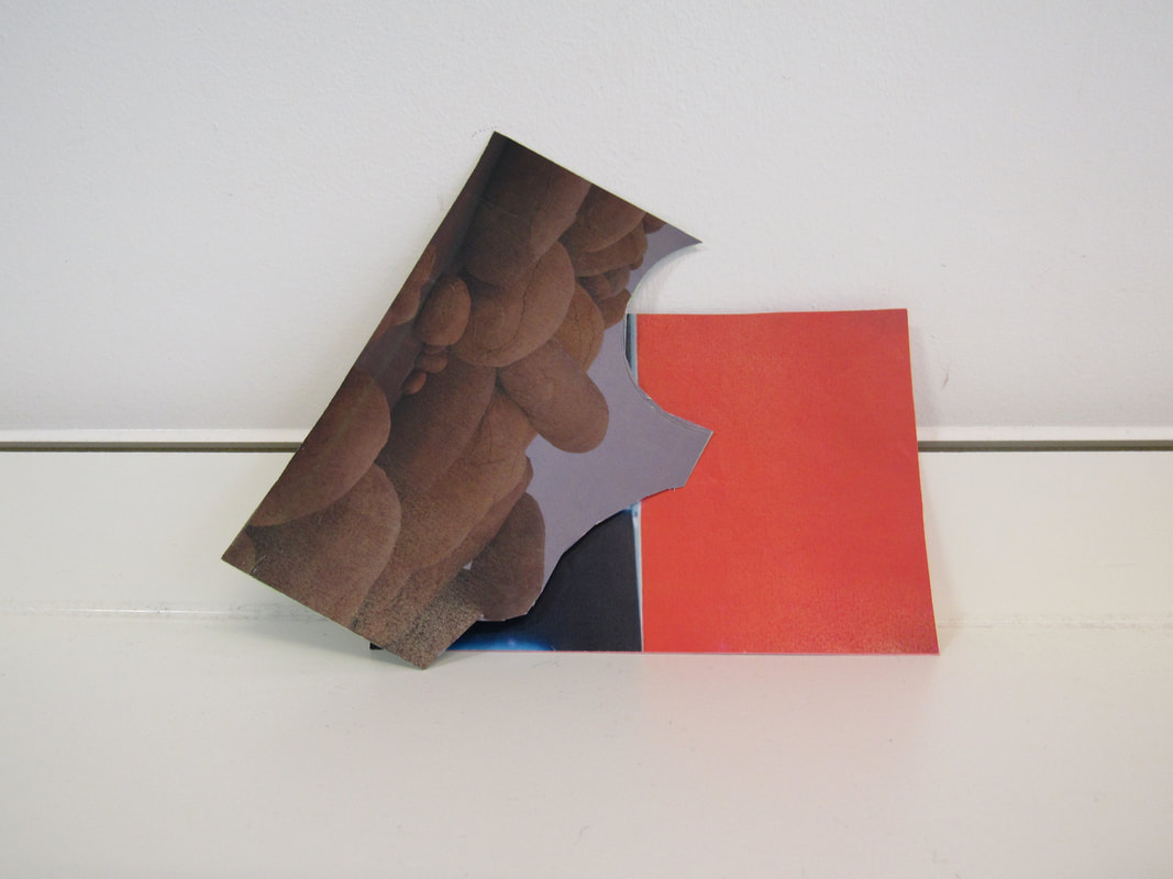
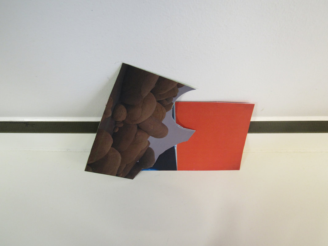
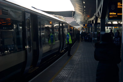
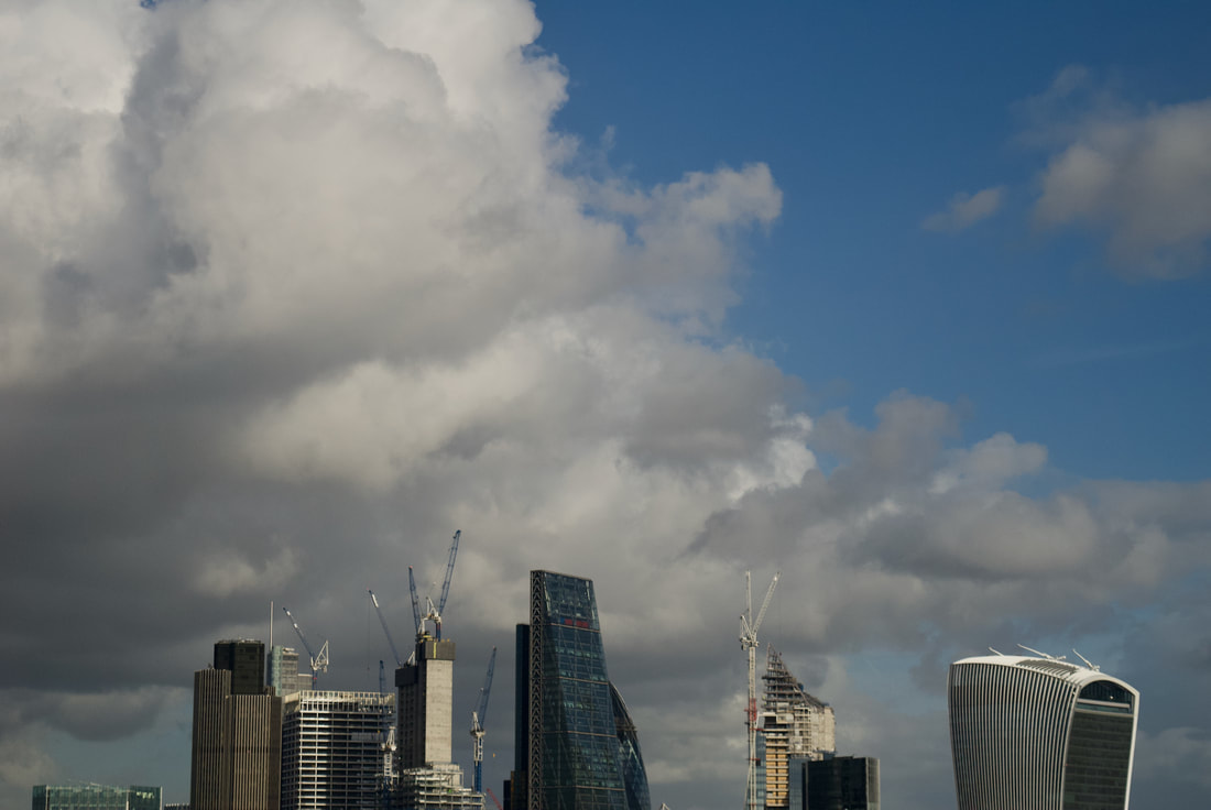
My favourite is the one of the Train Conductor, I think this because I focused the image nicely and thought of the edges and the other key things. I found the activity fun, as i enjoy visiting Art Exhibitions/Museums such as the Tate. I found the task of following the guidelines of the image enjoyable yet quite difficult. I particularly enjoyed the artwork of the Potatoes, I liked this one because of how they used the space to there advantage. I also like my image of the Man as you can see his expressions and you can tell what he is feeling. My favourite exhibition is the one with the urinal and the general selection of Art, with a mix of different styles, for example in one room their was a more sculptural piece and then a more paint based piece. I prefer sculptural art as it is more interesting as you can perceive it from multiple angles. I think I also really enjoyed it as I liked to discuss the Art and what it portrays with my friends and teachers.
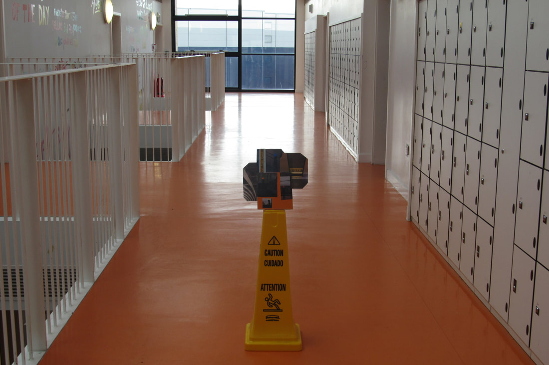
Photo Sculptures (Photoshop) -
I took 10 image of suitable backdrops with a suitable place to edit/photoshop my Sculpture onto. My favourite image is the middle one. I think this is because I nicely placed the sculpture and (luckily) the lighting matched on both sides. I think I could have improved by learning how to edit the light to make it seem like the image is actually there. I am quite confident with Photoshop as I have used software like it before (e.g Illustrator). I found the task fun as I enjoy a challenge with the photoshop.
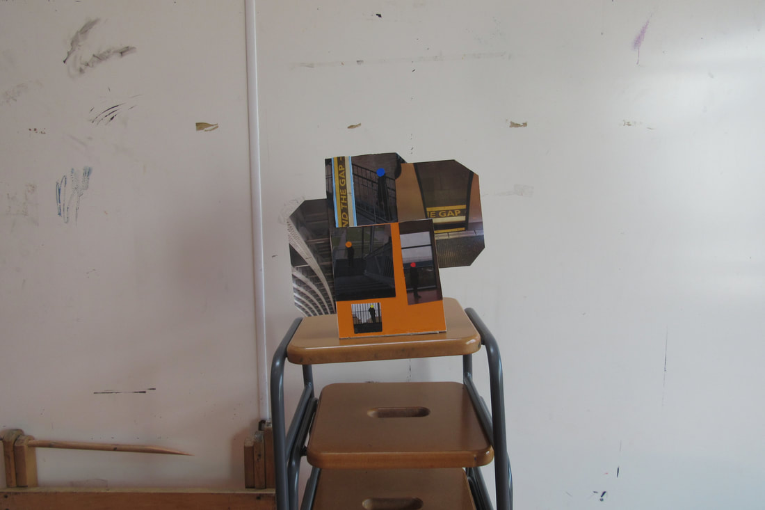
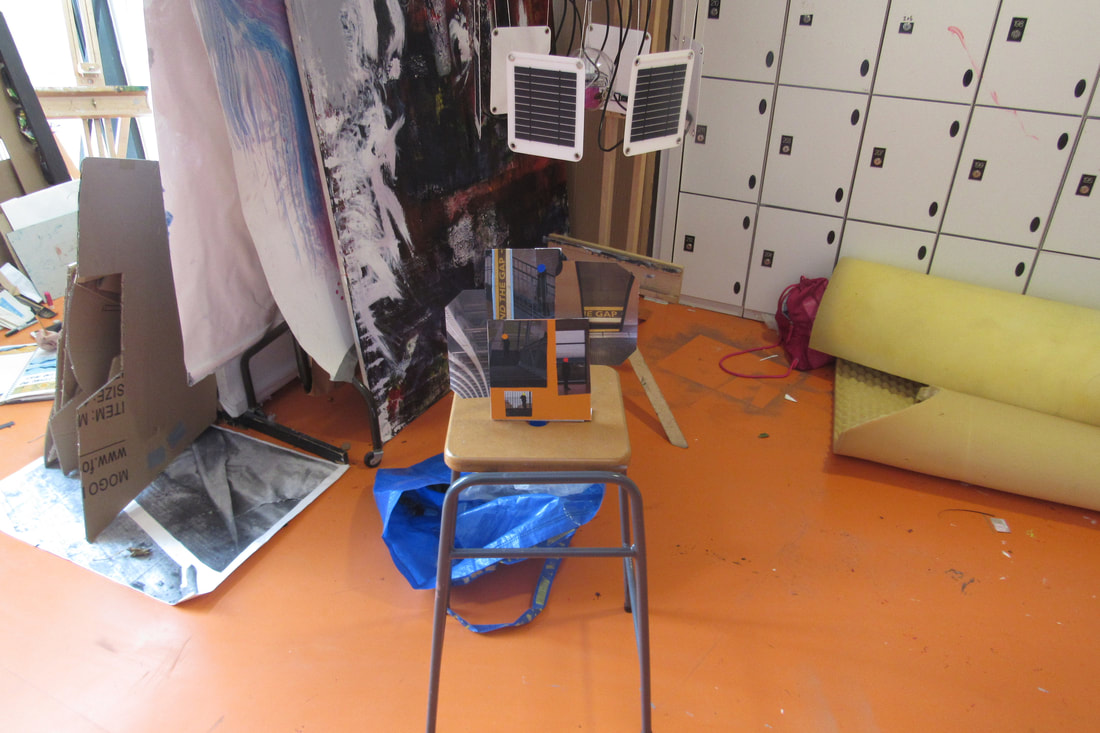
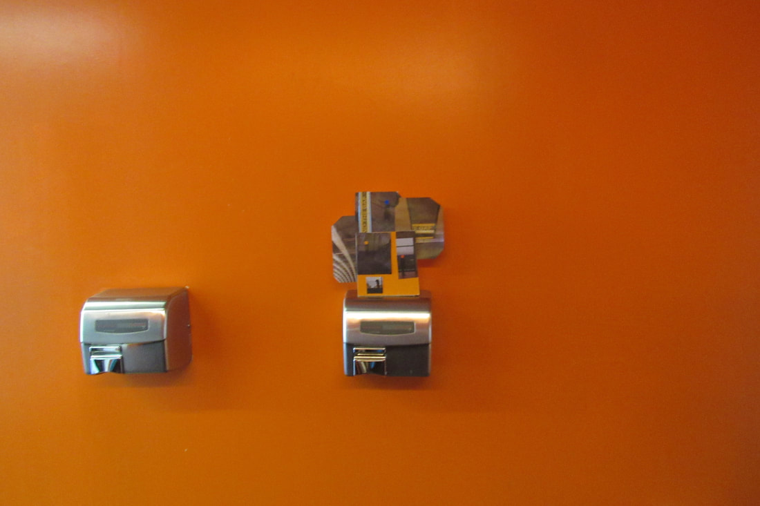
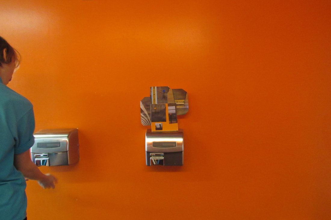
Post Card Sculptures -
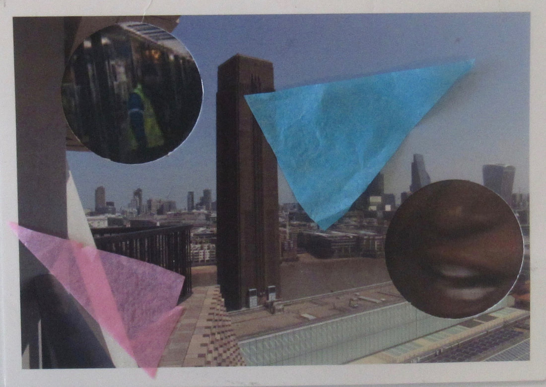
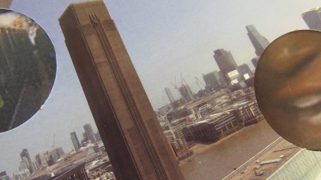
Photo Card Sculpture -
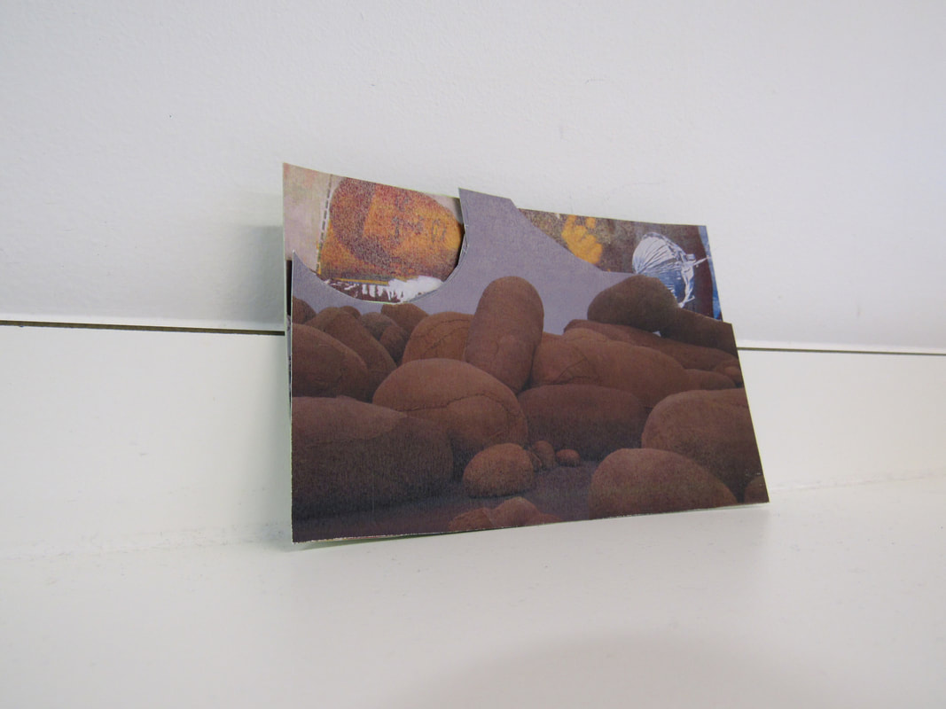
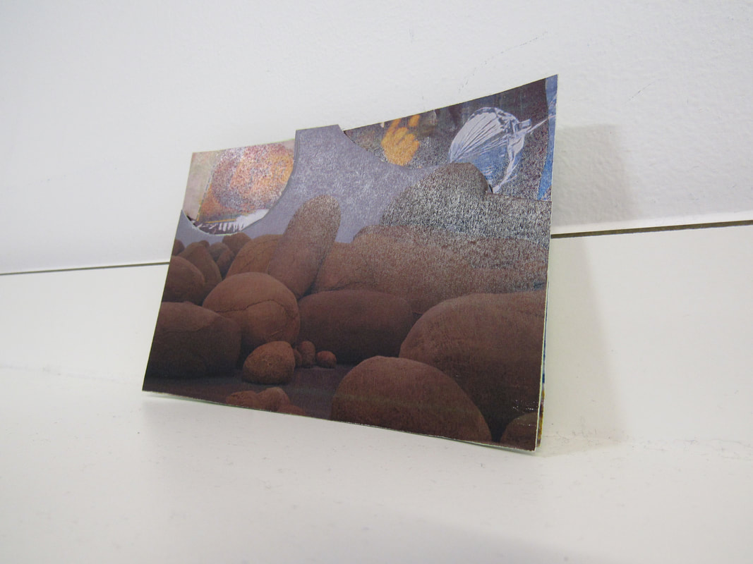
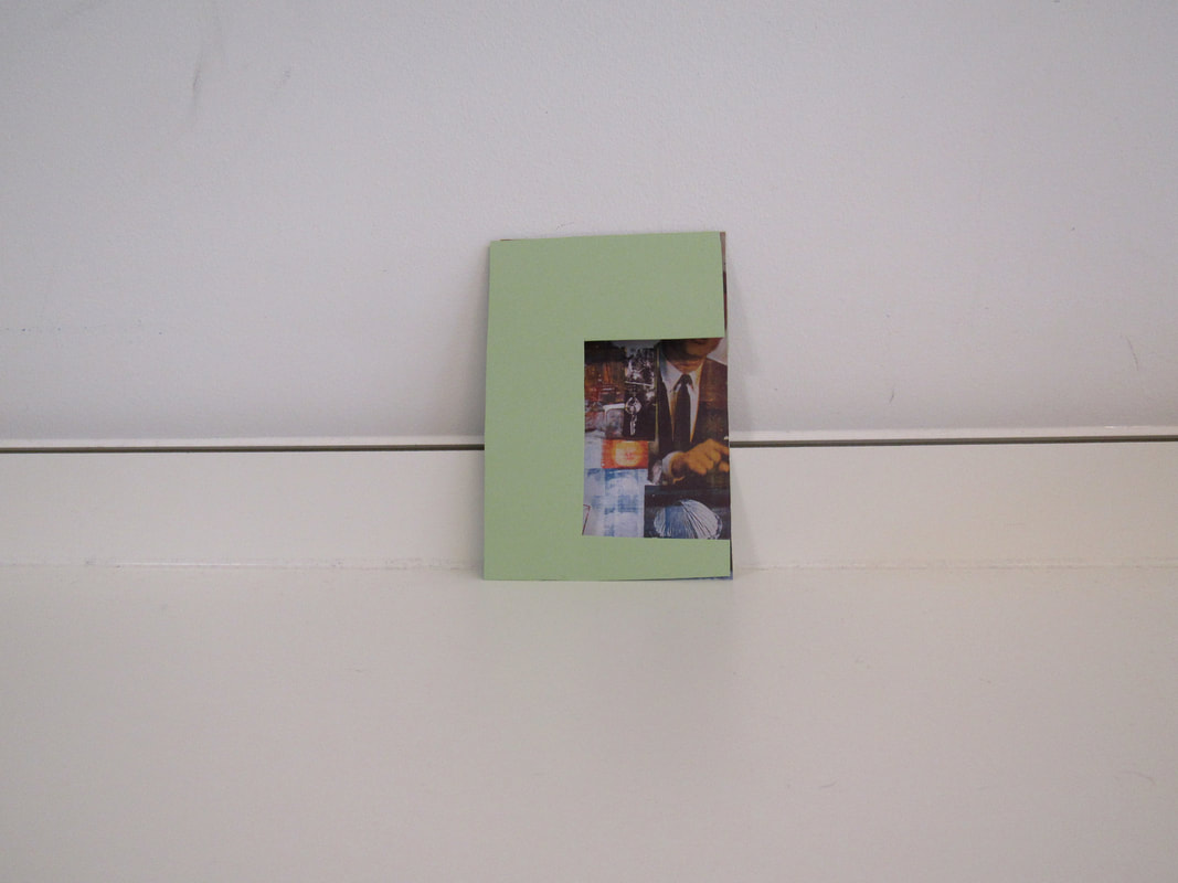
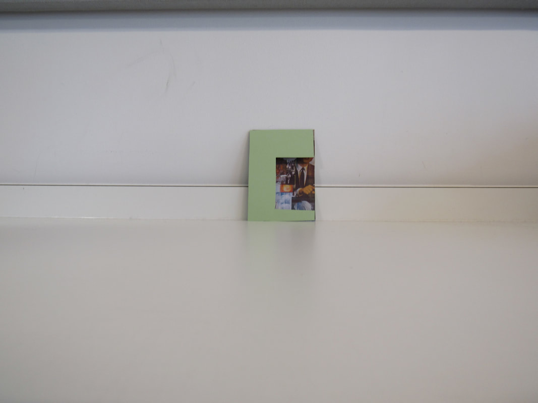
WWW - I took nice images and my ideas were in the right place. I took some nice images.
EBI - However, due to the conditions, I could not use sunlight to make shadows, which would make for a more interesting sculpture. I also hoped to have better equipment as the circle cutter was fairly blunt.
My favourite two images are the 5th one and the 1st one. This is because I like the composition, lighting and I also like the sculpture.
Photogram -
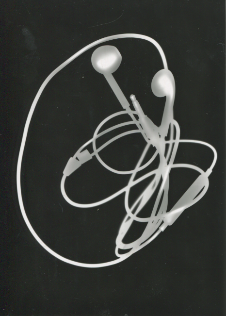
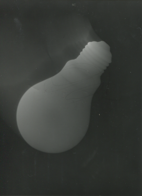
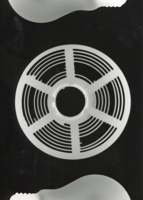

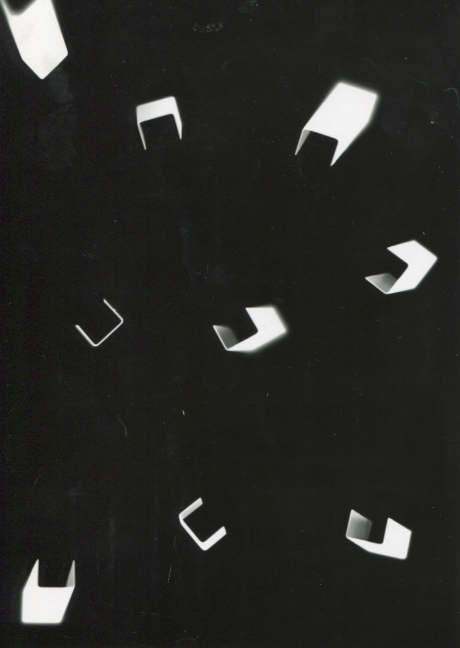
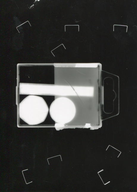
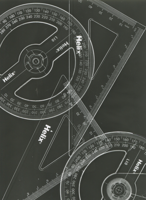
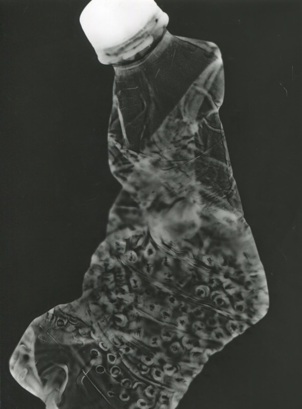
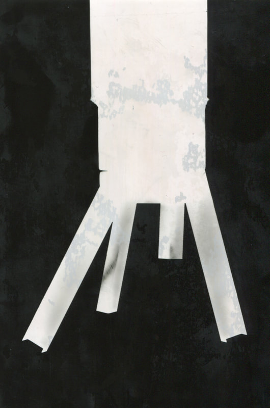
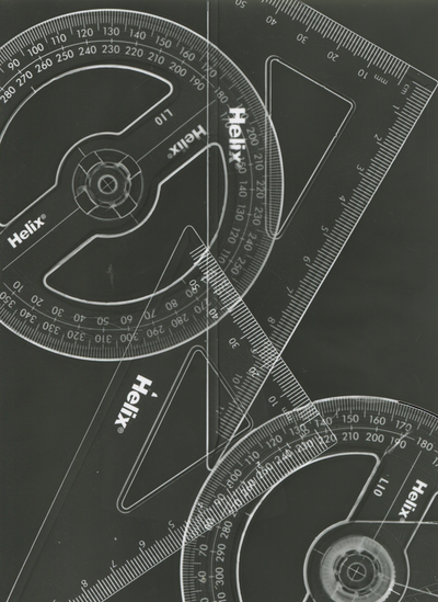
WWW - I took some nice Photograms with nice compositions. My favourite photogram (as of 12 March) is the one of the Helix rulers. I like this as it has the aesthetic of a Blueprint.
EBI - I need to have a more interesting ways of presenting my Photograms. I am thinking of either making a photo book (like my first one) or an exhibition like my 'Mapped Out' exhibition.
EBI - I need to have a more interesting ways of presenting my Photograms. I am thinking of either making a photo book (like my first one) or an exhibition like my 'Mapped Out' exhibition.
Photo Book -
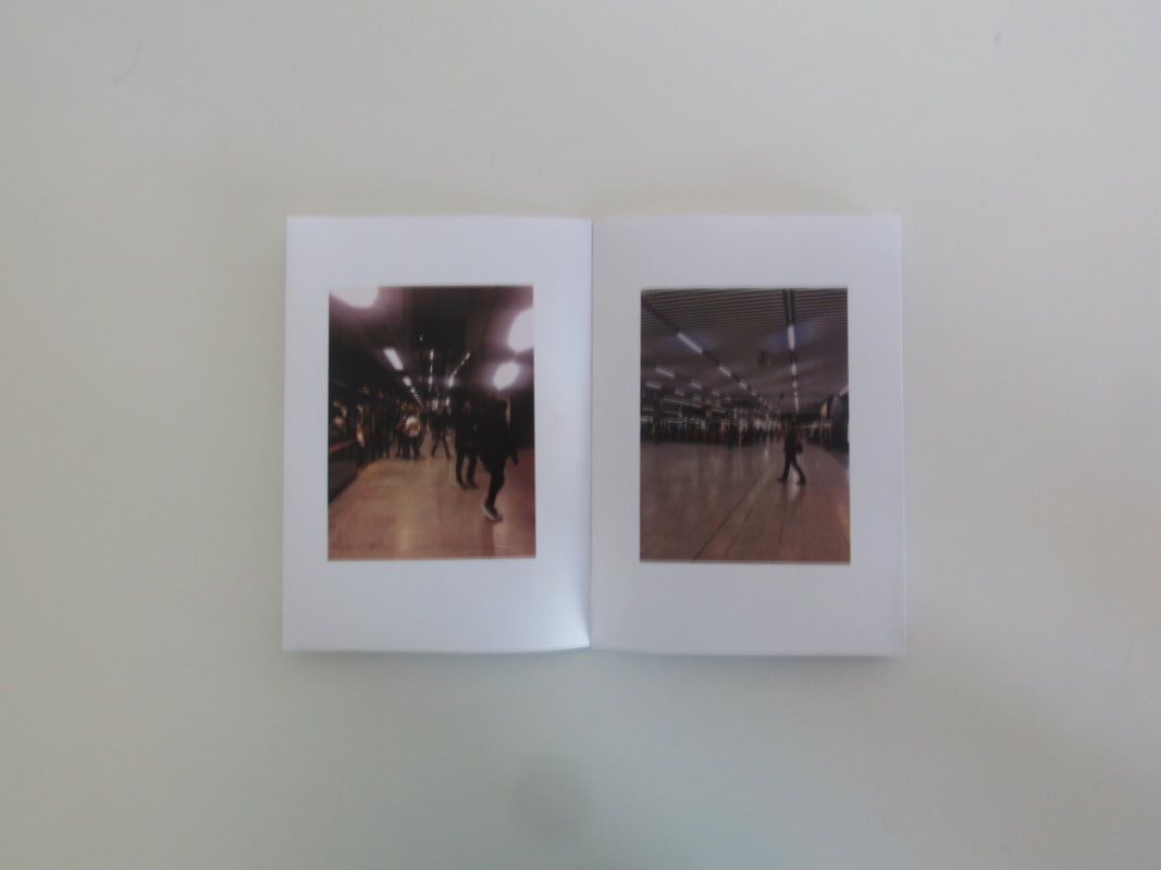
WWW - I made a nice Photo Book which was refined and looked very professional. I took nice images and laid it out nicely on InDesign.
EBI - I need to add more of an explanation to my work and something about the images. Basically I need to add context to allow the viewer to have a better idea.
EBI - I need to add more of an explanation to my work and something about the images. Basically I need to add context to allow the viewer to have a better idea.
Edges Conclusion -


Row 1 - Tate Visit / Row 2 - Photograms / Row 3 - Dolores Marat Inspired Work
WWW - I enjoyed the edges project as I felt taking Images with Edges is something I am quite good at. I personally enjoyed the trip to the Tate Modern. I enjoyed the trip as I really enjoy looking at successful artist or photographers work and drawing inspiration from it. I took images with edges on the trip using the skyline of London to my advantage. I enjoyed Photograms as it is an interesting process used many years ago. The final results are also very interesting as see-through objects allow the light to go through yet not fully expose the paper under the object. I used this see-through effect on the Image with the rulers. The researching and replicating of Dolores Marat was enjoyable as I personally really like Marat's work. The darkness and muted tones added a layer of mystery to her images. My personal favourite is the Image of Harkeerat on the staircase replicating Marat's piece of a woman standing on an escalator. With my Final Piece I wished I had more resources and a printer with the ability to print double sided. I have also learnt that you should cut with the guillotine before you glue it together.
EBI - I could have improved on my edges project if I took more images as I would have a larger amount of images to choose from than if I only took three. And sometimes a 'bad' image that doesn't follow the rules of a great image may be good as the idea behind it is good. I could have taken more Photograms but the cost of photo paper is quite high. I wish I could have been more productive with making my final piece as I did multiple attempts in a long period of time when I know that I could have done it quicker.
EBI - I could have improved on my edges project if I took more images as I would have a larger amount of images to choose from than if I only took three. And sometimes a 'bad' image that doesn't follow the rules of a great image may be good as the idea behind it is good. I could have taken more Photograms but the cost of photo paper is quite high. I wish I could have been more productive with making my final piece as I did multiple attempts in a long period of time when I know that I could have done it quicker.
